 Hiram.edu redesign: Your chance to flog me
~ 05 July 2004 ~
Bear with me as I attempt something I’ve never done on this site: Posting in-progress client work for the sake of gathering reader feedback:
A few weeks ago, Jon Linczak, Webmaster and project lead, contracted with me to produce a redesign for Hiram College’s existing site. Savvy in both code and business, Jon is by far the most sensible client I’ve ever worked with. His unceasing desire to ensure the success of his project is what led to the request you’re reading about now.
So what’s the request?
Simple: Take a look at the comps and provide suggestions for improvement. Jon’s team and I have had several discussions and have reached a point where we’re all pulling different directions. Thus, Jon has given me permission to post the comps here to gather additional IA, layout, and design feedback for internal (Hiram) and external (yours truly) purposes.
I’m rather apprehensive about all this, because I hate showing work in progress that still requires a fair amount of polishing. But I’m positive an open flogging will be worth the pain for everyone involved.
So if you’ve enjoyed the complimentary breakfast buffet here at Authentic Boredom, here’s your chance to give back. No free Gmail invites, no gimmicks, no hot dogs or balloons. Just an honest request from an honest guy.
On behalf of Hiram College, thanks in advance for helping out.
![]()
README.TXT
1. Any comments that fail to provide reasoning, such as “It sucks. Try again.” will be ignored.2. That said, a few elements really do suck. I’m probably already aware of most of them, but please point them out regardless.
3. I’ve been hired to do only layout design, which won’t include any coding or IA or content or logo design (Jon & crew to handle it). However, feel free to comment on any of these areas, as Jon welcomes your feedback.
70 Comments
Stock photography, type, and killer tees. Genuinely recommended by Authentic Boredom.
Looking good. C1 is my favourite. It’s bold and simple, and subsequently makes good use of negative space. The other ones are well laid out but busy. I tend to like simple nowadays ;)
On A1, the font for the testimonials in the top right is very hard to read.
The secondary pages are VERY nice, well laid out and easy to navigate.
Overall, very nice colours and font choices.
I like the way the new designs have more information on the initial page. The one what made the most sense to me was the first one with “Hiram College exists to offer you…” I’m a big fan of hitting the visitor with something intriguing right away. I also want to know why this College is better/different more suited for me than any other. That said I find all the layouts infinitely more useful than the current site. The proposed redesigns (beauty aside) all make me want to click on something. The current one makes me want to leave (too much underlining, too little balance, too little information).
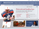
My only beef (nitpick) is the lonely African American as football player. I do see the African American woman with the quote AND perhaps a hispanic with the cap and gown, but that football player sticks out in a negative way to me. I think the stereotypes of black kids with footballs, basketballs, etc. don’t do anyone any good. It gets old… but not in the good way this site is *G*. I like the photo though, just wish he was other than African American.
A1 - I like the Hiram College text and clock logo better on B1. The layout is nice and simple and I think the cursive is a nice touch underneath the logo, but too much on the people with quotes section. I would change the cursive fonts to something along the lines of C1 and C2’s Rashel Jones section. Also, I am not a fan of the huge quote in the middle (Hiram College exists…). Something about it doesn’t set right.
I really like C1 and C2. Just looking at it, it seems easier to get where I want to go. What if in place of the links jump list, you put a few of the people from the A1 layout. I like the meet a few students, faculty, etc. on educational websites.
I like the secondaryB1 prospective students section better than secondary A1. The italics kind of sepearate it from the other copy on the page. However, I like the A1 menu tabs better than B1. I am a fan of smaller sizes, but I don’t have bad eyes.
Nice work! All of the layouts are vast improvements compared to the current Hiram site. Also, I really like C1 and C2. I would roll with those.
Hmm. A.1 loses immediately due to the script font. It’s illegible. And the font in the nav menus is unnecessarily “sculpted.” This adds neither readability, nor understanding to the tab choices. I find the “breadcrumbs” at the top unintuitive - they imply a threaded idea, but I don’t understand the thread.
And I intuitively ignore the type box to the right of the photo. Without even looking at it, I know that there’s nothing there worth reading.
B.1 is better. There’s a relationship between the photo and the white dropped type. Why “Hiram News”? Whose news would be there besides Hiram’s? Again, hate the sculpted type on the tabs - it adds no information and makes the type hard to read. I wonder what the tabs would look like if the type were the same colour on all of them, but you retained the tab colour change. I worry about the three “Something here” areas. Feels like a perfect candidate to abuse down the road.
C.1 fixes the type on the tabs; I suspect it’s the same, just bigger. But the sculpted look is diminished and this is a “good thing.” Like the list box for navigation, provided the nav choices are good and the list is short. But why use a list box at all - why not more nav like the choices to the right of the photo. Like the photo drifting over the whole thing - somehow, I understand that the photo will change next time I visit. Love the short and sweet nav choices to the right of the photo - lots of information in a tight space. Like the handling of news items - concise, I know what I’m gonna get when I hit those links. Like the “something / something else” areas on this page - they feel a little controlled by the larger photo. But I am confused about whether those are nav areas - do I get anything by clicking on them? Should I? My first instinct is that those are media - audio, video, something “extraordinary,” something light and entertaining - a puff piece video roll, a rotating gallery of photos. Perhaps links out to on campus arts events.
I think that navigation on C is generally more intuitive.
If I were laying money on it, the campus chooses A.1
For the secondary page, I prefer the layout of B1. The grid structure is a bit better carried out, IMO. Personally, I don’t like the gray background, and would play around with that.
I’m going to go with B1 for the homepage, as well, as it seems to go better with the subpage for B1. However, I do like the logo treatment for A1 better. The extra colors help set it apart from the top bar.
If it were me, I’d try adding some borders around certain elements, notably some of the photographs. I’d also think a border on the bottom of the top navigation bar would help out.
Overall, it’s a nice looking design, and seems to fit it’s purpose quite well.
I like C1 and C2 the best, race aside (the football player will most likely be an actual student, and it will be his story, not his race that is being told, and if he happens to be black then that’s that), because they accomplish what most University websites are trying to do these days: sell the university to prospective students.
I think the 3 forms of navigation are a bit much though. The tabs are well laid out and intuitive. Even more focus should be given to the centered whitespace to explain the story of the picture, followed by just one link drilling the visitor into the site. Personal stories really let a high school student connect on why he or she would choose hiram over another school without coming across as obvious whitepaper.
A definite improvement.
Just for clarification: On C1 and C2, all three of the major elements (large photo, campus photo, and student quote) will be randomly pulled in separately from 4-5 defaults.
All the designs are very nice, but C.x is my favorite. I’m curious, though, how you plan to attack the overlaying photos when you get to the XHTML/CSS stage. They look fabulous — it just seems like it may be tricky, is all. I guess you could cut the subject out of the photo and put an alpha-transparent PNG version in an absolutely positioned DIV atop the rest of the page — but this would fail in IE.
In any case, good luck. The work is really great, and inspiring.
Homepage, build C.1 and Secondary page, build B.1 are the one’s I prefer.
I do like the logo in A1 and perhaps it could be used in the other designs.
Awesome job on those designs though, they all look good. I just prefer those that I mentioned above. :D
Have a nice day.
My preferences:
Homepage: C because the content is easier to scan in a single eye movement rather than darting all round the page (A). I find it more inviting than the grid layout used in (B). B’s welcome text is obscured by the tower in the background, and A’s cursive fonts are also very hard to read.
Secondary page: B2 because of stronger and more legible tabs, and the serif titles with larger first letter.
Hope that helps.
Okay, I’ll say this off the bat — I’m really not a fan of sites that have so many navigation menus… each of those pages has at least 3 distinct navigation bars/whatever you want to call them, and the secondary pages have 5 areas to work with. I realize it’s not easy to pare those kinds of things down, but if you could, I think it’d really help… because right now, all of the designs are straddling the line between “busy” and “confusing”.
That aside though, they’re all very well done. :-) I have to go with the crowd and say that the C-pages are the best, since they have a strong element (a large-ish shot of a person) as the central focus, against that nicely contrasting blue-white background. A and B look too busy compared to C1/C2.
For the secondary pages, I much prefer B1 — Larger typeface, and more importantly, varying typefaces… there are switches between serif and sans-serif, which works really well. A1 is totally sans-serif, so a lot of the text seems mingled together (well, not really, but I think you know what I mean). The gray text for “Prospective Students” on B1 should be sans-serif though, just to keep consistency… also, it looks a bit corny with that Georgia-like font anyway. ;-)
Cameron,
First off great job. These look great. For the homepage I definitely like C. The cut out image gives it a dynamic feel that is missing from the rest. The information also seems better organized. Some Suggestions:
- Emphasize the logo more. It’s getting lost at the top. Comp A did a really nice job of this.
For the secondary pages I prefer comp A. It’s cleaner and easy to read. The “Prospective Student” box doesn’t feel squashed. I do however like the use of the serif type face for the headline on comp B.
Thanks for sharing these Cameron. I hope I was able to provide some help.
I really like the Logo and navigation in A1. In the other comps the clock tower gets lost in the low contrast. I also like the right justified navigation. The script font on the testimonial boxes on the right is horrible tho. Maybe another font?
I also like the content areas of Cx. If they are random with every page load (from what I gathered from the description) it would add a unique freshness to the site.
Horizontal drop shadows look nice and add a casual formality (heh) to the layout that suits a college site perfectly (careful or you’ll start a trend).
So, if it were me, I’d go with header/navigation from A1 and content area from Cx.
I applaud you asking for opinions, and honestly I think it’s the best way for designers to flourish. We design not for ourselves, but for the masses, and asking opinions can only help us cater. One of the reasons I am a regular at www.webdesignforums.net
As for the critique,
I just don’t like B, it’s a bit too dull for me all around. Nothing really grabs my attention and I just end up glazing over it as if it were just another site.
I’m torn between A & C. Visually, C just grabs me and I love it. However, there isn’t as much information available as there is on A, which I like a lot. Ultimately, I’m leaning towards C because the design grabs me immediately and is just overall visually impressive.
As for the IA of the site, I made believe I was back in High School looking at colleges, and it was very clear where to go when I wanted to go somewhere. The same applied as when I thought of how I use my own college’s site now.
One note I would like to see on C is the logo from A, or a variation of it. I don’t like the pure black logo on the purple background, it’s kind of annoying.
I agree that the Cx versions are more dynamic, and therefore more pleasing to look at. Remember your audience, prospective high school students (mostly) and current Hiram students (secondarily). The C design reinforces what a high school student would be looking for. Switching the images does keep it fresh, which would help current students who have to see the site more frequently. It also helps to keep the site from feeling neglected. I would change the inactive tabs on Cx to look like A.1(secondary) and use A.2 as the secondary. I would also change the inactive tabs on A.2 to look like those on A.1. Keep the active tabs the same on Cx and A.2(secondary).
Overall, it makes me want to redesign sites I just wrote for two cigar places. One question, did you code it and then photoshop a screen capture, or did you just copy certain elements and create the image from scratch?
The following is all IMHO:
#1. C1 & C2 look well suited for an event that wants to scream loudly, rather than a poised, confident, established institution. While excellent designs, I’m not sure I’d use them for a university (or is this my evil, old, stubborn, skeptical side speaking?).
People will visit this site repeatedly… over and over and over and over. I like feeling like there is a framework to a site, a sense of place that you get every time you come back.
#2. B is hard to judge b/c of the blank boxes at the bottom, but it appears a little generic, a little distant, nothing special.
#3. Overall, I like A (provided the script is replaced with something readable). It feels like there is a strong presence behind it, and I like the layout of the headlines in the bottom-right. It offers stability for the long-term user, and for prospective students it gives a strong message and has ample room for content without overloading the user with text.
——————————-
The Admission…Sports links bother me, I feel like they’re lost out in the open and need anchoring down somehow.
——————————-
Best of luck, I hope our feedback helps!
Matt
The designs look good Cameron, but (don’t you hate that word)…. by the time you get to the secondary pages the screen seems to be filled almost entirely by navigation menus. Three rows along the top of the site and one on either side of the page. Ummm, is there going to be any room for actual content?
If the navigation is going to be that complex and dominant it needs a pretty solid overhaul in my book.
my 2�:
A: This is the one I like the most. It is dynamic and the positioning of the images moves the eye across the page. This layout would also allow for placing more kinds of information on the homepage at the same time, therefore making the page pertinent to a wider audience. As has already been stated, the script font is pretty illegible. Also, the font used on the tabs in version C is more clear than the one used here. I think the quote to the right of the picture is too wordy, I just skip over it. A shorter quote might create a bit more space on the page as well. Finally, the links to Admissions, Academics, etc. just kind of hang there and look a bit orphaned. The triangle bullets suggest that maybe they are dropdowns?, maybe breadcrumbs? Perhaps if they were moved up closer to the Search, Sitemap links they would seem more integrated into the rest of the page?
B: Layout kinda static and not very interesting.
C: I like this one best after A, however there isn’t a lot of information being imparted and the repition of the Prospective Student, Current Students links, along with the addition of a drop-down, adds too many navigation elements.
Secondary page, build A.1
My personal opinion: drop the drop shadows, especially on the menu. It looks too “computerized” and not like real objects. Otherwise it looks neat and clean.
I think A is good but C1 and C2 does it for me - simply becuase they are more alive… They jump out at you and ae something you can connect with.
Although A conveys a lot more information, i think the more minimal first page is better - less distracting.
I love the overal design, I think you have done an excellent job. The only think i would be tempted to change, would be to make the menu tabs/buttons stretch across the whole width of the main page, instead of stopping short - just my personal opinion.
Good work!
Well, here goes my 2c:
- Like the logo on A1 better. On the other comps the logo itself is confused with navigation and the clock is too faded out.
- Don’t link to a search page. Provide a search box right there on the home page. 1 step is better than 2 and on a site like this, believe me, people will often search.
- Loose the sculpted and faded out look on the tabs. It’s hard to read. Like the tabs on C better. Still on those, loose the white drop.
- Don’t do navigation drop downs. Worse, don’t do it without a button. In the first place, drop-downs were never meant to be navigation gimmicks and second, auto loading drop-down scripts are a pain. Say you select an option and are waiting for it to load and you hit the scroll button on your mouse. The script will redirect you to another page that you didn’t wished for.
- On A1 loose that fancy marketese next to the pic. Why is this colege better? That text doesn’t incite me to read further.
- Headlines need to be in bigger type. Too small the way they are now.
- On A1 the testimonials are too small to read.
- On C1 why do you replicate the tab links? This just adds clutter and confusion.
Anyway, Good Work!
I prefer Build C. I really like Build C if you can get a bunch of those images from people on the campus. I love it when educational institutions use actual students and stuff.
The faded logo looks better than the boxed in logo. No real need to call that much attention is there? I also like the bigger version of the text for the logo.
Do they really need a drop down for navigation??? At least it is at the top of the page where it has room to expand.
On Build A not a big fan of the quotes. Are they buttons? Something that should be saved for the prospective students area.
On Build C why do repeat the navigation elements in the middle of the page. And why so small. Do they take me someplace else?
Please please please make sure the calendar pages look as good as this. University calendars always suck and they can provide such a valuable tool at important times like move in and graduation.
I like C1/C2. It’s less like other sites already out there.
I’ll second some other votes for the C.X variations. The thing that jumped out at me first was the floating background in the content area (light blue with line effects).
For some reason, I don’t like how it doesn’t line up against the navigation bar and the bottom. I see the reasons against, but it still doesn’t seem right to me for some reason.
I’ll also have to second the nominations for C.x. My company (well not mine, but the one I work for) works exclusively with colleges, so I see their websites all day long.
A1 looks very much like a lot of school’s sites… a ton of information, but possibly overwhelming if you’re looking for something specific.
B is good, but C.x really stands out. It’s very elegant, and different than the competition. Nice job!
I think Homepage A is a strong comp, this one has a hierarchical area denoted by color backgrounds that are effective to emphasize telling the story. The drop shadows around the global nav up top are effective to draw your eye to these elements. The secondary page’s use of the inner shadow on the hero graphic is a persuasive technique to encourage the user to look inside of the pages and see the school with more of a connection to the image.
I vote for the C homepages. Beautiful work. Like many others, though, I’m not sure repeating the tabs in a list next to the photo works. Perhaps if you replaced those links with a task-oriented list that deep links to other areas within the tabs? Maybe short-cuts for people who don’t feel like exploring and want to get down to business immediately. Possibilities include direct links to the admission application, campus map- that sort of thing. (In other words, pages people are going to want often, but not often enough to bookmark themselves.) You could even try profiling the existing site and figuring out the deep links people hit the most often and use those.
I personally like Homepage build C.1 and C.2. Those two are the cleanest looking out of the three designs. I like the text in the tabs being a bit bigger and the text in the current page tab being a bold color. One problem, though. You will put text on that picture of the campus at bottom won’t you? How is anyone supposed to know what that link is?
As for the secondary pages, I like build B.1 because of the lined up sides. In A.1, the sides ARE lined up, but the bottom part lacks the white line that separates the sides on the top part. And the left side on top and bottom is thinner. That just looks better to me.
Hi,
I liked the layout and menu of homepageB1 and the layout and font choices on secondaryA1. However, I also really liked the idea of a randomly pulled image with some copy and the “cover page” feel of homepageC1. I feel the homepageC1 feel combined with the added content sections from homepageB1 will give you the best combination of information and style possibilities. I would definately stick with secondaryA1.html for the sub-pages and do a hybrid of sorts from the other two hompages—something like this, maybe.
The logo still needs a bit of work, but I suspect you are still playing around with how to display it as well.
HTH
Best regards,
Mike Wilson
Just covering stuff that wasn’t already mentioned a few times…
A1: I like the way you dropped the logo out of the top bar. Provides just the right amount of focus. The script font pull-quotes on the right are hard ot read. Good overall page balance.
B1: Granted the elements on the bottom aren’t fleshed out yet, but the page lacks the balance of A1. Logo fades away. Type over the image feels muddy. I think the drop-shadow in the photo frame is one too many.
C1: Nice feel to it. The image overlay is a neat idea. (How are you going to code that?) The photo-relevant headline has the right amount of real estate and focus. Logo is still a bit subdued. This page has a better organization the A1. Better hierarchy. Unique photo treatment is a plus.
Secondary: For the amount of information on the page you did a solid job of organizing it. The only thing I don’t like is the lead-off blurb Prospective Students. It seems a little too dense. It also might cause problems if it can’t flow downward with bigger fonts etc.
Nice work!
zapfino seems awfully difficult, and annoying to read..
otherwise, at quick glance, its quite impressive
There appears to be double nav horizontally on all the first pages that I find confusing.
As far as look and feel goes, build A1 gets my vote.
I like the quotes section top right, instantly obvious what they are about. Also nice use of the grid.
B1 and C1 look a little hollow, I’m not tempted to go much further in, A1 however looks like it has far more to explore (whilst being clean enough to do so).
C2 looks fraught with code trouble (IMO) but then I am looking at this as a designer not a code ape.
I’d also align the ‘admission’ nav hard right to fit the grid (but as mentioned I find it an extra level of nav and somewhat confusing).
Secondary levels - I think the grid needs to remain the same as the frontpage, ie the containers need to be aligned where possible.
Needless to say, all versions are dramatic improvements on the current website!
The C layouts are simply beautiful. They depart from the typical college/university website mold in interesting and intriguing ways. Quite honestly, based on website alone, these layouts would make me much more interested in attending Hiram college than any of the universities in my area (and I’ve never even heard of Hiram!)
As beautiful as they are, I do have one reservation. This reservation is based on my assumption that the content in the two bottom boxes will change. Although I LOVE how the paper that the guy in C2 is holding overlaps one of the boxes, what happens when the need arises to place something with text in that area?
Just something to think about. Keep up the good work.
Good point, Tyler, on the change in content down the road.
Thanks to everyone else for posting. Keep ‘em coming. I didn’t expect this many responses so quickly… still reading through all of them.
Re: Home Page Comps
I think B.1 is the strongest choice. A.1 feels, on the whole, too busy to me. Specific offenses include the list of buttons on the right with the script font. While I think the effect is a nice idea, it’s clutter to an already intense bunch of information, and you have to work to read them.
C.1 on the other hand feels to corporate. That’s the most succinct way I can put it.
B.1 feels nicely in the middle of what I perceive to be the drawbacks of the other two: it’s clean, but not too dry, and the information feels very digestable.
I am indifferent to the secondary page layouts for the most part, but A left me feeling slightly more impressed.
All are good designs.
- The IA from what I can tell looks well planned but without seeing more I really can’t go to far with that.
- Homepage build A.1 is (IMHO) the best. It is both visualy appealing and makes good use of space. I would however, change the scripted font to make it a bit more readable. The colors and use of imagery (the graduate photo) seem to hold the viewer’s attention while bringing out thoughts of success and purpose. In regards tothe other designs: B1 bring the ideas of “good times” and socializing chile the colors are cooling and seem to convey an almost relaxing tone. And C1 seems to convey the images of everything other than acadamia. By this I mean all of the frills that comewith college life. And C2 is too generic and looses the uniqueness that is created by the grid with the shadowing.
- Secondary page A1 & A2 are similar with minor changes. I prefer the imagery that A2 gives the viewer. The thoughts of friendship and common interests with a common goal. The people in the picture will have a great appeal with the younger students while the imagery will appeal to the older viewers. Additionally I think the italicized font next to the main picture adds character to the page without drawing the eye away from the focus of the page which is the imagery of the picture. I would also say that the cool blue in the Welcome -nav menu list (whatever) and the font that is used in that list is more visually appealing that the red “you are here” deal with the larger text. The red larger text draws the viewer’s eye away from the center (focus) of the page.
Hope this makes sense and helps out. jZ
The “C” versions appeal to me best. I like the way it breaks out of the boxed layout many sites like this have, I also think that it will pull out the human element more.
No question about it the C version is the best out of the bunch in my opinion. They all look great BTW. I really like how the content is separated into bite size chunks.
I really like the C version. The only change i would make to the design is lose the grey drop shadow on the navigation and make it a darker blue. The grey drop shadow over the light blue seem to clash a bit and make it a bit harder to read the text.
Well, after looking them over, I have my favorites, but there are still some issues that I have with them. I would go with, for now, Homepage of C.x and Secondary page of A1. For now.
The bigger concern is the navigation mess that is created from having direct links, followed by tabs, followed by a drop down list, vertically, on the homepage. I despise this mess, while my boss’s just love it. For some reason they think it’s easier, but it’s not, it’s already proving to be a mess - and I’m not a designer, just a power-user, and it’s been the case that if I can’t find something on our website, it’s not there, and this interface has me befuddled.
So, other than that snafu, it’s really beautiful. I would suggest fixing the navigation by reducing it to two forms, and either doing dual layer tabs, with all the above stuff going under the Welcome tab, or adding another tab called something appropriate, like ‘Shortcuts’.
But the layout for C.x is truly inspired work, really fresh and bold without losing the integrity of the school. AMAZING! GREAT JOB!!!!!!!!! (I would use ten exclamation points, but that would be just silly…)
All, thanks so much for your comments so far, and like Cameron said, keep ‘em coming! One of the difficult things about website redesigns of this magnitude is the design aspect, and the more comments outside of the institution we have, the better, I believe.
Many of your comments are excellent, and I’ll be using those in designs of some of the other pages. Thanks, all!
Just to repeat what has mostly already been said, while all are impressive, C is for me by far the most innovative and inuitive design. It’s also inspirational (i’m trying to find as many adjectives that begin with “i,” apparently). I suspect that Cameron agrees because it’s the comp he decided to thumbnail when introducing the post…
Nice looking redesigns. I really like Cx over the others - the larger type size in the tabs makes them stand out better, in A and B it’s difficult to figure out hierarchy between both horizontal menus. I love the blocked-out photo - it pulls the design out of the grid and makes it feel more dynamic. I also like the pull-down links, they’re a quick way to manage a list - easy to modify, easy to fit into a clean layout. Also - I don’t like scrolling on a home page if I don’t have to. Layout C fits in my screen nicely; all the text is at the top of the screen.
Secondary B1 stands out as a stronger design than A1 due to the use of serifs for the headline(s) and italicizing the text in the upper left. It’s just a more clear way to present the information and separate it from other content.
Great work! - dan.
looks good so far, appropriate professional look for the project. Wondering how the whole thing is going to work other than what it looks like now, what you are planning to do to make it wasy for anyone else to add sub-content and pages to your redesign as the site moves forward in the future, since this is looking to be quite a large site, and with colleges new stuff comes up all the time. much nicer, cleaner look than their current site.
I can understand your concerns of not showing work in progress, I go back and forth with this for my own site (www.sjgraphic.com), but it does help to get input from random sources and also keep a link there so that your client can check and see the progress of their site and get excited about what you are doing (and also so people looking at the site can see the most up to date thing I am working on and that I am not out of business or something!), once you get to a reasonable point of design to where it is understandable what you are showing. This is the approach that I have taken and it has worked pretty well. I think the colors in A pop the most, but all of the designs look appropriate for the project
I echo a lot of what has been said. But I have a couple items I wanted to mention.
The logo treatment on A1 stands out a lot more and is more interesting to look at. I think the A1/B1 tab navigation is more “pretty”, but the larger ones on C1 and secondary B2 are better and more contrasty/easier to read. I really like the C1 and C2 designs, but I looked at them over and over and never noticed the “select a link and go” drop-down. I’m guessing regulars users could miss it as well. I also completely missed the “search | site map | contact Hiram” nav at the top of all the designs until someone mentioned it in a comment. I am typically a very perceptive person so I found it odd that I missed those.
Nice one Cameron (so far!). The details put me in mind of Dominey’s work on the (stunning - and I hate golf) PGA.com site. I’ve not seen anything as accomplished as that for a while, and this has the potential to get there.
But, none of the links, rollovers or drop-downs work.
That’s a joke (British sarcasm…)
Cameron, you’ve WOWed me again by being as ballsy to post work in progress. By now you’ve found that there is too little feedback AND too much feedback. That said, here is my humble suggestions:
A1- too busy…guessing it’s what the school will like (with the impression that more is ‘better’). The logo is more collegiate than the other versions (but the does not help the design)
B1- possibly to best compromise of content & ‘white space’. Keep it simple enough for people to find what they want without having to read it all to find out (you already know this though)
C1-2 - My favorite at first but the logo gets lost. The navigation gets lost next to the logo as well. I didn’t even see the ‘search & ‘contact’ info in the top right corner until I looked for it.
A,B,C,
The navigation is tricky on all the sites. Can I suggest looking at www.indwes.edu? While not cleanest design, it does address the issue of too many links on the main page. Might give you some ideas to clean up your nav bar
The secondar pages are link heavy…but that’s the nature of the beast. Thanks for caring what others think. I miss all the design critics from college days. It was refreshing, in a boring kind of way ;)
Homepage A1:
Prefer the cutout around the clock logo. The blue quotes omn the right need visual seperation but in any case the quotes are not very visible.
Homepage B1:
Yeah it’s okay … nothing special here.
Homepage C1:
Good visual impact. The maroon links in the center draw attention away from the tabs at the top. Possible work overhead problems if every feature photo needs to be cropped like this. Clickspace on links and news items look like it is going to need high precision positioning.
Homepage C2:
Yep too much work needs to be done to the photo for it to be viable in a production system.
Secondary page A1:
Maroon links on right look like they will need too much mouse precision.
Secondary page B1:
Like the better contrast of the active tab. All the pages could do with more contrast on the tabs. I found that I had to scan to find them.
All:
The string of items to the right of the HIRAM COLLEGE logo is a problem. My mind keeps wanting to interpet them as a breadcrumb trail. I suspect they will be clickable but there isn’t any affordance to direct attention there.
It looks like you use four (five?) different schemes to present links. I think this needs some standardisation.
Ok, so I’m a little late to the party. I’ll focus on the C design, since it is the strongest and seems to be most popular. I don’t think you posted these for a pat on the back, so I’ll skip to some issues.
The main problem I have is the seeming rigidity of the layout. What happens when the client manages(I assume this is the case) the content and puts it more than you have shown? The news items on the right take up all of five lines. Are you going to restrict this area to that much? What if each item has two or three lines apiece? How does that make the page expand with the images below and the image to the left? It might be better to give these items a little more breathing room. Related to that, the image on the left seems way too large. How big would that file be? 35-45k? That’s a lot to spend on one large image, especially when you have a number of other images going on. (Since you didn’t give any user specs, i’m assuming that a college would have a large user base, some using dial-up and old computers)
The ‘Select a Link and Go..” dropdown seems superfluous. If you have a good idea of what the user wants to get at and have constructed your navigation as such, then shouldn’t that be on the home page? What is in that drop-down that’s not on the home page?
As far as users go, most college/university sites seem to try to separate out their users from the very start, since they usually fall into 2 or 3 categories, something like prospective,current, and faculty/staff, which you have. But the content behind these is vastly different and the secondary pages could change as such. Why not weed them out from the start with larger areas(content/images) in addition to the navigation directing them to each of these 3 sections. And then, on those subsequent pages, you can have a different look for each type of user, since they all have different needs. That would result in, I suppose, a secondary ‘home page’ for each type of user with different types of messaging. Perhaps that’s more work than you’re prepared to do. Just a thought.
Cameron,
From looking at the comps, there is so much good stuff, I’m just going to skip over trivial design criticisms and get down to the nitty gritty. Comp A is the most visually appealing to me, probably because it follows the grid the most, so I’ll use Comp A as a starting point for my criticism.
Using tabs at the top to direct different users to the appropiate content is a great choice. It’s like looking at the same webpage through different views, but what each tab should really do is filter the content of the homepage. Effectively, each tab should lead to a visually similar homepage that contains focus content related to the specific user group. Visually, I think removing the tagline under the logo and aligning the tabs to the left side of the wrapper would emphasize the tabs more.
A homepage for each user group would allow you to deliver appropiate content and navigation to users depending on the group. This would allow you to simplify the design by removing the second line of navigation (Admissions, Academics, etc.) that is currently on each page. This would help emphasize the tabs and reduce user confusion. I also don’t know why it would need to be on every page — why would someone who chose “Current Students” then want to choose “Admission”?
I like the idea of providing quick navigation to frequently accessed content, such as campus maps and calendars, but an extra row of navigation at the top distracts me from the tabs which are clearly the most important navigational elements. The purpose of this secondary navigation could be implemented further down the page, using “lead in” content tailored for each user group. Why not replace the unnecessary navigation with three columns at the bottom of the homepage? And maybe add a catch-all tab called “About Hiram” or something similar that contains content that doesn’t fall under other tabs.
At the bottom of each comp you have set up three columns. Why not fully define these three columns and add content relative to the user group. Each user group homepage could have different columns containing “lead in” text depending on the interests of each user group. You could have specific columns for news, sports, maps, calendars, etc., depending on the user group, and fill them with the links to frequently accessed content. Information relative to all user groups, such as calendars and maps, should be on the College homepage.
I also like the first focus area, under the tabbed navigation in Comp C, because it doesn’t look like it is trying to sell me something. Looking at all three designs it seems that trying to “sell” Hiram College to prospective students is the most important function of the site. Putting myself in the position of a prospective student, I wouldn’t find the obvious “marketing” of the college in Comps A and B remotely interesting.
I would much rather be given the opportunity to form my own opinion of the college rather than read someone else’s opinion. I would prefer to learn about the college in a much less intrusive manner — by reading about activities currently happening at the college or perhaps in a more inventive manner, such as an “online tour” of the college. An appealing headline with an emotional photograph might entice me to read the entire story, and if it is written well and the subject is chosen correctly, it should make me feel like Hiram College is an exciting place to be.
Although the basic idea behind the headline in Comp C appeals to me and I love the colors, I have a few major problems with the design: the drop down menu completely ruins the look of the page for me and I abhor the idea of using a drop down menu for navigation; repeating the links in the tabbed menu in the middle of the page is overkill and confusing; and the news items would have to be too short to be effective. I would recommend increasing the length of the “lead in” text under the headline and slightly increasing the line-height to make it more legible.
To summarize: the tabs do an excellent job of targeting and directing user groups to appropiate content; remove that unnecessary line of navigation and replace it with columns of tailored content; a bold headline and emotional photograph are more appealing than blatant marketing; and use the bottom row of columns more effectively. I hope that all makes sense and you find it useful.
Great job on all design comps, Cameron.
I noticed a lot of people exclaiming how they hate seeing all of that navigation on the home page, but I, on the other hand, definately feel your pain.
I work as a web designer for a medical college, and I understand that not only is there a TON of information that colleges wish to have accessible to the public, there is also that huge pink elephant standing in the middle of the room…the political battle of who (departmentally) gets to have a home page presence.
I think you have displayed a truck-load of navigation as well as anyone else could have. It is also well that you are trying to acheive a more “service oriented” navigation as opposed to a “departmentalized” structure. It’s better for the user….good job!
I also think your designs and layouts are excellent. It is passive, yet not boring. Perfect to have the content as the main feature, and not the design.
So now I have to shift gears and tell you what I think needs improvement…
Is a pull-down the best solution for the navigation there? Granted, you don’t need another nav list on the page, but the links under the pull down are hidden from everyone. Do you think the user will be curious enough to expand the menu to see what is there? I bet they won’t unless they are desperate. Anyway, I hope the links under that pull-down are not too critical for your users.
Option C is my favorite layout, followed closely by B. The script font in A along with the several busy photos kinda muck it up, but the logo treatment is better than B or C.
I think that B is the cleanest of the three, and it looks like it has room to breathe…very good, I’m undecided about the left-hand portion, because it seems the text is getting lost within the photo bg. Now I don’t want to ruin the design, because it’s a nice effect, but maybe provide a little more contrast between the font and the bg image?
C design is by far my favorite, but it also seems to me that it will be the most difficult to modify/ maintain. Are the large overlaying images on the left going to be dynamic? If so, are they a true layer on top of the highlight photo under it? Will the highlight photo ever change? It seems like a lot of graphics work, but if you (and they) are willing, then ok.
Hope this helps, and I hope I didn’t come off as too pretentious. I guess I just feel like I understand what you are trying to do more because I work for a college. Good luck!!!
A mi también me gusta mas el concepto C, ya que la imagen te sirve para conectar las zonas horizontales…Yo quizá trabajaría mas el menu superior de la derecha.
Un saludo (hope it doesn´y annoy anyone the post in spanish)
Ándale, Rafa. Te entiendo.
Hi Cameron, I will go for home pages C. I understand C1 and C2 show examples of random photos.
Secondary B1 would be the right internal page for C home pages.
Additional comments about my preferences:
Great use of the drop shadows.
Nice color palette but I wold play a bit with the blue backgrounds from the header and navigation tab, I think is a too “boring” blue.
The logo is a little hidden.
The drop down (Select a link and …) should not contain technical wording, it could use a move to action phrase such as “Choose any of our courses …” and don’t mention the word “link”. I don’t think the drop down style (ala Mac) matches the site design.
An AI issue: I would remove the navigation for links: > Admission > Academic , etc , I think they compete with the “real” global navigation.
Why don’t you capitalize the first letter only in the utilities navigation (example: Search Contact Sitemap)
In the internal pages, I see we have 3 levels, for example in Secondary B1 we have: Prospective Students > High School Students > (Major, Athletics, etc) am I right?.
I would put the third level navigation (Major, Athletics, etc) to the left with the second navigation links (High School Students), of course with different padding so the visitor can see the third level “inside” the second. This way you have more space for actual content.
Maybe using a expandable CSS menu could help in the implementation.
I like photography and font types.
Nice work!
Cameron, one question, how did you get the inspiration for creating the comps?, I have wrote about this in my blog and would be nice to share ideas.
Regards!
First, I would like to say they are all excellent mockups. Nice clean design on all of them. The navigation scheme on the mockups is a vast improvement from the current site for the college. I know a lot of people felt you had too much navigation on the pages, but this is a college website and that is expected and unavoidable. As Jason referred earlier with a college website, there are many hands in the pot and they all want a sweet spot on the homepage! I work at a college and know first hand the battles that go on. I like homepageC1 the best. The cutout photo just pops out at you and information is easy to digest. I think the logo needs to be a bit bigger. It seems to get lost and fade into the background. I like the drop down menu. I tend to use those the most when I visit a college website and I think most students will use that menu first before clicking on anything else. For the inside pages, I like B1 the best but they are both great so it is hard to decide. Thanks for sharing Cameron. You did an excellent job as always.
I am not sure if everyone has commented about this already (there are 56 comments!), but from my experience as a regular user of my university website, I think the most important links are to admissions (and related news) and to the online facilities offered to the students (library catalogue, student body,IT helpdesk etc), and a search field which will let me find my stuff if I cant find it in the front page (I think i am lazy to go into a secondary page without a concrete idea of where I will find what I want).
I do like C.1. Though its uncluttered, it does not highlight the links to “admissions” like A1 does. But A1 looks quite top heavy. C1 also seems to place emphasis on the photo rather than on the text.
As a Lazy Ex-University Student, I think I wont be bothered to go through drop down menus most of the time, unless I am desparate.
Okay I think I have done enough finger pointing to keep me satisfied for the day :)
I like design C the best. Unlike the other two designs (especially the very busy A) it has a clear focal point; your eye automatically knows where to go. The cutout photo feels vibrant and surprising, a welcome contrast to the other square boxes. There are enough other elements on the page to make it feel pleasantly occupied without being too busy.
Design A was just too crammed and cluttered for me, and the font you were using for the testimonials, though great-looking, was hard to read.
C is the best design. Lots of action and depth to really “wow” when you 1st hit the design. Then on to the content, easy to read, the random image isn’t too distracting since its on the left and can be ignored (mentally) and the user can continue to read on.
Sub pages are nice, one that is a personal web pev is that the 1st line of a paragraph is often not indented (even though we have that option/capability). It gives the eyes a place to start and reference in terms of movement down the page while reading.
Color scheme over-all is excellent and works well for those of us with shade confusion (ain’t color blind-ness fun! :).
I like C.x for the primary page best as it shows far more action than most other sites. Also, judging from the differences between my own university’s website and others I’ve looked at, very few universities highlight individual students and make you feel less like just another number in their record books. This is an excellent touch in pulling students to the university and only build C.x offer that level of personal interection.
There’s something about the nav elements - perhaps the alignment of the middle navigation bar - that throws me off. I can see why you chose that placement but I don’t think it is ideal. I also prefer the logo treatment in A.1 over that of C.x. I’m not fond of the script chosen for the quote. It seems like it was mistakenly used as that’s the only place that font is found on the page.
Last, I think it would be fitting to include a caption for each image - the name of the football player and the name of the building somewhere on or next to the images, perhaps?
Hi Cameron, I’m new here, and appreciated your tutorials on how to make things look well worn. Thank You.
I’m finding the navigation bar is “hiding”. It doesn’t stand out and my eyes are too lazy to take the time to read what those links are. They also seem to be positioned awkwardly in some comps in the sense that I really don’t want to move my mouse to them.
A1 - I prefer the positiong of the tabs in this one - layout not bad but too much noise.
B1 Layout is stronger but would prefer the tabs aligned to the right.
C1 and C2 the initial reaction is I want to click the large student. What if you put several “boxes with pull” down the lefthand side (as in the boxes at the bottom of the page) and then at the bottom put a shot of the school, or a bunch students having fun at a fucntion… or it could be a cycling image…or another box or two with pull. Just a suggestion.
Also, if you have the select a link and go bar, i would suggest moving that up into the header and have it persistent on all pages.
As per the secondary pages, they’re likeable, but what would happen if you flipped them? as in put the navigation on the right and the content on the left? For some odd reason to me, the page logically screams for that.
Hopefully it’s not too late to put in a few notes worth. I made some rough comps (as in very rough) from what you had…if interested in seeing them let me know. These are only suggestions and hopefully we haven’t gone out of bounds in suggesting them.
Thanks again for the “worn look” techniques.
Marty
The bigger, more contrasted tabs are definitely easier to read. I had trouble with A1’s tabs, as well as everything set in Zapfino — as lovely as it is, it’s just not readable at anything smaller than enormous headline size. I do like the way the background graphic crosses over all the buttons here.
On B1, the “Welcome to Hiram” box doesn’t have quite enough contrast. I think I’d try using the same color for that text as the news items below. I like that the news items are larger in this comp. I, too, am sick of pixel fonts. Nothing important enough to be front and center on the home page should be set in type so small.
That said, B1 is terribly generic. I much prefer Cx, if you can pull off the overlay images. Rashel’s quote is much easier to read here, and I like the whole design of that box. I’m puzzled about the drop-down menu — there are already so many navigation choices here; what’s left to choose? (I keep trying to click the comp to see what’s in there. Argh.) Like Jason, though, I’m a university designer and I sympathize with the required plethora of navigation choices. (God save us from interdepartmental bickering.)
Several people mentioned that the Admissions, Academics, etc. links across the top look like breadcrumbs, and I agree. The triangular bullet works great in a vertical list but in a horizontal one it’s implying a relationship that doesn’t exist. The pipes used in the top right corner work better as separators, but I’m not sure that’s what this list needs. (It definitely needs something.) Maybe it feels like it’s floating because it doesn’t align to that right margin. If you were to go with layout C, I think this list could replace the red list of audience links in the middle of the page, since those are already in tabs.
Why not rearrange the search/sitemap/contact area slightly so the search box can be included right on the home page? You might have to reverse the order to make it work: Contact Hiram | Sitemap | Search _____ >.
I really like the more subtle logo on B and C, mainly because the one in A just doesn’t look like it belongs. Maybe if it were above the blue area instead of jutting into it?
The secondary pages are both superb. I like the proportions of B1 slightly better (more room for content) and of course I prefer the larger tabs. Your right-aligned nav list is a little unconventional but it works really well. I think the little triangle pointer is what saves it.
Any one of these designs would be a huge improvement. Well done.
A1 put me off as soon as it loaded - there’s just too much going on in too many segments - my eye doesn’t know where it should be looking and there’s too much to take in without me being aware of what order i should be taking it in. In short - the design is confusing and too text heavy. It scares away the more casual visitor.
B1 is nice, i know exactly where i should be looking and there’s just the right volume of information. A good design but not a lot of flair (im being very picky btw)
C1 is the nicest design, it has a great individual look whilst retaining the functionality and ease of understanding from B1. If i were designing it howerever i would try and transport the idea of B1 into the execution of C1 - in that i’d use the main text ‘located in the rolling hills…’ rather than whatever the photo-relevent headline might be. This allows the user to know what the site is about and a little about the college. The football guy, while looking good, doesnt contribute to the understanding of what the page is about. My first thoughts would be ‘this is a sports site’ because so much screen space is given to a sporting picture. (in short, the guy doesnt scream ‘this is a college site!’ at me, and as such confuses the message for the page as my brain tries to give him relevence).
I’d proberbly drop the selection box too. If the links it contains are important enough to be on the main page then they’re too important to be hidden in a drop menu.
First off, these are all great concepts! Nice work.
For the homepage I am partial to C1 and C2 for the fact that they are a bit more engaging from a viewer standpoint. It is a lighter layout, that is, this design has room to breathe thus making it easier on the eye. Also, the foreground image of the football player and student really tie all the elements together. Because they are not enclosed in a box or confined to a small space, it really gives the page a dynamic feel.
For the secondary page I am partial to B1 even though they are very similar. This one just feels a bit more solid. I think it is the 5 px or so white gap between the content areas and the links that sort of anchors the layout down, as opposed to A1 which does not use the white gap on the lower portion of the page. I also enjoy the oblique serif type used in the Prospective Students box. It really evokes a sense of collegiate academia, and when coupled with the san serif type it gives a feel of being a modern college with solid traditional roots in academics.
That’s my two cents. Hope it helps.
Great work man!!
As someone who recently went through selecting a University and subsequently have to continuously visit the web site because I’m going there, I find C to be the most appealing.
The photo captures your attention because of the negative space and with a relavent headline it will be great for frequent visitors (i.e. current students, faculty, over-anxious applicants) who will get to see something fresh as opposed to a marketing view. But from the perspective of marketing the college it shows something big about it, in your layout C.1 football, and will let first-time visitors explore that. I find its the easiest to look at simply because it flows with your nautral eye movements.
For the secondary page, I’d say go for B.2, it has a more educational/professional feel to it with a serifed font. I like the header in A.2 better, its slimmer so it doesn’t attract attention away from the main content. Although, I’d make the current selected section title red over blue as you did in B.2.
Take my opinion with a grain of salt though, I’m just out of highschool and heading to York-Sheridan’s (its a unviersity and college in Canada) joint Bachelor of Design (honours) program in the fall. Technically I shouldn’t know all of this for 4 years :)
C.1 design is definitely my favourite, like the changing elements and all round look to this design, works very well.
Only thing I would change is the top nav, I feel the arrows beside each section link look too much like greater than symbols and remind me of a breadcrumb trail, whic I know is’nt your intention, so I would change them even just remove them.
I really like the navigation on the secondary pages. It’s clear, obvious but out of the way. better then my college! www.tcnj.edu
I think you’ve done a really nice job with these.
A1. Love the logo ‘cut-out’ effect. Have you tried including the text ‘Hiram College’ within the cut-out? Currently it looks a little ‘stuck-on’. As others have commented the script font is a little hard to read, but I like the idea of a script here - perhaps just choose a less elaborate one? The big text for the ‘middle-third’ paragraph is excellent and breaks up the images nicely. And the photos used on this page tell more of a story than on the others. Students can sit on grass anywhere, and unless you play football, C1 could be off putting - but, with A1, well, everyone wants to graduate - and even better if you can do that in beautiful surroundings.
I prefer the navigation to be left aligned with the left hand photo / space, as with B1. Here, you’ve lost the script tagline which is, I think, a good thing - and have left aligned the main nav menu in it’s place. A good move.
C1 has a good use of negative space, but I think the image will alienate more people than it will attract - again, going back to A1, everyone wants to graduate, not everyone wants to play gridiron. In C1’s favour is that it is much lighter - there is more negative space (around the football player) which allows the design to settle better on the eye … the other pages, while I prefer them, are a little more crammed. I think that’s okay for an educational project, but if you can ease it up a little, it might be worth considering.
So, my preference is A1, with some modifications as noted.
On the secondary pages, the ‘quarters’ method of dividing up the page is very successful. I prefer the image in B1, as it seems more involved / involving. As someone goes deeper into the site, they feel more involved, and so should the images. Smiling students is a ‘home page welcome’ sort of feel, students peering into a computer in a work-ish related environment is much more engaging.
Anyway, I think they’re all clean, well thought out and well observed. I’d like to know what direction the client is pulling in, if it’s in a different direction to these!
Good luck,
David
A1 - I like the overall layout - the script font though doesn’t really work and I found it difficult to read.
B1 - a stepwise progression to C1 which IMHO doesn’t add anything itself
C1- good strong header -prefer it stylistacally to A1 and the use of larger font sizes makes it clearer than B1
As for which one I’m torn between A1 and C1. Whereas C1 serves Current/former students more looking for news etc (at least thats the vibe I get), A1 gives a better mix between providing nfo for prospective students and drawing them in to ‘click further’ whilst providing current/former students easy access to the latest news
Unbelievable, everyone. Superb feedback. Thank you. Comments are now closed to allow Jon and myself to thoroughly read your suggestions.
Authentic Boredom is the platitudinous web home of Cameron Moll, freelance new media designer, author, and speaker. More…

Full-time and freelance job opportunities. Post a job...
A selection of fine reading, available for a limited time only:
- Jobs home page reorg
- Coming soon: Mobile Web Design, the book
- Dyson ad: Text as more than just words
- Setting sail for Europe
- Review: Sumo Omni bean bag chair
- Dashboard widget for Authentic Jobs
- Limited-time offer: $99 listings
- Nine skills that separate good and great designers
- Fire sale
- Introducing AuthenticJobs.com
 CSS Mastery: Advanced Web Standard Solutions A solid round-up of indispensable CSS design techniques by Andy Budd, Simon Collison, and Cameron Moll.
 Mobile Web Design A guide to publishing web content beyond the desktop. Tips, methodology, and resources. Now available.
![]() Letterpress Posters The unassuming beauty of a freshly letterpressed print.
Letterpress Posters The unassuming beauty of a freshly letterpressed print.
![]() That Wicked Worn Look. Techniques for that worn, aged, distressed look.
That Wicked Worn Look. Techniques for that worn, aged, distressed look.
![]() Mister Retro Machine Wash Filters Turn the dial to “Instaworn” with these filters.
Mister Retro Machine Wash Filters Turn the dial to “Instaworn” with these filters.
![]() Blinksale Dive in and enjoy shamelessly easy invoicing from Firewheel Design.
Blinksale Dive in and enjoy shamelessly easy invoicing from Firewheel Design.
![]() Basecamp My preferred web app for internal and client project collaboration.
Basecamp My preferred web app for internal and client project collaboration.
![]() HOW Conference Austin, June 24–27. Pentagram, Adobe, P&G, et al.
HOW Conference Austin, June 24–27. Pentagram, Adobe, P&G, et al.
![]() Web Design World Seattle, July 20–22. Practical sessions on web design.
Web Design World Seattle, July 20–22. Practical sessions on web design.
![]() Stimulate Salt Lake City, September 2009. Entrepreneurship and design conference.
Stimulate Salt Lake City, September 2009. Entrepreneurship and design conference.
Linkage:
Follow me: ![]()
1 Kyle Jones ~ 05 July 2004 at 08:55 PM
I really like it, looks like you’ve gone ahead and realized your 4th prediction on the horizontal drop shadows. I think a little deeper blue for the top would look better, but thats me. looks good, keep it up!