 Chiasmus and the Poetic Pagination
~ 24 January 2005 ~
So the boss comes to you and says the company needs a new product brochure. Apart from the part where you ask him how soon and he says “Yesterday!”, you have no idea where to begin.
Ever found yourself in a corner like this?
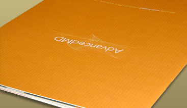
Such was the predicament I found myself in last August while working on a new product brochure for AdvancedMD. Though I had most of the content on hand, I had relatively no idea how to present the content.
The typical song and dance followed — examine the content, analyze the objectives, thumb through other brochures, weed through a few portfolios online, and so on. But none of that seemed to produce ideas for a logical content flow on this particular piece.
It seems the most useful inspiration is often found in the most irrelevant places. And that was exactly the case with this brochure. In the end, I turned to a medium free of pictures and sales pitches. I found inspiration in ancient literature of all places, borrowing a style of communication used more frequently than we realize: the chiasmus.
The Chiasmus
Though at first it sounds complicated, a chiasmus (pronounced ky-as-mus) is relatively easy to understand and almost as easy to execute. Technically speaking, a chiasmus is described as introverted parallelism. But if that makes absolutely no sense to you, no worries. Here’s some less-technical jargon: A chiasmus is a pattern of words or ideas stated once, then stated again but in reverse order.
Try this example: “Whoever sheds the blood of man by man shall his blood be shed.” In bold are repeated ideas, and it should be obvious that the ideas are repeated in reverse.
Make sense? Work with me people! I promise there’s a strong tie to the product brochure featured in this article.
Back in September 2004, I presented a poem in memoriam of 9/11, The Fallen Will Forever Stand. Repeated here is that poem:
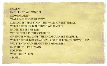
Knowing I’d someday author the very article you’re reading now, I intentionally wrote this poem as one giant chiasmus. Here’s the same poem, but with a breakdown of the chiastic structure:

Apparent by now is the fact that a chiasmus is 1) well-structured and 2) layered with repeated ideas “pointing” to a central theme. And that’s essentially the point of a chiasmus. It forces one to organize thoughts and ideas, and to present them to the reader in a structured, meaningful format.
That’s fine and dandy, but how does all of this relate to a product brochure, you ask? Simple. Of all the ways to organize the pages of a brochure, why not add a chiasmus to the mix?
The Poetic Pagination
If a chiasmus forces one to organize thoughts and ideas in an artistic format, it seems the logic of such can be applied the pagination structure of a product brochure. So for this particular brochure, I took a chiasmus format and ran with it.
Shown below in numerical order are the pages from this 20-pg brochure, with a breakdown of the chiastic structure:
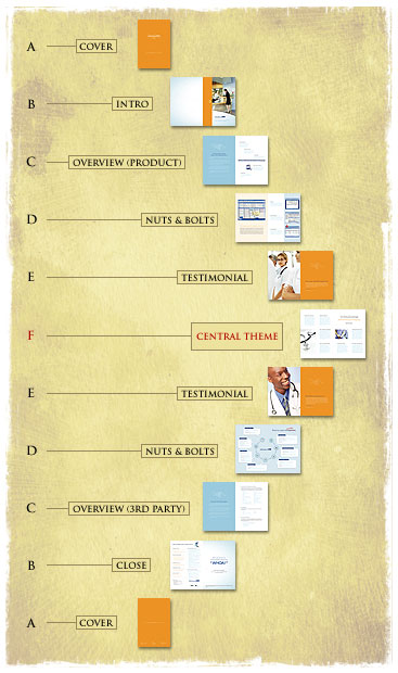
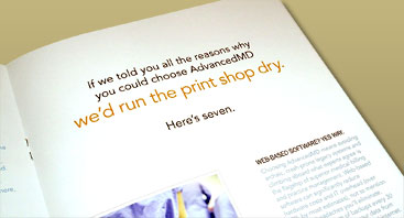
Now, the chiasmus in this piece isn’t perfect, but it sure is close. Repeated ideas lead to a central theme, which in this case are seven reasons to choose AdvancedMD. Here’s a snapshot of the center spread:
Just before printing, pages 14–15 (the second ‘D’ above) were drastically redesigned to produce a revenue cycle model that could very well replace the seven reasons as the central theme. Nonetheless, the idea still has merit.

What to make of all this? Good question. In fact, one might argue that the chiasmus does nothing to strengthen a theme nor focus reader attention. Perhaps that argument holds water. And I don’t recommend any of us use the chiasmus all too frequently, unless warranted.
But at the end of the day, one thing’s for sure: The chiasmus sure beats the typical song and dance.
![]()
Note
A technical element in one or more of the diagrams above has been labeled incorrectly according to common practices. I’ll send a signed copy of the brochure featured in this article to the first person to spot the error. UPDATE: Kudos, Michael B. See comments.54 Comments
Stock photography, type, and killer tees. Genuinely recommended by Authentic Boredom.
Nice. I love things that have been thought over, even though it’s not obvious if you don’t know the meaning behind it.
And this, I must say, is very advanced thinking. Whoehw.
Great article. Is the mislabeled technical element the central theme? Should it be marked with an X?
Is this the same piece that you ran by the folks at Amputate last year? Just wondering.
As for the gaff, methinks the image you placed after mentioning “the second ‘D’ above” was a mistake. The image is actually used for the first ‘E.’
Maybe?
Alan - Nope, isn’t the X.
Erat - Yes, same piece. As for the error, lol, no that’s not it. Call it gratuitously showing off another page from the brochure that perhaps wasn’t related to the article at hand.
Hmm… applying my somewhat limited intellect to the problem:
Is the answer that you have a single central theme, and Chiasmus typically don’t? In other Chiasmus I have seen (Cough chiasmus.com Cough), the layout would be, to take your example: A-B-C-D-E-E-D-C-B-A (leaving out the F).
By the way, the site and your work is inspiring. A pity I suffer from a criminal lack of design skill. Cheers!
Thank you for sharing that Cameron. Brilliant.
Intro (B) and Close (B) do not share the same graphic elements in their layouts. Intro has a orange vertical bar while Close has no orange bar.
Can we take a second run at this, ‘cause I’m thinking about the basic presentation formula. Can’t quite put my finger on it… but there’s something… hmmmm. More later, maybe.
Not to be a nitpicker, but in the main spread “Here’s seven” should really be “Here are seven”.
I love hearing about the process others take, or better yet, how they avoid the usual process and find a new way to achieve a solution. I’m a big fan of tight organization and structure so I will keep in mind the way of the chiasmus.
Presenting complex information is always a challenge, and I really appreciate that you shared your results on this piece. This is a great structural motif that is new to me.
The quirk you mentioned… I am guessing that the second B should really be B’ (B-prime).
Good stuff, enjoyed reading it, got a few fresh ideas flowing.
Nice article. Im from the UK, and I’m young, but in essays we call it Intros and Conclusions. But I’m sure that’s not it.
Thanks for sharing…
John - Your argument is rather close, but not the one I’m looking for. Good guess.
Ray - Good eye. Though that’s part of “this isn’t a perfect chiasmus”.
Kim - Also good eye. I’ve been waiting for someone to point that out. That was a marketing decision I made for reasons of flow, much like “got milk?” was chosen instead of “do you have any milk?” Hope it was the right decision. Too late to go back now…
Michael B. - DING DING DING. You nailed it. Close enough, at least. All of the second letters should be primes. Send me your address by email and I’ll put a copy in the mail.
Wow. I’d never even heard of that word before, but now I can’t wait to use it in a sentence.
As for the diagram, I would think that the second ‘B’ in the second diagram should be called ‘Outro’, keeping in line with the word used for its twin - ‘Intro’.
But its just a guess. Incidentally, couldn’t it be considered unfair to point out an error ‘according to common practice’ without identifying the paradigm of that practice? ‘Common practice’ of what? Technical writing? Graphic diagram design? Corporate Pagination? Technical jaragon of chiasmuses? Just a thought… =)
There’s a whole website devoted to chiasmus, too.
Brilliant read. Is the mistake anything to do with the fact the center page is not the central theme?
I would say the central theme is introduced during ‘C’, the Overview.
Perhaps I should have read the comments first! Well done Michael B.
“I’ve never won anything before!” (laughing) Actually, I won a small prize in PowerBall once. But this is better, hands down. An email with addy is forthcoming.
great article…I learn something new with every article.
Very interesting, though I must admit that before I clicked “continue reading” I immediately thought of The Sphinx from the movie “Mystery Men.”
“He who fails to plan, plans to fail.”
Much simpler structure. I knew there must’ve been a word to describe it; thanks for letting us know about it.
Any chance for an online PDF version to download and admire?
Anyone care to explain what Michael pointed out? B prime? huh? is that a Chiasmus term or something, I feel out of the loop.
This must have come directly from ancient prose. Thanks for bringing it up. In any case, as an alternate to the chiasmus, you could use a different poetic structure.
B’ should be used because it’s not exactly the same theme. Like intro to outro, however it’s the same element. That’s the best I can do to explain.
is B’ (b-prime) a ‘symbol’ or whatever that is used in poetry notation? I understand why it should be different just not where the term or symbol b-prime is coming from.
Sorry, thanks =)
aren’t those images from Veer?
This is a rather intriguing idea in structuring content. I wonder—perhaps to spring up some discussion—if it would be viable to use other poetic forms in design. Rather than the ABCBA (or some such) form shown here, why not try an AABBCC (horrible example, but you get the idea)?
Just a thought. :)
In software development, one of the ideas kicked around is “design patterns”. The idea is simple - lots of different wheels have been built already, why do it again? If you have a good catalog of “wheels” many real world problems seem to be solvable by properly choosing your “wheels.”
So, are there any other patterns out there? I think a collection of them would serve a way to ensure - well, *encourage* - success; the pattern worked before, properly executed it can work again. And if the structure is already thought out and proven (by past use), time can be spent on new twists that could keep the reuse of the pattern fresh.
Somebody has to have thought of this before. If not, there’s a book opportunity here.
Or is this the PowerPoint Template Effect that makes everything look the same and narrows the way that we think and present information…?
Jesse:
“Prime” refers to a punctuation mark used in mathematics and science. In literature, it’s used to denote word stress (in some dictionaries) and to show a slant rhyme scheme in a poem. It looks like this: [′]; whereas an apostrophe looks like this: [’]. In this poem:
I like trees,
Because I like leaves.
But I don’t like flowers,
Because “petals” doesn’t rhyme.
The rhyme scheme is AA′BC. The prime means that the second A doesn’t rhyme exactly… it’s a “slant rhyme.”
In Cameron’s diagram above, he’s saying that the second set of letters should all be primed because they don’t have the exact same content. Personally, I think only B′ should be primed because it is the “Closing” page, in opposition to B which is the “Intro” page. All the other pages are iterations patterned after the same archetype—just as different words are iterations of the same rhyming sound—so priming is not required.
Anyway, this is probably much farther afield than it needs to be, so I will just stop.
I second Brian Corenett’s comment: love hearing a designer’s process for a project, especially an article so clearly written and illustrated.
Is this representative of a gradual shift—among the upper pantheon of design blogs, anyways—from an accessability and technical web design focus to one of more foundation building, problem solving design theory? If so, keep up the good work.
“Hope it was the right decision”
I doubt most people will notice. Most people speak/write that way anyhow.
:)
OK, I consider myself to be an intelligent man, but I suddently feel very stupid.
Well done Cameron and Michael. Well done indeed.
Seriously, this is a brillant design idea (and really well written). Now I’m going to be looking for patterns like that all day long.
(And I feel even worse looking at my last post. Suddently? Oy. Time to install Spellbound for Firefox on this machine.)
Brilliantly laid out Cameron. You’re one smart designer.
For those of you who haven’t realised, the chiasmus pattern is a way to make people remember what you’ve said better. This is because the brain stores repetitive things deeper/better in your memory.
Ironically, repetitive structures like these are also part of the ‘Information Manipulation 101’ in mass communication.
(catching up on comments)
Dru - A PDF version hasn’t been posted online yet, so I can’t make it available. Once it is, however, feel free to download it at AdvancedMD.com.
Mikolaj - Yes, some of the images are available through Veer, most notably the shot of the female doctor.
Noah - What you’re referring to (AABBCC instead of ABCCBA) is probably known as climactic parallelism (instead of introverted parallelism) and may also be an effective presentation structure.
Re: why Michael B’s answer was correct, it’s generally the accepted practice to prime the repeated ideas. So the diagram should technically be labeled A B C D E F E’ D’ C’ B’ A’ to better reflect the pattern. However, this isn’t a rule per se, but more a common practice (at least from what I’ve seen, that is).
And as John Leonard points out, we might even take it a step further and repeat the F (two Fs instead of one), which is also a common practice. Though in the case of this brochure, it wasn’t structured as such.
Excellent thought-process. Giving a strong foundation to any design automatically strengthens it’s likelihood of success, whether or not the final product adheres to the original intention.
Thanks, you helped me peel my brain-storming process off an eight-foot wall.
I’d like to point out that I learnt everything I mentioned in my previous comment in 2 minutes at chiasmus.com.
IANACE (I am not a chiasmus expert).
There, Cameron - see how far some of us will go to get an example of your work? :D
Man… brilliant approach. It takes a true artist to consider function so pivotal in the design process, and to use such a different approach. Most designers would just make it “look good” with the content on hand. Great approach. Can’t wait to see a pdf of it sometime.
If you don’t mind me asking, what paper stock did you go with. It looks to have some nice texture to it (or perhaps that’s in the printing). Just curious… great work. Very motivating as I’m working on a corporate brochure today as well.
Great question, Josh. The cover was carefully selected to present just that — a tangible texture. I went with Carnival Groove 80# cover by SMART Papers (scroll to the bottom). I highly recommend it, as well as Carnival Vertical.
Interesting way of formulating an idea. Personally when I have done brochures it has been a case of read the material and highlight the important Information and work up your key spreads from there.
However, your example works nicely as ‘being seven key reasons etc.’ may have otherwise come acorss as “1. reason one”, “2. etc.” very linear. I like and will try and use this thinking for my next job. Thanks:)
Thanks Cameron!
I should have known, I love the Carnival line.
Thank you I am learning of new things all day! And it is good to know of my RSS already work.
I think I need add button of RSS to make this thing clear.
But more work to do!
I would be interested in seeing what kind of feedback you get from this piece. You should blog about the kind of feedback you get from the client and the client’s prospective customers.
Brent, this piece was actually completed back in August/September and has been in use since. We’ve received a fair amount of positive feedback from both customers and partners alike.
I just checked out the AdvancedMD website and it looks superb! Did you design it Cameron, or know who did?
Nope, Dan. Before my time. That would be Humaniz, down the hall and to the right.
I’d read through the article a bit ago, but there was something about it that seemed familiar that I couldn’t place my finger on. Then I remembered back in the day 7UP had their slogan as “You like it, it likes you!”
The fact that I rememberd that after all these years may prove that a chiasmus is not only good for structuring data, but for advertising as well. Well, maybe. In any case, it’s a good read on an interesting subject.
You totally blew my mind =P
hehehe nice entry, I certainly just learned something new which is GREAT!
Hey, whatever happened to my autographed copy of the brochure? I’ve been anxiously awaiting it! :-)
FYI - Michael received his copy a few weeks back, for those biting their nails with anxiety.
Mr. Moll,
We poets _love_ chiasmus and adore its employment in other realms. Congratulations for the elegance.
And although it seems Michael B. caught the error you intended, take another look at the center spread which says:
“Here’s seven.” as in ‘Here is seven reasons.’
With agrement of number, wouldn’t that be:
“Here are seven.”
Cheers, and I can’t wait for my own signed copy :)
GH
Gary - see Kim’s comment and my response shortly after.
Authentic Boredom is the platitudinous web home of Cameron Moll, freelance new media designer, author, and speaker. More…

Full-time and freelance job opportunities. Post a job...
A selection of fine reading, available for a limited time only:
- Jobs home page reorg
- Coming soon: Mobile Web Design, the book
- Dyson ad: Text as more than just words
- Setting sail for Europe
- Review: Sumo Omni bean bag chair
- Dashboard widget for Authentic Jobs
- Limited-time offer: $99 listings
- Nine skills that separate good and great designers
- Fire sale
- Introducing AuthenticJobs.com
 CSS Mastery: Advanced Web Standard Solutions A solid round-up of indispensable CSS design techniques by Andy Budd, Simon Collison, and Cameron Moll.
 Mobile Web Design A guide to publishing web content beyond the desktop. Tips, methodology, and resources. Now available.
![]() Letterpress Posters The unassuming beauty of a freshly letterpressed print.
Letterpress Posters The unassuming beauty of a freshly letterpressed print.
![]() That Wicked Worn Look. Techniques for that worn, aged, distressed look.
That Wicked Worn Look. Techniques for that worn, aged, distressed look.
![]() Mister Retro Machine Wash Filters Turn the dial to “Instaworn” with these filters.
Mister Retro Machine Wash Filters Turn the dial to “Instaworn” with these filters.
![]() Blinksale Dive in and enjoy shamelessly easy invoicing from Firewheel Design.
Blinksale Dive in and enjoy shamelessly easy invoicing from Firewheel Design.
![]() Basecamp My preferred web app for internal and client project collaboration.
Basecamp My preferred web app for internal and client project collaboration.
![]() HOW Conference Austin, June 24–27. Pentagram, Adobe, P&G, et al.
HOW Conference Austin, June 24–27. Pentagram, Adobe, P&G, et al.
![]() Web Design World Seattle, July 20–22. Practical sessions on web design.
Web Design World Seattle, July 20–22. Practical sessions on web design.
![]() Stimulate Salt Lake City, September 2009. Entrepreneurship and design conference.
Stimulate Salt Lake City, September 2009. Entrepreneurship and design conference.
Linkage:
Follow me: ![]()
1 Jay ~ 24 January 2005 at 06:59 AM
very nice writeup. you nearly lost me with the Chiasmus but you -once again- succeed in making your idea very clear.
Though i personally would have placed the ‘testimonials’ together i do realise that this way of buildup has its advantages. And not only for the reader