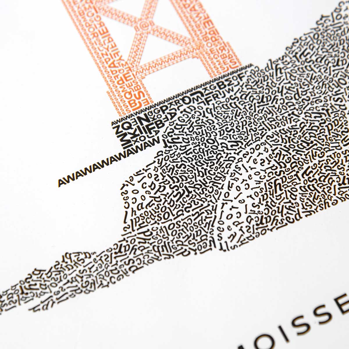
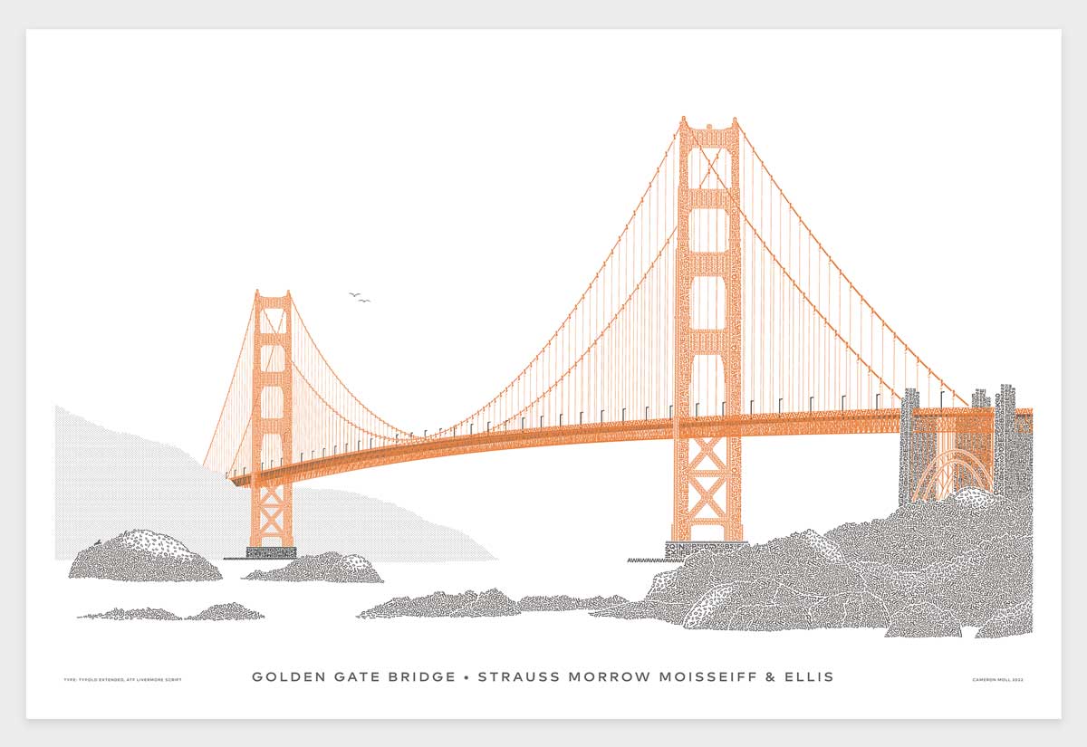
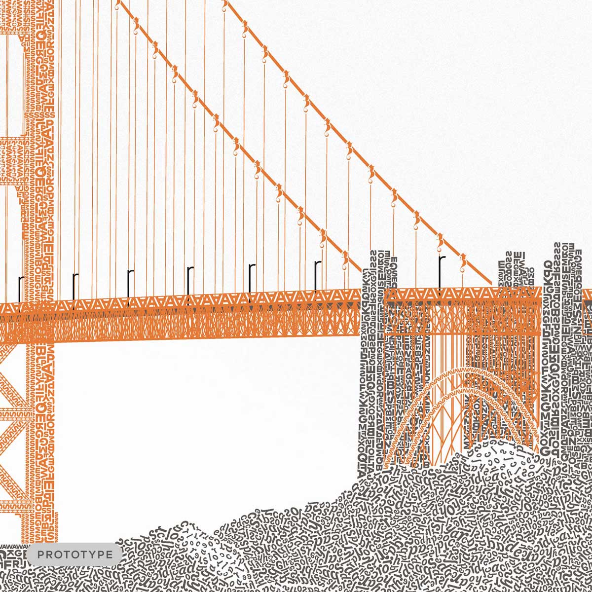
It's finally here. This is the Golden Gate Bridge in letterpress type that I've lovingly handcrafted character by character over the past two years. More than 200 hours to re-imagine the Golden Gate as if constructed entirely with type.
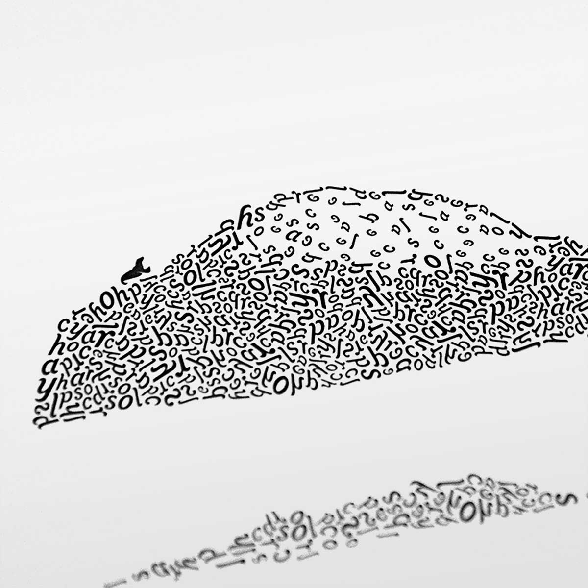
Fonts used in the artwork represent the past and present influence of the Golden Gate Bridge and San Francisco area. The rocky shore is rendered in ATF Livermore Script, which was designed in the style of script faces used in advertising in the early 1900s around the time the bridge was first envisioned. The bridge is rendered in Typold Extended, a modern goemetric font designed by Jonathan Hill, which connects the artwork with San Francisco's modern-day presence as ground zero for technology and forward thinking.
The cables in the Golden Gate were constructed by Roebling & Sons, the company that was spawned from cables completed for the Brooklyn Bridge many years earlier. Given this history, the artwork includes the same cable artwork from the Brooklyn Bridge in Type. It also includes a nod to the Colosseo in Type with the same bird in flight plus a buddy.
Letterpress printed by Bryce Knudson of Bjørn Press in Utah, United States. Bjørn Press has printed every copy sold since 2008.
Each copy will be signed and numbered as a limited edition of 1,500. Printed in 2 colors — Charcoal and the iconic Golden Gate Bridge International Orange. Final version will differ slightly due to the artwork being finalized. Shipping is expected to begin August 1.
Pre-order your copy at the early bird price of just $89.
Special thanks to Rodrigo Soares for the blueprint photo used in the artwork.