 Part One: The Indispensable Tool Trio
~ 26 May 2004 ~
“That Wicked Worn Look”
Alright peeps, it’s been two days since I announced the Wicked Worn Look series. Hopefully you’ve been biting your nails furiously in anticipation of discovering the three indispensable tools used in aging and weathering.
Time to reveal the trusted tool trio.
But before I do, let me reissue the warning: This isn’t rocket science. You won’t find any fancy tools here. It’s all about using basic tools in basic ways. Yet the results are often far from basic.
Enough explaining. Here’s the trio:
![]() Brush Tool
Brush Tool
![]() Burn Tool
Burn Tool
![]() Eraser Tool
Eraser Tool
Yup. That’s it. And get this — all I use is a 1px–5px round brush, a 5px–13px round burn, and a 3px–9px round eraser. Nothing fancy.
Foundation Wear
You gotta start somewhere. I call that somewhere “foundation wear.” This is the first level of detail in creating worn styling. Often it’s enough to stop at just that, without bothering with some of the techniques you’ll learn about in the second and third parts of the series.
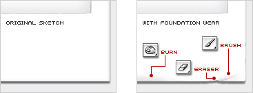
I follow a simple, three-step process: 1) create wear by randomly erasing the edges of the artwork, 2) reinforce the wear by darkening the erased areas with the burn tool, and 3) finish it off with brush strokes that add detail such as creases, folds, and spot marks.
This process was used on a mocked-up photo for a recent magazine ad. The diagram below shows the original sketch before and after wear. Again, no tricks here. Just simple, random wear was applied using the indispensable tool trio.
Hold On There, Tiger
Ready to give it a go? A few things to consider before starting:
- Start with the corners.
You’ll always find wear primarily on the corners of nearly any tangible object, regardless of the shape. Dull down sharp corners with the eraser and add discoloring with the burn tool. - Don’t over do it.
Applied wear shouldn’t call attention to itself. The best wear is often that which isn’t readily noticed but rather contributes unassertively to the overall worn styling of a piece. Meaning, it just naturally fits in. Unless, of course, you want it to be noticed. (Example: Someday I’ll redo my Premium Linkage graphic, as certain parts beg for too much attention.) - Choose a color palette judiciously.
For lack of a less cliché term, “retro” colors are often great for producing a worn piece. For some reason, the muted hues of retro will almost always lend a good start to your efforts. (Need help? Try these retro Photoshop swatches.) - Be just as judicious with type.
Smart typography choices will go a long way for enhancing the overall look. It’s difficult to pull off worn styling when using something like Bank Gothic. Instead, go for classic typefaces, like Futura. - Avoid pure black at all costs.
Avoid any use of pure black (#000) in your artwork. Remember that discoloring is a vital part of realistic weathering and aging. Black, as any color, becomes muted over time.
Open Source Download
This episode’s free download is the mocked-up photo from the magazine ad mentioned earlier. The original untouched sketch and final worn version are included. Zoom in to see some of the detailing. (I apologize in advance to those of you on modems. I feel your pain. Smaller downloads to possibly follow.)
Questions? Feedback? Fire away.
![]()
28 Comments
Stock photography, type, and killer tees. Genuinely recommended by Authentic Boredom.
Nice article. I’m designing a website for an antique store and this will really come in handy!
Holy cow! I never knew there existed such a glorious thing as the Burn Tool… all my many hours spent pouring over photoshop documents mimicking this effect with other tedious methods. It’s always insightful to hear another designer share his techniques and routines. I can’t wait for my next grungy challenge!
Thank you for this article. I’m a complete beginner (need a web site for a business venture) and your expertise will prove invaluable. Your generosity in sharing your talent is really appreciated.
Can I have part 2 tomorrow please?
“But before I do, let me reissue the warning: This isn’t rocket science.”
Well, you Could explain things in a bit more complexed way. You’re making us designers unemployed… ;-)
lol. I think you’ll find it to a bit tougher than expected once you sit down and begin pushing pixels around. The trick here isn’t to learn how to use the tools but to learn how to pull off realistic wear, if that makes sense.
I agree with k above.
Giving away our secrets is going to put us out of business. I call for a BOYCOTT of Authentic Boredom and all of Cameron Moll’s sites!
uhh… just kidding BTW.
This is great stuff. Thanks for taking the time to put it together.
I have been wondering what you do to get those great textures.
Thanks for this, Cameron. I’ll be eagerly awaiting the next three installments, and look forward to trying these techniques out. Whenever the next iteration of my personal site comes into being, I’m sure this will come in handy.
Very nice tutorial, thanks very much Cameron. I’ve tried to get the “worn” look before and haven’t been very successful at it. Last week I bought MisterRetro.com’s Machine Wash Image Filter’s disc to help me out but this gives you a lot more control.
Lovely article Cameron, I’m very much looking forward to the rest of the series. Thanks for giving us graphically challenged folk a helping hand.
The real challenge, the one that separates the designers from…erm…me, is to apply the technique to make something newly old-looking look new. (how’s that for blatant abuse of language?)
Nice article! Thanks for sharing. Looking forward to the other three parts. Very easy to understand, but will take a lot of pratice to get it right.
Better get to it, only a week until the next part.
Don’t forget inspiration from real life!
Glad I finally found this series, I got lost in my blogroll searching for it the other day. Finally stumbled upon it again (now that the series is out).
By far (imo) the hardest technique to master in the “trio” is the Brush. I found the Burn tool to yield instant gratification when applied, Eraser slightly less gratifying, but still helped the final product. The Brush simply ruined all the efforts I put out, thank god for the ability to go back in time (aka History).
I guess I’m going to have to work it a while to get some satisfaction from the Brush.
Thannks Cameron!
if your dents & scratches are on a seperate layer, you can then go to the next step in the process and do a ctrl-click on the layer and apply a gradient (mud to redish black) and voila - rust [credit wastedyouth years ago]
- leo
uhh.. about what K said.. he’s giving our secrets away.. but how did we became designers in the first place?
Great tutorial! I know you are keeping it straightforward, but I would suggest always using Layer Masks instead of the eraser tool to safeguard against the inevitable client change.
Me likes booty
I agree with kadavy, using Alpha Channels is a great way to non-destructively manipulate your images. BTW, Cameron, I think the acronym WTF is perfect for this technique, personally!
Neat-o
Very nice article, just what i was searching for. I’m going to the next one!
Ruben
yeah, um what’s that all about -alex? Is this some kind of blog spam hacking?
It was, Chris. Comments spam A-bomb dropped on me July 2. Taken care of now, though.
I agree with Justin, hardest tool is brush. Kadavy, you are rigth about using layers for not making destructive changes, but burn and eraser won’t have the same effect if working on another layer, am I right or maybe I missing something?.
Nice series Cameron!
It would be so cool if you had PDFs of these tutorials because then I could add them to my “notebook”.
This Brazilian guy is the master of the worn look, he even gives away some free fonts and brushes that allow you to achieve that worn look really well:
http://www.misprintedtype.com/v3/
The worn look is already worn out.
Authentic Boredom is the platitudinous web home of Cameron Moll, freelance new media designer, author, and speaker. More…

Full-time and freelance job opportunities. Post a job...
A selection of fine reading, available for a limited time only:
- Jobs home page reorg
- Coming soon: Mobile Web Design, the book
- Dyson ad: Text as more than just words
- Setting sail for Europe
- Review: Sumo Omni bean bag chair
- Dashboard widget for Authentic Jobs
- Limited-time offer: $99 listings
- Nine skills that separate good and great designers
- Fire sale
- Introducing AuthenticJobs.com
 CSS Mastery: Advanced Web Standard Solutions A solid round-up of indispensable CSS design techniques by Andy Budd, Simon Collison, and Cameron Moll.
 Mobile Web Design A guide to publishing web content beyond the desktop. Tips, methodology, and resources. Now available.
![]() Letterpress Posters The unassuming beauty of a freshly letterpressed print.
Letterpress Posters The unassuming beauty of a freshly letterpressed print.
![]() That Wicked Worn Look. Techniques for that worn, aged, distressed look.
That Wicked Worn Look. Techniques for that worn, aged, distressed look.
![]() Mister Retro Machine Wash Filters Turn the dial to “Instaworn” with these filters.
Mister Retro Machine Wash Filters Turn the dial to “Instaworn” with these filters.
![]() Blinksale Dive in and enjoy shamelessly easy invoicing from Firewheel Design.
Blinksale Dive in and enjoy shamelessly easy invoicing from Firewheel Design.
![]() Basecamp My preferred web app for internal and client project collaboration.
Basecamp My preferred web app for internal and client project collaboration.
![]() HOW Conference Austin, June 24–27. Pentagram, Adobe, P&G, et al.
HOW Conference Austin, June 24–27. Pentagram, Adobe, P&G, et al.
![]() Web Design World Seattle, July 20–22. Practical sessions on web design.
Web Design World Seattle, July 20–22. Practical sessions on web design.
![]() Stimulate Salt Lake City, September 2009. Entrepreneurship and design conference.
Stimulate Salt Lake City, September 2009. Entrepreneurship and design conference.
Linkage:
Follow me: ![]()
1 Bobby van der Sluis ~ 26 May 2004 at 08:31 AM
Great article, I am looking forward to the next episodes.
About avoiding pure black at all costs, Juxt Interactive created some nice weathered grungy effects on one of their Billabong USA sites.