 That Marching Ants Look
~ 15 September 2004 ~
Given that a few of you inquired about how the 9/11 masthead was created, and given that it’s been 3 months since I released a download, and given that the New Year is just over 3 months away, and given that…
Crhhh… Get on with it, Cameron. Over. Crhhh…
Alright, alright, here’s the skinny: I don’t have enough time right now to do a full tutorial, so following is a brief walkthrough. Download the PSD below.
- The animated frames weren’t tough at all to create. Once the actual marquee (aka “marching ants”) was created in Photoshop, I just screen grabbed it about 20 times to ensure I’d have all 8 frames for the animated loop. I then dropped the frames (screen grabs) back into the original .psd.
- Surprisingly, creating the marquee was a lot tougher than expected. I started by creating two pairs of vertical rectangles using the
Rectangular Marquee Tool and by pressing the Shift key.
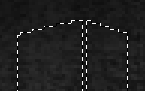
- Using the Polygonal Lasso Tool, I added angled caps to each marquee, again using the Shift key (and Option/Alt key to subtract when I inevitably screwed up several times).
- Trickery came into play once I realized the two rectangles in each pair were separated by 1 pixel that couldn’t be removed without joining the two marquees undesirably. So, I inversed the selection using Select > Inverse.
- That fixed one problem but created another. Now I had a marquee around the entire canvas. A problem no more: With the Rectangular Marquee Tool selected, I chose Select > Transform Selection from the menu, held down the Shift and Option/Alt keys to ensure centered proportional resizing, and enlarged the edges of the marquee just outside the canvas.
- Done deal. Take a few screen grabs and it’s all downhill from there.
Please enjoy in reverance.
![]()
14 Comments
Stock photography, type, and killer tees. Genuinely recommended by Authentic Boredom.
Why didn’t you just draw the two towers in regulr pixels (or with paths) and convert that to a selection? Would’ve been much faster.
[regulAr obviously]
what fonts did you use ?
I love the idea, very neato. I’m thinking would it have not been easier or perhaps less frustrating to simply take the screen grabs of the ants shown in step three, clear the left most ants in the second box and move the remainer over a couple pixels in each of the grabs?
This is brilliant! When I first saw it, I was like, “Why haven’t I ever thought of that?” Not the twin tower thing, but the animated .gif of the marching ants.
And as always — beautiful imagery.
I really loved that header - it spoke volumes while being understated.
On top of that, this post wins my “Best blog entry title of the year” award! Your glass ant is on its way…
Glass ant?? Rock on.
I take it you used to marching ants to symbolise the fact that the towers are no longer there?
Excellent header by the way :)
Michel Vuijlsteke - Process is roughly the same either way, but I wanted to test my skill in “marquee art” on this one.
Sami - Clarendon and Edwardian Script. You’ll see both of them in the PSD.
Alternate Method: Ants.psd.zip
- Mask out area of image where ants will march.
- Animate Barber Pole diagonal lines under image
Love the marquee, and the Premium Linkage license plate tickles my fancy in all the right ways.
On a sort of related note, a couple days ago there was a red underline on the navigation, intentional? I prefer it as it is now, but maybe it had some sort of meaning?
Nope, just toying with adding lines to a hrefs. Trying to figure out why it’s adding the lines to images.
Byron, that method rocks…
Authentic Boredom is the platitudinous web home of Cameron Moll, freelance new media designer, author, and speaker. More…

Full-time and freelance job opportunities. Post a job...
A selection of fine reading, available for a limited time only:
- Jobs home page reorg
- Coming soon: Mobile Web Design, the book
- Dyson ad: Text as more than just words
- Setting sail for Europe
- Review: Sumo Omni bean bag chair
- Dashboard widget for Authentic Jobs
- Limited-time offer: $99 listings
- Nine skills that separate good and great designers
- Fire sale
- Introducing AuthenticJobs.com
 CSS Mastery: Advanced Web Standard Solutions A solid round-up of indispensable CSS design techniques by Andy Budd, Simon Collison, and Cameron Moll.
 Mobile Web Design A guide to publishing web content beyond the desktop. Tips, methodology, and resources. Now available.
![]() Letterpress Posters The unassuming beauty of a freshly letterpressed print.
Letterpress Posters The unassuming beauty of a freshly letterpressed print.
![]() That Wicked Worn Look. Techniques for that worn, aged, distressed look.
That Wicked Worn Look. Techniques for that worn, aged, distressed look.
![]() Mister Retro Machine Wash Filters Turn the dial to “Instaworn” with these filters.
Mister Retro Machine Wash Filters Turn the dial to “Instaworn” with these filters.
![]() Blinksale Dive in and enjoy shamelessly easy invoicing from Firewheel Design.
Blinksale Dive in and enjoy shamelessly easy invoicing from Firewheel Design.
![]() Basecamp My preferred web app for internal and client project collaboration.
Basecamp My preferred web app for internal and client project collaboration.
![]() HOW Conference Austin, June 24–27. Pentagram, Adobe, P&G, et al.
HOW Conference Austin, June 24–27. Pentagram, Adobe, P&G, et al.
![]() Web Design World Seattle, July 20–22. Practical sessions on web design.
Web Design World Seattle, July 20–22. Practical sessions on web design.
![]() Stimulate Salt Lake City, September 2009. Entrepreneurship and design conference.
Stimulate Salt Lake City, September 2009. Entrepreneurship and design conference.
Linkage:
Follow me: ![]()
1 Sean Sperte ~ 15 September 2004 at 12:48 AM
Brilliant. Tested and approved (except for the tedious screenshots step).