 Mobile Web Design: Tips & Techniques
~ 27 October 2005 ~
“Mobile Web Design”

We’ve examined the mobile web landscape. We’ve covered four approaches to developing for it. Our discussion now shifts from that of concept to one of execution.
How do we designers and code slingers cope with the current state? What slings and what doesn’t? This article attempts to present technical advice on a superficial level. Some tips may surprise the reader; others may disappoint. But let’s be clear about one thing: We’re not aiming to publish a replete guide to advanced mobile development, but rather a starting point for mobile development — both practical and ambitious. Hence, a superficial treatment of the topic.
Given methods #1 (do nothing) and #2 (raw HTML) from Part Two require little instruction, we’ll focus on the latter two methods:
- Handheld stylesheets
- Mobile-specific sites
Both are covered below.
Handheld Stylesheets
We’re not oblivious to the fact that plenty has already been written about handheld stylesheets — tutorials, best practices, pros and cons, and the like. Several of those resources are found in the Related Resources section at the end of this article and won’t be repeated here.
Instead, we encourage you to first confront and identify some of the shortcomings of the mobile web. Take note that an understanding of your own device’s limitations will enable you to better appreciate the limitations of the hundreds of devices on the market.
To help familiarize yourself with the mobile web dev environment, access the following markup pages on your device to test XHTML and CSS styling:
Compare styling on your desktop machine with that of your mobile device. Next, make a stop at Patrick Griffith’s handheld
media test page to determine how/if your device interprets media="handheld":
Red and green visuals will indicate what forms of handheld links your device supports. Realize that we’re not suggesting that by testing your device you’ll automatically grasp the mobile web at large, but merely that you’ll be more sympathetic to its shortcomings in terms of HTML markup and CSS styling.
And what about those shortcomings? Here’s a brief summary of the current state:
Typography
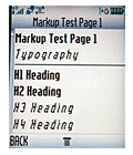 Heading tags are decently supported. However, many devices display some at the same size and weight (e.g.
 h1andh2= identical).pis reliablestrongandboldare well supported- However,
emandiare not as well supported font-sizeis almost useless (currently). Consider using headings instead to control font sizing.font-family- don’t even bother with it. Nearly all devices currently default to a proprietary sans-serif.
Lists
ulandolare well supporteddlis decently supported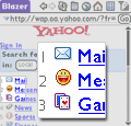 Consider using
 olinstead ofulfor navigation lists. This allows the use ofaccesskey, which is fairly well supported on a variety of devices. Users can then quickly access menu items via keypad numbers. For example, try accessing menu items on Yahoo Mobile using only the keypad of your mobile device. Word of caution: There are concerns surroundingaccesskey(e.g. keystroke conflicts), and it will likely be deprecated in the future. See “The Future of Accesskeys”.
Images
- Nearly all current devices display images
- However, users may browse with images turned off. Always use
alttext (which, of course, is recommended practice anyway). - Use images as little as possible, only where contextually relevant. Keep in mind some users may be paying through the nose per KB of mobile web data.
 If you must use text in an image, consider bitmap fonts for optimal clarity. Example: “mobile edition” type
rendered using Silkscreen, shown in the image at right.
If you must use text in an image, consider bitmap fonts for optimal clarity. Example: “mobile edition” type
rendered using Silkscreen, shown in the image at right.- Be aware that some device browsers may downsize the image to fit within the screen width. Wide images may therefore become illegible.
background-imagesupport is decent at best. However,background-coloris somewhat well supported.
Miscellany
- Surprisingly, floats are supported rather well. However, how practical is floating elements on a 200px-wide screen?
border-stylesupport overall is sketchy, butborder-style: solidis probably the most reliable of the bunchmarginandpaddingsupport is decent. However, use cautiously with screen real estate, and useemor%instead ofpx.- JavaScript support is hit or miss, more ‘miss’ than ‘hit’ currently
As a reminder from Part Two, two big drawbacks prevent us from shouting the praises of handheld stylesheets:
- Devices currently sold in more mobile-affluent countries have good XHTML support, while those sold in the U.S. have decent support. Both vary widely in consistency. Markup rendering on mobile devices has improved much over the past year, and by this time next year, it’ll probably be less an issue. But for now, the best advice we can give is to test your work on as many mainstream devices as possible. Not emulators, but actual devices.
- Quick-fix handheld stylesheets do little to address the context of being mobile, e.g. providing users with information relevant to their mobility. Some argue there should be “One Web”, while others argue different content for different devices, and yet others argue just to argue. But one thing’s for sure: Expect the consumer to indicate which they prefer — a unified web vs. device-specific delivery — in the next couple of years.
Mobile-Specific Sites
So you’ve shunned quick fixes and you’re serious about mobile web design and development. You want to create a site that’s mobile-context aware, like a traffic update site, a wi-fi locator, or an app that allows users to quickly locate information on the go.
Your best bet, then, is a mobile-specific site, with design and development built for the small screen. Though many outside the mobile space aren’t aware of it, there are really two mobile webs. They aren’t entirely separate per se, but rather each are accessed differently.
The first is much like the desktop web we know and love — drop a URL into a mobile browser and off you go. The second is through your carrier. When you launch your mobile browser you’ll be taken to the carrier portal, known as a “deck”. From the carrier deck, links to many different mobile websites are provided. These sites tend to be either mobile specific versions of web content, or mobile-only sites.
Following are tips for the development of each.
The “Indie” Mobile Web
Lest we’re confused, let’s start by clarifying a few acronyms. WAP (Wireless Application Protocol) is the protocol, whereas XHTML or WML is the language. WML (Wireless Markup Language) was the former language of choice for WAP 1.0. With the introduction of WAP 2.0, XHTML Mobile Profile (XHTML-MP) became the official markup language. Nearly all devices sold today are WAP 2.0 devices, and they can access “ordinary” sites, not just XHTML-MP and WML sites.
So, did we confuse you further?
The important thing is this: Standards aficionados will find the coding aspect of XHTML-MP to be rather painless — XHTML-MP doesn’t differ much from XHTML 1.0 Strict or Transitional, nor does the CSS. It’s the device testing and lack of browser consistency that’s rather painful. There are over 40 mobile web browsers on the market today, making testing expensive and somewhat impractical. However, initial testing and validation can at least be done using any standards-compliant browser.
To code a XHTML-MP site, you’d begin with a doctype like this one:
<!DOCTYPE html PUBLIC "-//WAPFORUM//DTD XHTML Mobile 1.0//EN" "http://www.wapforum.org/DTD/xhtml-mobile10.dtd">
You’d then proceed to code the remaining markup much like you would any other page, while considering the shortcomings mentioned earlier. XHTML-MP is not quite as replete as the full XHTML 1.0, as it builds on a “lighter” version of XHTML called XHTML Basic. But there’s plenty of common tag love to go around. A full list of XHTML-MP tags can be found here.
 So who’s deployed XHTML-MP sites thus far? The list isn’t huge, as far as we’re aware (for the “Indie” Mobile Web, that is; the Carrier Web has many XHTML-MP sites). But pioneers are paving the way. Flickr is probably the most notable of the bunch. Flickr.com/mob, Flickr’s “light” mobile edition, gives users access to their account, with a feature set relevant to mobility. Take a look under the hood and you’ll discover a site coded in XHTML-MP much the same way one would code for the desktop.
Flickr Mobile bypasses the carrier model. But even if you don’t plan to be on the carrier deck, it’s worthwhile to investigate carrier style guides. They contain helpful information can help to avoid common issues in developing mobile-specfic sites.
On that note, enter the carrier.
The Carrier Web
If you aim for widespread adoption and world domination through mobile web content, you’ll need to first conquer the carriers.
As each carrier is different, supporting a bevy of devices unique to that carrier brings undesired restrictions for developers. Each carrier can and will have specific requirements for how mobile content is displayed. In order to appear on the carrier deck and drive traffic to your site, you must comply with these requirements.
Sadly, in many cases, this means a return to antiquated practices. Since using widths, positioning, and floats can still present some unexpected results on many devices, carriers strongly suggest that you use tables — yes, we just said tables — to control your layout. This provides for maximum consistency across multiple browsers. Mass market mobile devices simply aren’t ready yet for us to shed our legacy of table-based layouts.
If you choose to code your site with XHTML-MP, all carriers strongly suggest providing both XHTML-MP and WML versions of your site. Further, they also recommend device detection — routing specific devices to the best version for each device. If your device detection system doesn’t recognize the device, carriers recommend it defaults to the WML version.
Take note that WML sites support very limited use of stylesheets. In fact, as WML is your safety, you should be as “safe” as possible with your design — think links on a page with a few images, nothing overly styled.
XHTML-MP carrier support is growing with each passing year, but it still has a long way to go.
Locker Room Rally
The Carrier Web is still a behemoth in comparison to the Mobile Web. The more of us that develop for mobile and push the limits of
design, usefulness, and functionality, the sooner device manufacturers, carriers, and mobile browser developers may increase
support for “mobile web standards”. Fight team fight!
Related Resources
General Mobile Web Dev
- Webmonkey: The End-All Guide to Small-Screen Web Dev
- ALA: Pocket-Sized Design: Taking Your Website to the Small Screen
- O’Reilly: Creating web content for mobile phone browsers, part 1
- O’Reilly: Creating web content for mobile phone browsers, part 2
- Opera: Authoring for Small-Screen Rendering
- Opera: Making Small Devices Look Great
- Stopdesign: Targeting Small Screens
- Design Interact: The Pulse of Modern Mobile Design
- W3C: CSS3 media queries
- Jeremy Boles: Friendly Option Links
- SourceForge: WURFL
- MobileDesign.org: The Mobile Device Detection Problem
- Little Springs Design: Screen Design, Part 1
Handheld Stylesheets
- CollyLogic: 7 Steps to Better Handheld Browsing
- CSS Discuss: Handheld Stylesheets
- Opera: Web Pages with Multiple Views
- HTML Dog: HTML and CSS for Mobiles
- HTML Dog: Mobile CSS is a Reality
XHTML-MP
- Developers’ Home: XHTML-MP Tutorial
- Developers’ Home: XHTML-MP Introduction
- Nokia: Getting Started with the XHTML Mobile Profile
- XHTML-MP Tags List
- XML.com: Developing Wireless Content Using XHTML-MP
- Developers’ Home: Advantages of XHTML-MP
- Developers’ Home: WML features lost in XHTML-MP
- Openwave: Using numbered menus (accesskey) in XHTML-MP
- Open Mobile Alliance: XHTML-MP documentation (PDF)
WAP CSS
Mobile Web Stats
Glossaries & Directories
- The Mobile Phone Directory
- Mobile Design: Mobile Glossary
- Wikipedia: “microbrowser”
- Wikipedia: “mobile phone”
- Bobby van der Sluis: Mobile/handheld resources
Developer Tools & Resources
About the Authors
Cameron Moll is a freelance new media designer, with a passion for functional web design, clean markup, and savvy print design. Some say this one-page PDF sums things up quite nicely. Others say his website does the trick.Brian Fling has been entrenched in mobile design for nearly five years. His love for the Mobile Web is matched only by his contempt for its current limitations. He publishes thoughts and portfolio work at FlingMedia.com and MobileDesign.org.
15 Comments
 Veer: Visual Elements for Creatives.
Stock photography, type, and killer tees. Genuinely recommended by Authentic Boredom.
Cameron, Brian — Thanks for publishing this series of articles. Intensely educational and useful.
I do have a question though, targeted at anyone who has experience working with the Blackberry browser. From what I can tell, “display: none” isn’t a supported CSS property. Now, I can handle support (or lack thereof) for all sorts of things — color, background-image, float, etc., etc., etc., — but this… This has me wanting to crawl into the corner, whimpering and gnashing my teeth, screaming “why?” over and over and over.
Can someone confirm this is true, or provide a way of getting around it, or… console me in some manner?
I’ve made a handheld stylesheet for my website some time ago and tested it with the the “small screen” mode of Opera. It’s pretty useful. I don’t have access to much of these mobile browsers and I think it’s the same for most people; wouldn’t it be great to have a more “universal” simulator?
Maybe all we need is a collection of user stylesheets with some “!�important” rules to disable CSS features and impose specific styles to websites. Obviously this wouldn’t simulate parsing bugs or navigation behaviors (like access keys on list of links).
It may be worth noting that along with device detection, it might be a good practice to also choose to include an override stylesheet in your markup, dynamically inserted per page, to compensate for a particular device’s shortcomings. It makes for a less infuriating mobile device design experience.
Doug - Danger resource added. Thanks.
Blair - As for display:none not working on a Blackberry, that’s the first I’ve heard of it. It might be similar to the Treo, which sometimes displays screen styles AND handheld styles simultaneously. Try the htmldog media=”handheld” test and see what your device displays.
I’ve been going crazy trying to gather resources in order to build my company’s mobile site. There are plenty of articles all over the place, but they’re scattered and lacking. Your article was quite the opposite - you cleared up a lot of doubts for me (especially with the styling). Thanks, man!
Has anyone any good resources for embedded video content for mobiles? I cant seem to find anything around the web..
re: My last comment I downloaded the darwin streaming server (the open source qt streaming server) popped it on our server and in a matter of minutes i was streaming mp4 and 3gp movies to mobiles around the office. In the page content i just linked to the movie with a simple href=”rtsp://linktomovie/movie.3gp”
Not sure if that is of use to anyone, but it answered my question :)
Thanks for publishing these thoughts I was wondering if you knew of any links to mobile video content resources?
Hi there. Can I just ask if you’re sure about ‘using headers to control font size’? Because to me that sounds extremely un-semantic, and doesn’t sit to well with the rest of this excellent article!
Jessica - See Jason’s comment just above yours. Beyond that, no resources come to mind at the moment.
Pete - The recommendation to use headers to control font size isn’t an un-semantic one per se, but rather a recommendation to use them even more generously than you would otherwise — while still staying true to their intended use.
I can confirm that display:none is not working on the Blackberry browser (7100 and 7730 handhelds). I’m resorting to server-side processing to exclude the elements I want to hide.
Thanks for posting all these resources Cameron!!
Find all the information about personal injury and your rights.
Great piece of work cameron!
But what I’m really looking for are some examples of websites using the media=handheld method or user-agent redirect method.
As mentioned within these comments, opera.com uses the media=handheld method, but Pocket IE messes that up, because it reads the screen css as well as the handheld version. Are there examples around of how it SHOULD be done?
Also, some sites have quite well made handheld versions, but do not redirect automatically! Examples of sites which do (besides Google of course)?
Thanks!
Authentic Boredom is the platitudinous web home of Cameron Moll, freelance new media designer, author, and speaker. More…

Full-time and freelance job opportunities. Post a job...
A selection of fine reading, available for a limited time only:
- Jobs home page reorg
- Coming soon: Mobile Web Design, the book
- Dyson ad: Text as more than just words
- Setting sail for Europe
- Review: Sumo Omni bean bag chair
- Dashboard widget for Authentic Jobs
- Limited-time offer: $99 listings
- Nine skills that separate good and great designers
- Fire sale
- Introducing AuthenticJobs.com
 CSS Mastery: Advanced Web Standard Solutions A solid round-up of indispensable CSS design techniques by Andy Budd, Simon Collison, and Cameron Moll.
 Mobile Web Design A guide to publishing web content beyond the desktop. Tips, methodology, and resources. Now available.
 Letterpress Posters The unassuming beauty of a freshly letterpressed print.
 That Wicked Worn Look. Techniques for that worn, aged, distressed look.
 Mister Retro Machine Wash Filters Turn the dial to “Instaworn” with these filters.
 Blinksale Dive in and enjoy shamelessly easy invoicing from Firewheel Design.
 Basecamp My preferred web app for internal and client project collaboration.
 HOW Conference Austin, June 24–27. Pentagram, Adobe, P&G, et al.
 Web Design World Seattle, July 20–22. Practical sessions on web design.
 Stimulate Salt Lake City, September 2009. Entrepreneurship and design conference.
Linkage:
Follow me: 
1 Doug ~ 27 October 2005 at 07:30 AM
Enjoying the series.
Don’t forget to include Danger’s Hiptop/Sidekick mobile device (http://www.danger.com/developers.php and http://www.hiptop.com/) in your list of tools and resources. The screen is a nice-sized 240x160 and loads pages at a pretty nice clip (including my test of your English360 site a few months back).