 New iLife ‘06 packaging: Hot or not?
~ 11 January 2006 ~
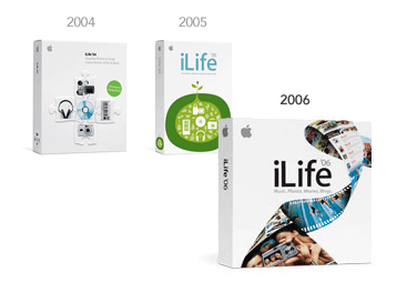
A few months ago I briefly discussed the evolution of iLife’s package design in this ALA article. With yesterday’s debut of iLife ‘06 and a complete departure from the seed-of-life / digital-product metaphor, you make the call: Is the new design a step up, a step down, or a step sideways?
![]()
101 Comments
Stock photography, type, and killer tees. Genuinely recommended by Authentic Boredom.
I think it’s a step back. I really liked the illustrated feel of the 2005 iLife packaging. I feel like the has a really stale look to it. Feels very much like 1997 (what a lame cliched thing to write, but I feel it’s accurate). The strip of film is pretty contrived. Seems a little counter-intuitive too. If the idea is pulling all of these applications to your computer… not sure that “film” has a role in that.
I think it’s a step up. I just like the whole DNA analogy that they’re using…it’s clever. The 2005 packaging is cool, but something about the design doesn’t sit quite right with me.
Technically, it’s okay. But I find the looping film strip quite distracting, and there’s no focal point. I think I preferred the iLife ‘05 packaging. (The same goes for iWork.)
Last years design felt very fresh and human, this years design is extremely corporate. When I first saw the site I was a little disappointed. It’s cold and feels just like any other computer packaging. Maybe in a month I’ll feel different, change is always weird.
Huge step up. The 2005 packaging was fantastic: I love the simplicity, the style, as Derek said the ‘playful’ feel to it.
But there’s the rub: it’s the branding that’s an issue. 2005 packaging, to me, was like “Hey, you can play around with your photos, some audio, maybe a little video.” 2006 jumps. It really suggests you’re going to be able to do a lot with what’s inside, it’s going to be fun and exciting, and the film strip with videos and music on it shows that, like 2004 and 2005 packaging did as well, it’s still all integrated to handle the full user experience.
It’s definitely a step up in a visual design sense.
As far as how well it communicates the iLife concept, I agree with Kendall that there are some practical problems with it. It’s hard to notice that only one section is actually a strip of film. This causes the packaging to connotate video more than anything else.
I think it’s definately HOT.
It gives the viewer a far better representation of what it’s actually designer for, I preffer realism rather than abstract pieces.
So what If I’m a tad picky!?
First off, thank you Cameron for posting about this, as I feel this is a HUGE departure from last years amazing iLife packaging. It has really been irking me all morning, I just can’t see why Apple would take a step back from all progress it has made with package design in the last few years. First thing I did when I got to the office was pulled out and old OS 8 CD and analyzed it … this new stuff looks exactly like the advertisements from 1997. Also, doesn’t anyone see a quality shift in the latest product photography? I looks very badly lighted. Why does it seem like Apple did all of this last minute … or let someone else take care of it. I don’t know, I just don’t like it at all.
Definitely a step down. I could see an evolutionary step like this for iWork. Sure, make that one more corporate and ‘professional’-looking (whatever that means.)
But iLife ‘05 was friendly and playful, which I thought perfectly captured the personality of the software. It felt like additive branding, where the look of the packaging positively influenced my perception of the software contained within. Sure, it shared very little visual similarity with the software itself. So what? That’s not a bad thing.
iLife ‘06 seems like a poorly thought-out, low-concept design hiccough that will be forgotten as soon as ‘07 is announced next January. ‘05 is going to live on in our memories for a long time yet.
Personally, I like the ‘05 better, but I can see from an unitiated consumer viewpoint that the ‘06 is more informational. Picture your grandma tring to buy software, and you can see why they picked this design. As long as the Mac strays further from the path of being a machine used almost exclusively by designers and other professionals and continues to bevome more of a “family” machine, I am betting the designs will continue to get less “arty.”Not worse, you know, just different.
Step down. And don’t get me started on the new PowerBook name… MacBook? Major step down.
iLife ‘06 all the way. Oh, sure, maybe not from an artistic standpoint, but at least it communicates a little energy and creativity. I think it works much, much better from a consumer standpoint. The ‘05 packaging looks like a lime grown by Pablo Picasso.
Besides, the ‘05 version is SO web 2.0ish. No one needs that.
What it all boils down to is this, though. Browsing through the aisles of my local Mac store, a glance at the ‘06 packaging makes me wonder if I’m missing out on some digital lifestyle everyone else is enjoying.
As others have said, it’s very corporate and boring. The whole film strip thing is a design aesthetic that has been over used way too many times to convey the “home media” concept.
Pretty boring and uninspiring design.Some pirates and skulls woul dperk up the design!
I agree, the playful humanistic look of ‘05 has been lost and replaced with something I feel like I’ve seen countless times before. iLife is no longer presented as a collection of tools for living, it’s now just a group of media players/viewers (or at least that’s what the new packaging says to me).
Richard - Though I still adore the aesthetics of the ‘05 design, I couldn’t help but chuckle upon reading your comment, “The ‘05 packaging looks like a lime grown by Pablo Picasso.” Funny.
Big step up, I think they did a great job.
The new iLife represents a bigger chunk of somebody’s life than the previous package design represented, and the new functionality and feature-set is better shown in the new design.
A step up… but give me the 2004 packaging with the larger font (e.g.: 2006). Gives me an idea of what is in the box.
I will say that I really like the way apple is using quicktime in the new product pages of their site
I don’t. Well, the truth is, I don’t know if I do or I don’t because I can’t see it.
My work computer does not have the quicktime plug-in, and to get the quicktime plug-in I have to download QuickTime and iTunes. I feel like maybe I am missing out on some good content here…
Whatever happened to graceful degradation …
’04 and ’05 show icon representations of all the iLife programs. ’06 shows those programs’ results.
Maybe that is a good direction to go in, but the filmstrip seems pretty generic and bland.
I hate that darn film strip. Could they have chosen a more tired image? Oooh, oooh, how about a light bulb? I personally loved the iLife and iWork ‘05 packaging. Maybe it wasn’t for everyone, but this filmstrip image is truly “non-creative garbage”.
Jason G - I was wondering if they had a backup graphic or detection for those without QuickTime. Guess not. That does sort of seem like a bad thing.
I LOVED last year’s design; it was such a shocking change from Apple’s usual design. So when I saw this year’s design I was immediately disappointed, but it is growing on me and I do like the quicktime integration on the website. It is definitely better than iLife ‘04.
I think it’s an evolutionary step forward. ‘05 was interesting, but completely unlike any other Apple marketing material. It appealed to me as an artist, but I’m afraid it probably didn’t do much for sales. It’s friendly and cute, but it doesn’t say a whole lot to the average user.
I think they are moving forward with their standard photo-realism and I think this is a lot more compelling than the ‘04 version. It has a lot of movement and life (sorry) and catches the eye and leads it straight to the product name. Apple gets my vote for this.
As to the way this was taken to the web… I love the Quicktime, but hate all the JS. It was buggy in the first few hours and didn’t provide me with the experience I’m used to with the Apple site. Sure, it’s very pretty, but I think it’s a step in the wrong direction. It reminds me of when I first started with the web. I had come from a print design background and tried to recreate print design online. This looks like a combination of a print and motion designer’s dream being “forced” to the web. I think it’s more of an execution issue than a design issue though. I do love the look, but would prefer a more traditional navigational structure.
It is a step back…why change so soon anyway.
Artistically - a step sideways.
Business-wise - a step forward.
As an average computer consumer (not a creative industry Apple lover) the ‘05 packaging doesn’t really tell me anything. Sure, it’s beautiful (i’m an illustrator after all…. I love it) but the ‘06 graphics do a better job of solving the design problem of informing the consumer what the product in the box does.
(And besides, the film strip is only part of the design. I see a DNA-like strand with photos, music, AND movies in it… the movie portion happens to have the film strip holes in the sides, the rest of the strand doesn’t.)
Besides… that’s a damn hot product package that jumps off the shelf (or web page) at me.
I’m reading the various opinions presented here, some yay, some nay. I liked the design of of last years packaging, it was a stark alternative to the ‘04 design, it was playful and almost whimsical. I feel that the branding of iLife ‘06 is consistent both online and offline, something we preach to clients at work. The online content is very engaging and interactive, which may or may not draw in more sales, but to me presents a very interesting looking product, the experience as a whole is positive.
Another thing is the shift on the Apple website to beyond the 800 x 600 pixel trend, coupled with the engaging content and I predict we’ll see more large scale websites following suit. Remember, Apple is a leader in the industry, others pay attention and many try to copy their style.
Aesthetically, I’d say 2004 is best, then 2006, then 2005. I really hated the ‘05 look. ‘04 was very clean and Apple-like (which is why it’s my favorite), but I’d have the give ‘06 the excitement factor. There’s a bit going on in the packaging, but it isn’t like mid-90’s package design where there was a lot going on, but it looked like crap.
I think it’s a step back and I agree with the 1997 comment. My initial reaction was “Office ‘97”. The 2005 packaging struck an emotive and playful chord with me and suggested that iLife would organically integrate with “my life”. The new packaging seems a bit literal - the limits of the product are suggested by the packaging rather than the imagination of the user.
Thank you Peter! I seriously thought Apple had something going for them with the last round of packing … the theme of “A beautiful thing coming out of all of these tools … it really stuck on me. Plus the color schemes were great. I just think thats it’s a rushed product ( and kind of think Intel is sticking their nose’s in places it doesn’t belong ). We’ll see … we’ll see. Trend setter Apple PLEASE COME BACK TO US!!
Here�s my first impression after reading the challenge and looking back at the packages:
The product name is the first thing I noticed on the 06 whereas it was the green blob on the 05. 04’s focus is obvious.
I then noticed the ribbon element (only part of the image appears to be a film strip) and how it kept re-focusing me on the product name.
The “Picasso lime” is the main focal element on the 05 package.
Both of these design strategies work well and serve the same purpose approach it from different angles.
In the 05 package the user is able to select the product by the visual cue of the dominant green shape, and as a relatively new product this is important. They may not recall the name of the product but the graphic stands out.
With the new 06 package, the product is more established and now’s the time to promote the name as the recognition factor, and since it is a newer version it is important to visually distinguish it from the previous images to avoid confusion in the consumer’s eye and mind. Particularly if the old and new products may be positioned close to each other on store shelves.
I believe the use of the more “clich�d” image of the “film strip” or ribbon was a calculated decision and works brilliantly to focus visual attention on the product name but also allowing the visual metaphors a place on the package and the users attention at a closer range, particularly as they pick up the package and hold it to view them, and that puts the product that much closer to a successful sale.
I think the new package works on more critical levels than the older ones. I like it, but I wouldn�t call it “hot” � just really well done.
I apologize for the weird characters im my last post. That’s what I get for cutting and pasting from Word.
The JamPack packaging on the other hand, is hot, nice and creative looking. Take a look. Sorry to post SO MANY times Cameron, but this topic really gets me going.
For me, the new graphic represents more clearly a shift in the product feature focus.
A big thing for this release is how easy it now is to publish your “life streams”, moving smoothly from one medium to another, and have people subscribe to them - this was pushed home a number of times during the keynote demo (rss, podcasting, photocasting, iWeb to integrate it all).
I’m as much a fan of the picasso lime as the next person, but I think that it communicates an earlier stage in the iLife strategy evolution (“hey - we’ve got this bunch of cool stuff together”). The new graphic says “integrated life streams” to me.
Nobody’s commented yet about the perfect squareness of the new box…
Okay.
Obviously they can make the package pretty much any shape or size they want since I presume it’s mostly air inside. (I don’t know what the documentation is like, if any, that comes with the software.)
In this case the square shape serves to both enhance the diagonal ribbon element and differentiate it from the previous packaging.
Interesting point, DaveMo. Now that you mention it, I wouldn’t be surprised if the aesthetic design superceded the physical design, thereby dictating box size.
Why does everyone think Apple is some amazing house of design and actually thinks everything through? They make stupid eye candy so they can sell more product. Even as a design student, I can point out lots of examples of stupid design changes that lots of people point out as “kewl”. Its all about being new and catchy, and not at all about being well engineered.
In short, Apple gets way too much credit.
A step up (a small one). I really liked the 2005 iconography, but it is perhaps a little too artsy if Apple is aiming to pivot its business on the iPod’s halo effect. The new box design is more concrete while maintaining that Apple understatedness, which will hopefully make the box more attractive to the wider, less graphic design-inclined crowd (read: everyone but us).
It could also be looked at as a DNA strand- which is of utmost importance to life (since it’s depicting iLife)…
It’s a step sideways and it definitely encompasses the new iWeb. First (‘04) you put everything together in one package. Then (‘05) you grow the programs which lets you grow your own material. Then (‘06) they all flow together on your own iWeb site… or just life. I guess now that I think about it, it’s just moving forward….
it looks established, confident, iconic. like if you didn’t know any better iLife was as old as MS Office. which no doubt it the image they’re going for.
Well, I think it’s a bit ordinary, personally. I mean, it’s definitely a well designed package, but there’s not much to it to make it visually pop out like last years did. All in all, I think they should take that one back to the drawing board.
For me, the ‘organic’ 2005 design was tired before it was released.
http://www.hicksdesign.co.uk/journal/time-to-redesign-the-logo-methinks
Frankly, there’s barely any difference between any of them. Same logo, same white box, same product! It’s just marketing and I don’t think it offers any real insight into Apple’s design direction. For that you need to look at the iPod.
I have a mixed feeling about the new iLife design.
I, on one hand, like the fact that it has more colors in it, compared to the monochromatic iLife ‘05, but on the other hand, it didn’t communicate the subject (i.e. Garageband) well enough. I can’t even tell that Garageband is a part of this package just by look at the filmstrip part. It also takes extra effort to examine elements in the filmstrip to discover that things like movies, blogs, and photoes would be involved.
Features of the iLife ‘06 package needs to be more highlighted.
The iLife ‘05 design, while lack in colors — which is a shame because more colors could really emphasize the concept of “life” — does striked a person as a cheerful [life] package and really communicate the subject involved well.
All in all, I would expect more from companies like Apple.
-Pornsak
@ 19 Jason G:
There is a Standalone installer of QuickTime 7. Please open your eyes: http://www.apple.com/quicktime/download/
@45 Niklas B
Thank you for pointing that out. I am glad they offer a standalone version. They could do a better job of offering it though. Still, the bigger point that I am trying to make is that there is no alternative content for people without the plug-in. I know it is not hard to do.
Personally, I thought the 05 packaging didn’t say the right thing. I read, “bloated software that doesn’t do much.” (Even know we know it’s not an MS product).
Illustration should not be used prominently on packaging unless it’s dynamic; 05 wasn’t dynamic.
So while the film strip (aren’t we digital now? who uses film?) is cliche, boring and a bit overused, I think Apple tells us that the product can do more.
I’d have to agree that the ‘04 packaging was probably the best overall. Life’s a puzzle — a bit of a mess, really — and what’s in this box will help you put those pieces together.
The ‘05 packaging never set quite right with me — it’s hard to decipher from a distance or with a passing glance what it is exactly that’s inside the box. It’s a step away from everything Apple — amorphous, rather than clean and crisp, illustrated rather than photo-realistic. Artistically beautiful, but since it’s not used anywhere else — from the branding within the OS itself to their website to their hardware — it really feels out-in-the-cold.
The ‘06 packaging screams film strip. No two ways about it. And, unfortunately, iLife is about much more than a film strip. Yes, the entire image doesn’t have the holes in the edges, but that’s irrelevant, especially from a distance or at a passing glance. I think they could have expounded on the DNA strand idea a bit more, or scrapped the whole mess entirely and went with something a bit less cliched (as an off-the-cuff idea, perhaps a “building blocks of life” theme). After all, isn’t that what Apple’s all about? A step away from the ordinary, beige, kick-it-hard-till-it-works world of the PC?
It’s reflective of the product.
I ponied up for a copy to get new iPhoto features and to get iWeb for my wife…Paid for .mac too.
The ribbon describes an ongoing iLife and the filmstrip style of it emphasizes the photo and movie publishing capabilities. The organic style of the previous iteration was cool, but this really delivers the product’s message.
I wouldn’t say it’s a step up, artistically. I’d say it’s a step down, but it’s a step into the mainstream. This packaging is likely engineered to appeal to casual users, not professionals - switchers, of which there will be a record amount this year with the new standard of performance/affordability that Intel brings to the Apple lineup.
What’s particularly striking about the comments here is the
vehemence of many of them. But is it really passion for design that drives these remarks, or is it the need to try to get in a zinger?
Interesting… They’ve pulled the Quicktime/JS version of the iLife pages in favor of static HTML and a more traditional navigational structure.
Maybe they read the comments here.
BTW - on the box shape… My first thought was “Wow, I hope that means the box is ths size of the DVD inside instead of the mostly empty box approach of most products.” Has anyone actually seen the box in person?
I think it’s a step up.
The ‘05 package had that personal feel to it, but by straying so far away from the professional feel, I found it to give the impression that your end products (what you’d create with the iLife apps) would resemble more amateur work than anything else. Easily made, sure enough, and stylish even, but amateur.
With the ‘06 package, I feel that they are presenting it better as a human-professional suite of applications. The film-strip as DNA represents the human side to it, whereas the professional overall appearance tells you that “you’ll create professional-looking things with this!” — and that matches the software contained within, which does seem like it makes creating very professional-looking movies, DVD’s, websites and podcasts an easy and enjoyable task.
More corporate? Sure, but Apple as a whole is going more corporate, and I think that’s a good thing. They’re growing, market share and direction-wise, and they’ll need a more corporate approach for that to keep up with themselves.
Seems to be a step back. The previous designs had a much stronger illustrated/graphical representation which led to a stronger since of design. This was a great branding concept.
The new package is too similar to what you may find in the SALE bin at Office Depot. It lacks any branding (besides the iLife logo). Very plain.
I don’t believe the package design matters a hoot.
In this case, Apple is not selling the package design but rather what’s inside (iLife applications). I bought iLife today and didn’t even look at the front of the box until I read this article.
Just a thought from a ordinary consumer, not a designer.
Speaking from an artistic standpoint, I’d say it’s a step sideways. I don’t really see it being anything modern or even post modern.
Logos and the like don’t have to change drastically from one version to another to still maintain a modern look and feel when the product is shipped. Take for example, the logo changes in the Macro…er….Adobe software between MX 2002 era and the MX 2004 line. Rather than filled in solid color logos (which were big at that time), they went with outlined and stroked variants on softly shaded white backgrounds.
That being said, things can go the other way too. The DW2k4 (v7) to DW8 logo and splash screen is a HUGE step backwards (IMO) It looks like circa 1990 work. Macromedia must have laid off their graphic artists before the acquisition and introduction of this software.
One interesting thing I noticed is that iTunes is no longer considered to be an iLife app. It’s not even on the iLife site, as it used to be in past releases.
As a consumer, when going through the Apple section of my local electronics shop, I could identify immediately iLife 2005 (and iWorks) on the shelf. And associate it with all the promises of conviviality of a made-in-Apple software.
Instead, the 2006 packaging looks more like one of those outdated video software bundles that you can get for $9.99 after mail-in rebate.
I never like the 05 packaging. I also like the how they use this new design on the web. I don’t usually say “wow” when I see a website, but when i first went to the new iLife page, i really liked the effect (which it doesn’t seem to do anymore). Also, the box is physically so small, i think this is a good use of space.
my immediate “gut” reaction was “ugh - is it 1987 again already?”.
I actually liked the 05 packaging and it’s metaphorical ideas - although not new, it still felt fresh, playful.
This new look is clones-ville. Is this the influence of Intel inside?
Hide the Apple logo and change iLife to; Cleaner XL or Avid Xpress I’d probably not look twice at it. Unusal for Apple.
You can usually pick their “look” without seeing a logo. A Big Step Backwards.
I’d say a small step backwards. What really stands out to me is the poor use of negative space — it feels like the words are just crammed in there.
The new packaging works much better on display in the reatil environment.
I was just at an Apple Store where I had a chance to see what it looks like on the shelves — both the new standardized size and the stronger color scheme of the new design give it very solid look when it’s sitting next to all of the other Apple software products (iWork and .Mac box design are also in the same look and feel ‘family’). Better recognition value on the shelf, looks now like it belongs.
The odd-sizing and washed out pale green of the 05 packaging made it look somehow odd and out of place on the shelves.
I like the new look myself, and I’m sure it will work better for Apple in the retail space.
From a purely visual point of view I prefer ‘05, but I think ‘06 says more about what the product is, what it does, what you can achieve with it. So, on that basis, is it more ‘successful’ as packaging? I think it might be. To me, there seems to be a logical progression in the visuals of iLife - pieces of the puzzle, seed of life, DNA. This is obviously going to develop (evolve?) again for ‘07.
I love the new box sizes. It has always puzzled me why software boxes are so big (especially if they don’t contain manuals). To that end I have wondered why more people don’t use DVD cases - hard wearing, stackable in easily available racks, standard size, cheap, room for small amount of printed material.
I think they stepped forward, hit a pole, and collapsed holding their crotch.
I’m putting my money on “step sideways.” I would have expected an evolution of the ‘05 idea with ‘06, but I find it a nice progression of the ‘04 design, and I love the smaller form factor of the box. Packaging aside, I’m looking forward to getting *inside* the box to the new tools.
While Matthew Robertson definitely said it best*, I believe this is both a step up and down (does that constitute a “sideways?”).
Subjectivity aside, it all comes down to audience.
The ‘06 treatment is Apple’s most intentional attempt (to date) at reaching the PC market** via their package design. In my, experience this audience needs more hand holding - needs to be told what to think while pleasantly distracted with… err… I mean, stimulated by pretty colors. They tend to react more favorably to a combination of shiny, “wiz-bang” graphics and a more literal message than what a smaller, niche audience might require and/or prefer. Unfortunately/inevitably, there must be a certain amount of dumbing down of a message in order to reach a larger audience. Thus, I score this a “step up” as the ‘06 design seems to fall within these parameters: Apple’s dumbing down it’s message to reach a larger audience and grow the company.
But for those exact same reasons, I also score this a “step down.” Unlike the ‘06 treatment, the ‘05 version had a much different audience: Mac users already well aware of Apple and iLife. This audience is very familiar with Apple’s reputation for intuitive ease-of-use (does ‘06 still ship sans instructions?), and expected this not only in their hard and software design, but in it’s marketing materials as well. Thus, as a long-time Mac user, I personally preferred the treatment of the ‘05 packaging more than I do the latest incarnation - but understand this latest version is a logical (albeit lamer) next step for a company on the verge of substantial growth.
Unfortunately, Apple has been forced to stopped asking their expanding audience to think different, but simply to think. I’m beginning to wonder if I haven’t already forgotten to expect different…
Reluctantly dumbed down,
lazyrighteye
* perfectly succinct.
** aka: the rest of the computing world who may only now begin realizing there is an alternative to Windows (thank you Mr. iPod).
Definately a step up. iLife ‘05 was a huge step back. The design did not fit at all with Apple. I think it was a mistake. It looked cartoony and childish and very much not what it should have been.
the ‘06 packaging is awesome! It is the right feel for iLife and Apple.
Step forward. The overall feel fits the products wonderfully. I like the packaging size too!
A step DOWN. ‘05 was approachable, ‘06 is too busy and overwhelming to new users.
Furthermore, what does a filmstrip have to do with iPhoto, iTunes, GarageBand or iWeb. For that matter, what does it have to do with iMovie, since it is all digital. It’s like using a rotary dial telephone to advertise a Motorola Razor.
Why is their hardware and software so elegant and their packaging so lock-step corporate?
The new iLife 06 packaging reminds me of the packaging Microsoft had for their Encarta Encyclopedia sometime back in 96 or 97… very similar with the flmstrip…
I think it’s a step back. It looks like packaging from 2000. I agree with Kendall, I loved the feel of last years illustrations way better than this. It seems to be more like product advertising instead of the lifestyle advertising that apple is so good at.
As far as the size of the box, I like it smaller. It says to me that the software will be lightweight, which is a good thing to me.
I know one group of mac “fans” that are a little disappointed with the new packaging - Apple store employees!
Basically, the boxes continually fall off the shelves. The seams for the shrink wrapping could be contributing to this, the obviuos problem is that the new packaging is “front heavy”.
I’m all for being environmentally concious, but a couple extra pieces of carboard probably could have fixed that problem. Either by making the packaging deeper or just using a spacer to keep the contents towards the back of the box.
Obviously the content inside is what matters the most and essentially that’s what we’re paying for but aside from the great updates every year of iLife, as a designer, I’m always looking forward as to how they’re going to promote the product.
I truely enjoy this years package design!
I agree with #55. I don’t really care what the packaging looks like. All I care about is what’s inside. As I said on the TUAW.com site, are we going to see future posts about the packaging for the iMac & Mac Book Pro also?
Don’t get me wrong, I love Apple and their products. I have a iBook G4, Powermac G4, 3G iPod, and a 17” iMac G5. Great company and great products. I just don’t see the need to review their packaging.
This post is a really good idea! I feel less lonely, now I know I’m not the only one complaining about this “pre-2000” design… eeek, I really miss last year’s freshness, playfulness and kid-like feel. Because iLife is not a set of tools for pros —it’s as easy to use as a kid’s toy — but it can make you look like a pro (iLife templates are beautifully crafted, for example). As a graphic designer, I know how to use many “pro” tools, but I use iLife a lot because sometimes, you don’t need more than that… and I want to get a rLife (r for real), so when managing gigabytes of media, quicker is better. Long live iLife, but please, come back next year with a nice, original packaging like ‘05.
The new package is most certainly tiny, like a Chiclet. I’ve been anxiously awaiting my iLife arrival…turns out that it was sitting on the assistant’s desk for hours, but I didn’t notice it because it was in a padded envelope, not a proper box. It feels a bit gimicky, but on the other hand - it’s typical Apple-classy and for a product that is re-released every year, maybe it makes sense to downsize. All I know is that the new iDVD/iMovie themes rock.
It is a diagonal, kadycorner if you will, step in visual design product design together.
Visually 2004 was too direct and duh…I have all these pieces and mac software can connect them together…like…a…a…puzzle yeah thats the ticket…but went along with apples photo realism direction. And the product did just that put your pieces together in a simple way…
2005 caught my designers eye and breathed some life into iLife…made me smile and go YEAH that is what this new digital world is like…I have all these tools and all this material and all this potential and it is just ready to spring to life…ALOT more conceptual but not over the top…and a TON less stale than some photo realistic devices on puzzle pieces…
now we come to 2006 where again the design matches the products personality as it has grown into a deliverer of your media, not just an organizer/molder…the visuals are dynamic/colorful enough to catch your eye but probably not as descriptive as it could be…but what works for it is how personal it makes itself with real photos and video etc…and you can tell that alot of media is happening, but what specifically am I getting with this product?? Read the box stupid! I know…but as someone commented how am I to know that they took iTunes out…expecting it and wondering if GarageBand is still in it at the same time…they are pushing one side of the product more than another and that is the pitfall of this design…so…
The new direction is a good thing because it is what it is…it represents the push that apple is trying to make…who knows if it was the best way to approach it but saying it is a step down or a step up is like comparing oranges to apples if you will pardon the pun.
All I can say is stop trying to push .Mac on me from every angle Apple!!!
I absolutely love it, and the dinky size of the packaging earns bonus points. The ‘05 package felt like a last minute “well, whatever you can whip up” cartoony stunt. The new packaging does a much better job of illustrating the key functions iLife is designed for, both on and off the computer.
I may have missed it, but not only is the package better looking, it is also smaller. I can stuff it in a drawer now.
Although I like the size of the package better (why bother wasting so much cardboard for a DVD), the graphic design is a huge step back. ‘04 was horrible with its stupid reference to the M$ Office puzzle logo (it’s like Office for the rest of your life … just as buggy and bloated), and ‘05 was a great step in the right direction for both iLife and iWork image-wise. Much more humanistic and creative, befitting an innovative company like Apple. The organic theme was great; ideas grow using the software. As many others have commented, ‘06 is so generic, it could be anyone’s software, and the flimstrip metaphor is just misplaced in digtial age. And it’s not even a double helix, so the DNA reference is a stretch. This is not a memorable package at all.
But more importantly, how is the software? Bloated as all hell. Why does this suite now require 7.5GB for installation? I bitched about the Adobe Creative Suite taking 4GB, but this is ridiculous! And very little innovation to show for it. iPhoto shows hardly any improvement. Performance boosts that should have been done a long time ago. The ability to pay Apple for more products such as calendars and notecards. Photocasting, something Flickr has offered an equivalent to for some time now. No industry standard metadata support such as IPTC, something that even the most basic Adobe apps like Elements and Album support (you decide to stop using iPhoto, all your keywording effort is wasted). A decrease in the resolution that slide shows can export to. The ability to edit in full screen? This is a new feature? C’mon, for anyone has used other image-editing apps, these “innovations” are just pathetic.
Then the newcomer, iWeb. I actually bought the suite because I was intrigued by the potential of putting content up quickly wtihout having to deal with a more complex WYSIWYG editor. But this product is simply awful. Not only do you have to re-upload your entire site every time you make a simple text change to one of your pages, that site is HUGE because of the way iWeb handles images. Although those templates make it really simple to drag and drop images, keep in mind that iWeb is converting them into enormous PNG files (a 600 x 300 image could be as much as 350K). Two simple pages with one photo each added up to a whopping 800K. This is way too big, even for broadband. Interestingly, image galleries exported from iPhoto perform much better as iPhoto is perfoming some sort of compression. I am shocked how bad this program is. This is barely beta stuff, and the problems are too numerous for point releases to fix them. The discussion boards have been lit up with this stuff. Don’t even think about it before version 2.0.
iMovie, iDVD both have very modest updates. iDVD can now write to 3rd party recorders. Couldn’t it always? It was just crippled by Apple. De-crippling an app hardly serves as innovation. GarageBand seems to be the one standout, as the new Podcast studio seems genuinely cool.
Overall, this is a pitiful effort and hardly worth the money unless you are a podcaster, or absolutely need the 3rd party DVD writer or widescreen support. iWork ‘06, by contrast shows real improvement in a whole host of areas. Let’s hope Apple can get it together for ‘07.
It’s clean and a bit more dynamic than the ‘o5 package.
The package is smaller, so each individual box has a smaller faceprint on the shelf…
It would have been logical to use somesort of repeating pattern vertically or horizontally or both so that when the boxes are stacked on a shelf there could be somesort of pattern…
Each box wouldn’t be particularly striking, but it wouldn’t have to be as long as sum of the parts formed some sort of pattern or mosaic such that the display would catch the customers’ eye. That’s all the packaging is there for anyway: just to catch eyes.
“Why does everyone think Apple is some amazing house of design and actually thinks everything through? They make stupid eye candy so they can sell more product.”
I disagree completely. Apple’s approach to “branding” is the most highly calculated and thorough of any company I can think of. For years now, they have been riding the minimalist black, white and aluminum aesthetic all the way from from the minutae of their packaging to the design of their hardware (no more color minis… just black and white) all the way up to the design of their retail stores (its not an accident that that the San Francisco Apple store bears a resemblance to the powerbooks… complete with a giant white glowing apple logo flush with the aluminum panels.) Every detail had to have been checked with the apple graphic and industrial design departments. Even the bathroom signage is in the correct Apple font. There is nothing “stupid” or ill considered about the way they present their products and their company.
That being said, I’d be willing to bet that the new box and graphics for iLife are more a result of 1) taking up less shelf space on their retail store shelves where every square inch matters. (notice the new nano and ipod boxes are a lot smaller too and exactly the same shape. 2) bringing the iLife graphics more in line with all of their other product graphics for consistancy’s sake. If anything, the iLife 05 graphics were the anomaly in the apple lineup with its retro 50 shapes that look like they came out of a hipster cocktail guide. I’m not sure retro is a good marketing tool for a product that is supposed to be cutting edge.
i really didn’t care for the ilife ‘05 packaging in the slightest, so this is definitely a step up to me. while the ilife ‘05 packaging concept was solid, it was the execution that was poor. the gigantic seed with the little dinky flower on it just looked silly to me. the colors were good, and went well on store shelves with the ipod shuffle (that was introduced at the same time), but i think the proportions of the picture were way off. if they were trying to get across the concept of life starting small, they should have started with something more sprout-like, instead of a wimpy, weak-looking flower.
the new box is fine. it’s nothing special, but it at least more closely follows the packaging theme of their computers. the square box design resembles the ipod packaging proportions, so it gives their store some consistency.
I think all have been an evolution and a treat. ‘05 was neat but wasn’t unique - IMO it followed a surge in nostalgic design sparked in part by the titles of Catch Me If You Can.
The latest packaging is distinct but swish and unmistakably Apple.
I am a fan (despite the cat it isn’t as different as ‘05 was upon launch). PS - have you opened the new smaller iLife packaging yet? Wow! Anyone new to Apple opening it will be seduced even further.
This style on the iLife box reminds me of the old Microsoft boxes from the early 90’s!!!!!! Do you remember them? I sort of seem to remember in particular this one box I had sitting on my shelf of Microsoft Word……. the font looked like this and the placement of the word looked this as well.
Honesly - if you took away the Apple logo and the “i” from iLife - you could mistake it for a Microsoft software……
I hate this look.
While we are on the box cover subject…what do people think about the .mac companion product box cover?
Personally, I found it to be an “old .mac globe icon in the middle of a supernova.” I actually thought it was a bit funny at first, just because it was so busy and full of so many inscrutable little images and icons all flying around planet .mac.
For a new customer however, I think it is pretty lousy. What the hell is in that box? Some sort of “bluish apple desktop explosion” program?
The ‘05 packaging was just awkward and weird. I was also very light, so it didn’t stand out that well. And of all the light pastel colors they chose green, which seemed very tacky. But the ‘06 packaging has life, dimension, it stands out, and it feels as if it’s flying towards you. It’s got a lot more impact than the ‘05 packaging.
It’s definitely a step down! Using a strip of film to represent the art of digital technology seems a bit out of place. The first impression might be a packaging box for iMovie. I certainly prefered the look of iLife’o5. Second thoughts, does it matter if what inside is good stuff?
Step back. I was acctualy pondering a couple of times exactly on this issue. The seed of life, was very… maccy, very apple. Warm, cosy… good stuff. This swirl looks like your generic PC software maker kinda software, cheese. They should add the Sydney opera house and a F-14 flying into you face, plus a comet, vulcano or something and voila, perfect PC clone army garbage packaging. Life 2007 will probably add clouds to the background?
:-) Cant wait…
Big step back.
I am torn on this one. On one hand I see it as a step up, the film strip of images embodies what iLife is about “digital imaging” it embraces both film and cinematography in the design. In an image driven society this is bond to grab more attention to the conceptial piece that will likely only really be understood by more artistic individuals.
On the flip side it looses the musical elements and focuses souly on the visual side of the programs. I think overall I would say it is a step back, but in an image driven society I think the package serves its intended purpose.
‘05 was great in a couple of ways:
It conveyed what the software did in very clever ways AND it tied the two software suites together. Good thing if you KNEW that they were both different and separate from the start.
From the unintiated folks’ standpoint, it might’ve seemed like companion software where suddenly spending $158 was harder to do than just $79 (as planned) so better to just not get any if one can’t have all the components needed. Honetly, iWork and iLife are NOT companion products. As much as I like that the designed conveyed that they were, it is confusing to those who don’t know any better (a lot of casual computer users [yes, Apple has those, too]).
Apple needed to do several things here… design differently than ‘04 and ‘05 so no one would overlook that Apple had “something new”. To stay with ‘05’s look would be a deathnail to new sales. Plus you have to get aways from ‘04’s flat photos.
Looking at the new packaging photos for both iLife and iWork, I think Apple has done what needed to be done… sell the software; convey two separate softwares; get away from previous campaigns; stay true to Apple’s general style of branding with white. (Do yourself a favor and download the hi-rez photos from Apple http://www.apple.com/pr/products ) if you haven’t already.
For those not looking at a hi-rez shot, you’re missing out on what people actually holding a box in their hands will see, which is the point, really. I think two things jump out here… photos and video.
Everyone has digital cameras and camcorders today but hardly anyone has any idea how they can showcase their work and have it ready to show or give away to anyone else to enjoy.
Music gets one shot (a musician at a bad angle playing keyboards (which is more about Garage Band than iTunes), while Blogs gets only slightly better representation. But actually, the two things that people need help with are Photos and Video. I think Apple done a good job of saying “need help with your photos and video? iLife ‘06 is the answer.”
We’ve got iPod ads featuring silhouettes fused with saturated, vibrant colors.
We’ve got iPod shuffle packaging that makes the product look 100 times more exciting than it is (I own one). Again, vibrant. Lines with subtle curves. Saturation.
Add an organic feel and we’ve got iLife ‘05.
Now it’s 2006. Vibrant Color + Perspective + Organic = Realism? What? Where did that come from?
Seems off the wall to me. Definitely not as exciting; rather, the new packaging is very cold.
Perhaps Apple did not sell enough iLife ‘05 because the perceived value was lower, yielding a branding shift; however, I don’t think they brought the new concept all the way home.
I’m surprised nobody has emitted the inevitable, “Well, if you combine iLife ‘05 and iLife ‘06…”
Crikey.
The ribbon on the box of iLife ’06 is not a filmstrip, except in part. If it were, then why are the holes on just one bit? I concur with Alan Pyne (comment 34) that it’s a lifestream. That’s what I thought when I first saw it, anyway. All this digital media forming a part of the big long tangled stream that’s a life. (An iLife?)
well, it’s a step…but more like that last step you take at the top of a staircase when you’re not paying attention…the one that isn’t there. That faltering, wavering step when you look around wondering if anyone saw you.
honestly, if your going to use a strip of media, why not make it something new or unmistakable, somthing consumers could identify with life? something like a double-helix, or maybe a mobius strip?
who’s to say us current mac users will even be able to run iLife ‘07? the faltering step analogy, in my humble opinion, seems to work for the way the company is going as a whole, not just their marketing. what did stevey-boy say in his keynote? 25 million macs sold last year? he might as well have yelled “suckers!” after showing that slide. you really think developers are going to continue writing software for the powerpc architecture? no…they’re going to ride the moneytrain porting universal then writing intel. ‘rosetta’ just became the new ‘classic.’
you can’t even import all your photos, videos, and music into iLife before the next version is released. what happened to being TRULY innovative? of taking what works, making it better, allowing people to get used to it, to REALLY integrate it into their lives, allowing it to develop to it’s full maturity, then making it the best…and doing it all with style?
for iLife ‘07, i think a nice digitally animated (like ‘XIII’ [the game]) ‘bird’ with the middle finger replacing the ‘i’ in the current packaging would be the next logical marketing step…complete with a diamond-crusted ring in the shape of an ipod.
@Jason G
Here’s a standalone installer for Quicktime. No need for iTunes unless you want it.
http://www.apple.com/quicktime/download/standalone.html
Well you can argue about the merits of iLife ‘06 packaging, but look closely at .Mac packaging. It’s just… awful? primitive? poorly executed? pretty much sucks? Seems like the whole iLife/iWork/.Mac design was rushed out the door at the last moment. The website is terrible, with tiny light-gray print on a white background (completely unreadable), dull graphics and overall cold, uninspiring look. Compare that with the Final Cut Studio website. Something strange is going on at Apple these days.
I think it’s a step up. My girlfriend is a computer user and only uses her iBook because it was a gift from me. When we were in the Apple Store, she picked the box up and thought this would be awesome for her and bought it.
That means it’s a step up.
I think it’s beautiful, i didn’t like the “playful” look very much.
From a design standpoint I prefer the old box but I can see where they’re coming from with the new one. They really want to hit home the concept of iLife and say what you will it does come across quite clearly…even with its tired, forgone metaphor.
In my opnion is a step up… but I didn’t liked the ‘05 box anyway. The ‘04 for me is the best until now.. let’s wait to 2007 to see if they came to a conclusion…
I love it - it’s small compact and does the job. It uses less cardboard there is less waste and less room wasted in transit and storage.
The graphics etc are evey catching and do the job very well.
If only all packaing was like this.
Authentic Boredom is the platitudinous web home of Cameron Moll, freelance new media designer, author, and speaker. More…

Full-time and freelance job opportunities. Post a job...
A selection of fine reading, available for a limited time only:
- Jobs home page reorg
- Coming soon: Mobile Web Design, the book
- Dyson ad: Text as more than just words
- Setting sail for Europe
- Review: Sumo Omni bean bag chair
- Dashboard widget for Authentic Jobs
- Limited-time offer: $99 listings
- Nine skills that separate good and great designers
- Fire sale
- Introducing AuthenticJobs.com
 CSS Mastery: Advanced Web Standard Solutions A solid round-up of indispensable CSS design techniques by Andy Budd, Simon Collison, and Cameron Moll.
 Mobile Web Design A guide to publishing web content beyond the desktop. Tips, methodology, and resources. Now available.
![]() Letterpress Posters The unassuming beauty of a freshly letterpressed print.
Letterpress Posters The unassuming beauty of a freshly letterpressed print.
![]() That Wicked Worn Look. Techniques for that worn, aged, distressed look.
That Wicked Worn Look. Techniques for that worn, aged, distressed look.
![]() Mister Retro Machine Wash Filters Turn the dial to “Instaworn” with these filters.
Mister Retro Machine Wash Filters Turn the dial to “Instaworn” with these filters.
![]() Blinksale Dive in and enjoy shamelessly easy invoicing from Firewheel Design.
Blinksale Dive in and enjoy shamelessly easy invoicing from Firewheel Design.
![]() Basecamp My preferred web app for internal and client project collaboration.
Basecamp My preferred web app for internal and client project collaboration.
![]() HOW Conference Austin, June 24–27. Pentagram, Adobe, P&G, et al.
HOW Conference Austin, June 24–27. Pentagram, Adobe, P&G, et al.
![]() Web Design World Seattle, July 20–22. Practical sessions on web design.
Web Design World Seattle, July 20–22. Practical sessions on web design.
![]() Stimulate Salt Lake City, September 2009. Entrepreneurship and design conference.
Stimulate Salt Lake City, September 2009. Entrepreneurship and design conference.
Linkage:
Follow me: ![]()
1 Derek Nelson ~ 11 January 2006 at 10:13 AM
I would say its a step sideways. I do think it visually represents what the package offers, but I like the playful feel of the 2005 packaging.
I will say that I really like the way apple is using quicktime in the new product pages of their site:
http://www.apple.com/ilife/
http://www.apple.com/iwork/
http://www.apple.com/dotmac/
http://www.apple.com/imac/