 An argument for “weighted” customer ratings
~ 24 January 2006 ~
So yesterday morning I’m on Amazon looking for a book on mobile devices, and I end up buying four books — three more than I planned on buying.
I blame it on their precisely persistent presentation (say that three times fast) of related books, strategically placed on product pages, shopping cart pages, and just about anywhere else on the site.
There is, however, one area in which Amazon — and many other commerce sites — could improve: Customer ratings on search pages. More precisely, these sites could improve the visual appearance of ratings (usually done with stars of some sort) when one product has been rated by a larger audience than that of a similar product with the exact same rating (or, same number of stars) by a much smaller audience. For the purposes of this article, I’ll refer to it as weighted customer ratings.
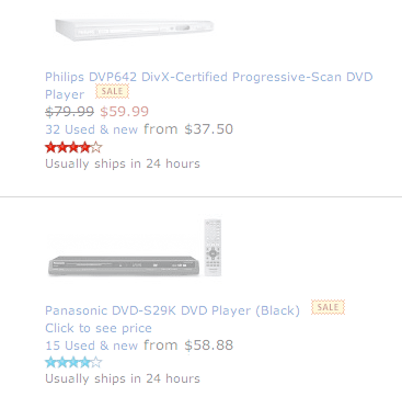
Here’s an example: Over the holiday break, I performed a search on “dvd player” while shopping at Amazon. The following results came up on the first page (click for large version):
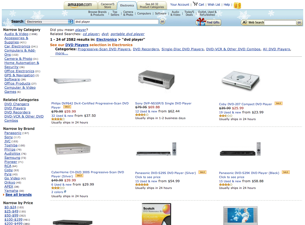
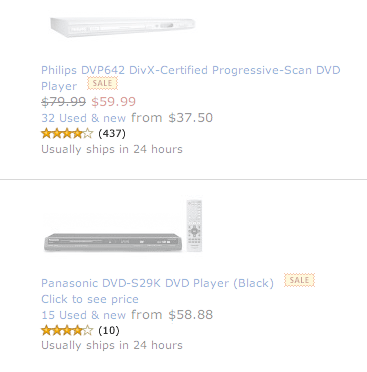
Notably, two DVD players, one a Panasonic and the other a Philips, similarly priced, had the exact same customer rating — 4 stars:

However, click a step further and things are quite different:
Panasonic DVD Player (10 reviews)
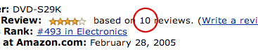
Philips DVD Player (437 reviews)
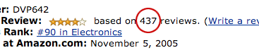
So, here we have two DVD players, similar price, exact same rating, yet one reviewed by 10 customers while the other reviewed by 437. Which rating would you trust more? I find wisdom in crowds, especially large ones when buying online based on customer ratings. I’d naturally prefer the Philips over the Panasonic, if features and price were similar and no strong brand preference existed.
Thus, it begs the question, Should the two ratings be “weighted” visually somehow to indicate the fact that the ratings, while the same number of stars, are actually based on drastically different review counts? Hypothetically, a product with just one skewed rating of 5 stars could potentially see more clicks on search results pages than a similar product with 4.5 stars rated by hundreds of customers. Granted, this is resolved as newly added products age, but see the issues this may cause?
Perhaps what’s needed, then, is a slight alteration to the presentation of ratings. It’s not an easy issue to tackle, as any solution inevitably presents 1) additional interface clutter and 2) another hit to the database on product or results pages — for every product on the page, no less. But let’s explore a few options for weighting customer ratings visually.
Numbers
The first is perhaps the easiest. Not the prettiest per se, but practical. Simply add a review count next to each rating.
A fair number of commerce sites already display numbers next to ratings on results pages. Seems fairly straightforward, but let’s look at other options.
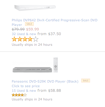
Color
How about using color to indicate one product has many ratings, while others have few? Something like red for rating hotness, maybe a cold color for little or none.
That seems to work in principle, but ignores color-blind users who may not be able to distinguish between the two.
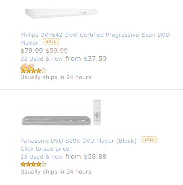
Size
Maybe size will do the trick — enlarging the rating icon (stars) for products with a larger number of reviews.
Hmm. Maybe not. Did someone say clutter?
The iStockphoto Flames
How about adding flames to the stars, much like iStockphoto does with popular photos (based on number of downloads)?
Well, works for iStockphoto. Not sure it works here.
The eBay Approach
I’ve got it — we’ll do an eBay approach of some sort. Like Power Seller or something, but instead “Power Rating” for products with more than X number of ratings (relative for each store).
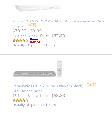
Um, not only does that look a bit silly, but doesn’t make much sense either.
Wrapping Up
Well, I suppose it’s clear that the clear winner in this case is no winner. At least this served as an exercise in interface design for me, and I hope the same for you. Even despite the fact that Amazon has probably already done A-B testing on all this, so I’m probably exercising in vain…
![]()
28 Comments
Stock photography, type, and killer tees. Genuinely recommended by Authentic Boredom.
I think that Jana is right - the number is best. Although I would put a clarification after ther number (437 reviews) rather than just (437).
The color SEEMS nice, but it would be a problem in application - like you pointed out, color-blind individuals (like me.)
Another thing I would experiment with is requiring a certain number of reviews before a star rating appears. 10 is just not enough to establish a true rating.
I’m not sure how useful this would be actually. While yeah, it’s nice to see that loads of people have reviewed said product… but as you touch on, what if the product is new, just in stores? It could be better, but only a couple of people would have had the chance to review it.
Also, big name brands would further increase their lead, getting more reviews than smaller manufacturers, making it harder for people to break into a market with a new product.
I have a client who uses a similar approach with job hunters reviewing recruitment agencies. Number of reviewers wouldn’t be so helpful here, as a small town agencies won’t be placing as many adverts as a national agency, and therefore will never get as many reviews.
I agree with Jana, also many sites do this already.
I too decided I liked the first method before I read any of the comments. It’s simple, straightforward and gets the info you want to see on to the search page. The only reason I can see why they haven’t implemented this already is so that they can sell more of the newer products in hopes that they too will have more solid ratings. Still though, just as I do when I’m looking for a recipe at Allrecipes, I’m going to choose the item that is not only rated highly, but has the number of ratings to back it up.
Now there’s a classic example of a design study. In my mind putting the number of respondents next to the rating works the best.
But why not use Ajax to allow customers to mouse over the stars and see a box with the first several lines of the first 15 (or so) reviews, with an option to view more? That would add more credence to the number in parentheses, and provide a neat way to go a little deeper without “losing your place in line?”
Always good stuff Cameron!
this subject piqued my interest since i do a lot of shopping on amazon myself and i’ve always thought that there could be a faster way to comparison shop.
the first thing that popped into my head before i even got to your ideas was color intensity. i’m not that familiar with color-blindness but i’d imagine that playing with the intensity of one color would be less of a problem. so, i’d keep the yellow and just make it go from light to full intensity. i’d limit the number of steps too - maybe something like: less than 10, 11-50, more than 50 as just an example. and to clear things up, i’d maybe remove the glow in the images and make the colors solid.
i also liked the straight-forward approach with just posting the numbers but i prefer a visual system since it makes scanning easier by allowing me to check the “weight” of a rating with my peripheral vision instead of focusing on each one.
forgot to mention.. i think the “new products” issue is a totally different problem but one that could be also addressed in the same space.
i’d first define the time-frame that i’d consider new - possibly different time-frames depending on the category of a product. for example, for a dvd player i’d maybe say 2 months from the day it’s available. then, i’d mark them with a lil graphic or text, flagging them as new. text in this case would be ok since it’s just on or off and would be noticeable while scanning.
I’d have to throw my vote to option #1. It is, as mentioned earlier, the easiest to figure out at a glance.
The issue of a products “newness vs number of ratings” comes in to play here (again, as mentioned before), and could possibly be remedied by displaying the date the product entered into the store to the product overview.
Agreed - #1.
Here’s a possible solution for newer products:
For a small fee — call it Amazon’s Adwords — Amazon offers companies with new products the chance to have their product reviewed by a team of Amazon-selected ‘experts’ in that particular industry. If the reviews are favorable, they get added to an ‘experts say’ review section below the user reviews. That way the product can further stand on its own merits. Of course, there’s the lag time for the product to be reviewed, and this might discriminate against smaller companies with tighter ad budgets…
Just a quick note on the colour changing example wrt colour blind users. As a colour blind user myself, the example you chose works perfectly well. If you chose to make the starting colour dark green or black then I’d probably have problems. Maybe the best implementation of the colour changing method would be to start with a light colour and gradually go darker as the rating became bigger.
Interesting, Richard. Would that hold true for all variants of color blindness?
The first option is by far the best… adding the “based on” X “review” make it even more clear. Simple and clear and exact!
For the color thing… Even when a user is not color blind they may not understand your system… how the hell im a suposed to know red mean more review… it just put more guess work on the user.
Despite the clutter or odd-looking variations, I would consider them all good suggestions, except for the large stars which could be difficult to understand.
Thanks for the wonderful article!
How about this:
New! | based on 447 reviews | review it! | HOT! | flag | tags | add tags
One problem with any but the first choice would be with a new user. What’s the color mean? Is red bad? Do flames mean it’s selling fast? Did somebody screw up the size of the graphic? What’s power rating? Number of reviews only means one thing, and you don’t need to be an Amazon regular.
Or just show their Rank at the same time, as that seems to already incorporate the influence of number of ratings and rating.
To be honest though, I don’t think colours, size or the flames would work too well within Amazons one-size-fits-all scheme. Text would work, but imagine all the (ahem) “casual internet shoppers” who would come up with all sorts of creative but wrong explanations for these foreign characters defacing the nice clean rating picture…
Ah well. It’s also true to say that while a product may be more reliable due to having more reviews, it’s also possible that the reviews are all 1-sentance “omg I love this product” , while an item with a smaller number of reviews are perhaps more informative and would sway you more than the former reviews. So perhaps review length should be highlighted when referring to number of reviews…
Ho-hum. Good spot though, I’ve often been put off an excelent rating through having on 3-4 reviews, and also discredit reviews that have either 1-star or 5-star ratings but fail to explain with anything terribly… legible.
The first thing I though of as I started reading this was Tae’s suggestion of adjusting the color intensity. Star ratings for products with fewer reviews would be washed out to white, with a few incremental steps to full intensity for large numbers of reviews. That being said, in this particular case I think the simplest solution, #1, is still the most easily understood by first time users.
the “Power Rating” solution/suggestion really got me all cracked up!
I agree with the masses: I recently shopped on Newegg for a monitor, and their system of displaying the number of reviews next to their star ratings served me perfectly.
A note about the color option: I like the thinking behind this idea, but I have to say that in this context red didn’t make me think ‘hot topic’, it made me think ‘bad’, and the calming blue made me think ‘better’. My point is, color is a very subjective thing, and I think its interpretation could be prohibitive not only to colorblind users, but to users from different cultures. I’m pretty sure that many cultures assign different meanings to colors.
I do like the idea of the color intensity that was brought up, though. Perhaps that in combination with the number of reviews next to the stars?
Keep up the good work! :)
I like the idea of both color and an indicator of how many reviews have been submitted. With time, the user will be able to understand the color system in relation to the review count. The star color could be gold, silver or bronze depending on the weight of the review.
Transparancy of the stars would also be an option … many votes = 100% visibility, fewes votes = 10% visibilty, and everything in between varies.
Min and max numvotes should be defined (viz. gotten from the database) at first though, but after that it’s all pure -easy- math.
I think there shouldn’t be more visual options on the frontend than data behind.
What I want to say is, that rating is something very subjective: there are people rating a book 5 stars but they havn’t even read it — ‘the cover looked so good, i’m very excited to see whats inside’…
So, you actually have to rate the ratings, to get useful data, too — amazon does this.
Based on that system and additional empirical data from other products (errors etc.), you can quite good predict where the average rating will go, even if there only a few ratings.
Next thing is, how does the user make a choice? What information is needed? For me, these are three things: product description, comments of users, average rating.
So, in my opinion, if you have the choice, invest the time in building good algorithms.
If not, I’d like it to be simple — as always, accessibility really gets an issue, if there are too much colors or visual effects are involved.
> Interesting, Richard. Would that hold
> true for all variants of color blindness?
The specific colour problems I mentioned wouldn’t hold true for all forms of colour blindness (the black vs red is specific to the form I have). However I’m pretty sure that your example, and any option going from light to dark, would be fine across the board.
He he he, i always wondered if those “related products” ever work. From your writings, igeuss that’s a yes! Thanks for the info.
What about the problem of e-graffiti, especially at places like Amazon.com, where some people will flood a particular item with phony reviews so that it will have a bad rating. Or how about cases where a competitor will anonymously post poor reviews of a rival’s product to try and influence sales. Sometimes it’s pretty obvious, other times it’s hard to tell.
While you have a nice idea, I guess the real question is can you trust “customer” reviews? Is the information you get from customer reviews accurate?
What of placement? The item with the higher nbumber of reviews was given more priority in placement than the item with the lower number of reviews. Placement and proximity are also good indicators as far as heirarchy goes.
My initial reaction to this question was that a second axis was needed. All these solutions only work along 1 axis (# of stars). Adding a second access (# of reviews) would create a nice, informative little plot. Of course, it would present quite a learning curve to the bulk of the population.
Umm, one solution not considered is a combination of several. People mentioned new versus old. A system may use a combination through active and passive means.
Active: display number of reviews.
Passive: newer products listed first.
Additional weighted criteria:
reviews rated as helpful
units sold.
higher margin products.
These last three would influence placement. review ratings may rate item higher. Units sold and margin are business driven and Amazon could set a threshold where a products ranking is dependent on this, after all this is a business.
Authentic Boredom is the platitudinous web home of Cameron Moll, freelance new media designer, author, and speaker. More…

Full-time and freelance job opportunities. Post a job...
A selection of fine reading, available for a limited time only:
- Jobs home page reorg
- Coming soon: Mobile Web Design, the book
- Dyson ad: Text as more than just words
- Setting sail for Europe
- Review: Sumo Omni bean bag chair
- Dashboard widget for Authentic Jobs
- Limited-time offer: $99 listings
- Nine skills that separate good and great designers
- Fire sale
- Introducing AuthenticJobs.com
 CSS Mastery: Advanced Web Standard Solutions A solid round-up of indispensable CSS design techniques by Andy Budd, Simon Collison, and Cameron Moll.
 Mobile Web Design A guide to publishing web content beyond the desktop. Tips, methodology, and resources. Now available.
![]() Letterpress Posters The unassuming beauty of a freshly letterpressed print.
Letterpress Posters The unassuming beauty of a freshly letterpressed print.
![]() That Wicked Worn Look. Techniques for that worn, aged, distressed look.
That Wicked Worn Look. Techniques for that worn, aged, distressed look.
![]() Mister Retro Machine Wash Filters Turn the dial to “Instaworn” with these filters.
Mister Retro Machine Wash Filters Turn the dial to “Instaworn” with these filters.
![]() Blinksale Dive in and enjoy shamelessly easy invoicing from Firewheel Design.
Blinksale Dive in and enjoy shamelessly easy invoicing from Firewheel Design.
![]() Basecamp My preferred web app for internal and client project collaboration.
Basecamp My preferred web app for internal and client project collaboration.
![]() HOW Conference Austin, June 24–27. Pentagram, Adobe, P&G, et al.
HOW Conference Austin, June 24–27. Pentagram, Adobe, P&G, et al.
![]() Web Design World Seattle, July 20–22. Practical sessions on web design.
Web Design World Seattle, July 20–22. Practical sessions on web design.
![]() Stimulate Salt Lake City, September 2009. Entrepreneurship and design conference.
Stimulate Salt Lake City, September 2009. Entrepreneurship and design conference.
Linkage:
Follow me: ![]()
1 Jana ~ 24 January 2006 at 07:46 AM
I think your first option is the best. A quick read, and involves less guess-work than the others. A site that does this well: www.allrecipes.com.