 On-screen design: Europe vs. US
~ 28 June 2006 ~
A rough approximation.
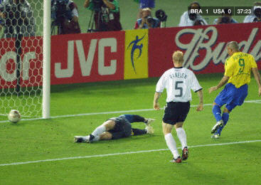
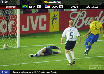
(Overly exaggerated? Not really.)
![]()
43 Comments
Stock photography, type, and killer tees. Genuinely recommended by Authentic Boredom.
Sure, ESPN is a little “graphics happy” but you also have to consider the audience. There’s probably a fair amount of Americans who don’t know where a lot of these countries are located, let alone their 3 letter abbreviation. (example: SUI = Switzerland. Not immediately obvious) There might also be a need for education about the game and the players for an American audience.
Since viewership will probably also be lower state side than overseas, I can forgive ESPN for needing to include some adverts in the top right because they’re probably taking a bath on broadcast rights relative to viewership.
That said, I do believe ESPN could *realign* their graphics to minimize the screen real estate used. e.g. Take away the bottom line and only display during :28/:58 updates. Also consider consolidating the “FIFA World Cup” line at the top into the scoreboard (possibly cycle through with the adverts)
That is pretty ghastly. I’d love to see the Japanese coverage, since they are the kings of filling the screen with crap!
I like my screen clutter free, all I need is the time and the score. I know ‘m watching the world cup, I know I’m watching the BBC, I know what SUI stands for, and I can get my world cup news elsewhere, not during a game I’d like to be able to concentrate on.
If people really want that sort of setup, why not make it an interactive service. I’m not sure how things stand in the US
I guess were just so used to covering football that we know how to do it, and can make assumptions about our viewers that can’t be made in the US due to the popularity of the game.
Still, god bless the BBC and it’s understated graphics.
The Japanese scorecard at the top is surprisingly small and unobtrusive, but they often have a lot of crap at the bottom. Sometimes it’s because they’re using someone else’s broadcast, I think. During the Olympics, they seemed to be using American video feeds with Japanese text and data superimposed on top when appropriate.
That top screen (the BBC, I assume?) is wonderful, like if Apple had a sports channel.
It isn’t the BBC screen, but it’s not far off, you can see it in this video: Youtube - BBC world cup coverage
This is bad, but American announcers have to be the worst. There was one time where Ronaldino (sp?) of Brazil was being double teamed, and they said something like “this is like double teaming Shaq and leaving Dwyane Wade wide open!” *cringe* Oh and I don’t need your anecdotes about when you were a soccer player briefly back in the day, thank you.
The first screen: Yes, it isn’t BBC, but rather a very close replica of a channel we watched often in Switzerland.
Yeah I hate it. At least we have tv en espanol that is pretty clean comparatively.
Although the BBC version is much cleaner, perhaps there are reasons for that.
1. BBC is publicly funded. If PBS in the US showed World Cup action, it could eliminate the advertising, but ESPN can’t afford to, considering the lack of breaks for ads.
2. ESPN could easily bump up the top bar and move the “LIVE” graphic and the “FIFA World Cup” graphic. But there are good reasons for them to have both of those. First, because the coverage is live, not taped, which is unusual considering the action is in Germany. Compare that to Olympic coverage. Second, many Americans wouldn’t know it’s the World Cup without being explicitly told.
3. I like the little flags. :)
4. I like the News ticker. Keep in mind this is on ALL ESPN programming.
5. In American Football, ESPN and FOX have the cleanest screens. CBS has annoying graphics that have faux metal, make sound effects when they animate their drop down info, etc.
6. I wish team USA was able to get far enough to lose to Brazil. :)
I actually watch the games on the spanish channels for this very reason. That and the GOOOOOOOOOOOOOOOOOOOOOOOOAL every time someone scores.
The clean one looks pretty much like Swedish television. Even our commercial channels don’t come anywhere close to the horror of the other one.
Dave Simon - I certainly agree there are logical reasons for the choices made by ESPN, but that doesn’t necessarily warrant cluttered design…
A lot of it probably has to do with cultural differences, too. TV in Europe seems to be a less-hurried experience, as if one is engaged in a program til it ends. Whereas here in the US we’re all about fast-paced programming, switching madly between channels, and so on. Undoubtedly that has some influence on screen design.
Speaking of commercials, Roger, I couldn’t believe my ears when I heard Sigur Ros as the background music for a Wimbledon commercial. How cool is that? Most of us still haven’t even heard of Sigur Ros yet in the states…
It seems either Europe and USA got it wrong! This is not “Brasil vs USA”. The image shown, displays the 1:0 (shot by Ronaldo) in the Worldcup Final “Germany vs Brasil” in South Korea and Japan 2002. Seen are, Defender Carsten Ramelow, Keeper Oliver Kahn and of course Ronaldo. The game ended 2:0 and Brasil was Worldcup Winner, the fifth time. HTH :D
lol, was waiting for someone to point that out. Couldn’t figure out who the white jerseys were for the life of me. Thanks, Christian.
What I like on the european screen is its simplicity, no cluttering at all.
The ESPN screen has more information, which is also great. I like the flags although I’d like to have written country names there, USA - Brazil”. But I don’t know why there have to be two ESPN logos. Get rid of that in the bar and get the worlcup logo there, then shift the bar to the top and have “Live” in the moving area of the screen.
Here in Germany the Worldcup is split up between three stations, two of them are publicly funded, one is comercial. The two publicly funded channels write the names and use their own design and German language. The comercal channel displayed just the international three letter acronym which can be confuseing. But we’re lucky, the comercial one had only games on sundays so I have not to look at it again (at least not for football).
Alot of the extra content permanently rendered “on screen” for the Americans is actually available for the UK viewers aswell. We have a service called BBCi (and ITV has a similiar counterpart) which provides news headlines, weather maps, match selection (great when you’re watching Wimbledon) etc at the press of the infamous Red Button. Not sure if you have this?
I’ve found I really can’t watch many sporting events on ESPN. For all the cruft on the screen, I could barely find the important information, such as the count in a baseball game, let alone see the actual game (stats and graphics shouldn’t block out the actual action).
ESPN HD is even worse… more room = more distractions. Since not all games are shot in 16:9 HD, they have the typical sidebars… except EPSN went nuts on them and made some pattern that draws your eyes away from the game. It’s unwatchable. I end up only watching baseball games on INHD (which I believe is a comcast only HD channel), because of the extremely clean, minimalist graphics: A diamond in the corner with the score, the count and the inning, plus runner markers in the corners of the diamond. That and the typical watermark, and that’s it. Simple and lovely.
The ESPN screen burned into my plasma. Since there are no commericals, and the graphic isn’t transparent the team names and scores (solid white background) burned into my plasma. Took a few hours to get rid of it…
i so agree with you steve c. i could not listen to the american announcers after they explained that two yellows equaled a red… no one that does not eat, sleep, breathe football is watching the world cup… we don’t need explanations! thank goodness, i have setanta sports so i am listening to the actual german commentary… as far as espn not being able to afford it… that is bullcrap… adidas is sponsoring the whole thing… paid in full… it is no excuse for this… setanta and univision both are showing the games without interruption or advertising… espn can not imagine NOT making a buck when they can… they have not accepted that football fans are used to watching the game without this garbage… while i am at it.. i HATE when they talk to the coaches during an MLS game… could you just imagine a reporter walking up to sir alex ferguson during a man u v. chelsea game and asking him a question about his strategy!!!! not a chance…
news headlines, weather maps, match selection (great when you’re watching Wimbledon) etc at the press of the infamous Red Button. Not sure if you have this?
I don’t know what the “infamous Red Button” is, but I’m pretty sure I want one.
Sponsored by Adidas!
Woh!, someone else who knows Sigur Ros, sweet! I love their music, it’s soo relaxing when designing.
Call me a Yank, but football (soccer) bores me to death. Must be in my genes.
So there you have it. Virtually no information vs live metadata. Football is not a viewer friendly sport by nature, given the average attention span of 15minutes (am I up to date on this with 15?).
But when I look at the YouTube thing I’d want that meta data on a 2nd display. But then again it’s getting like a cockpit. Left display game data, center display live game, right display player stats. - how far are we away from that? (neutral statement… curious).
ESPN HD is even worse… more room = more distractions. Since not all games are shot in 16:9 HD, they have the typical sidebars… except EPSN went nuts on them and made some pattern that draws your eyes away from the game.
A couple of issues with that: 1. I’m pretty sure that all of the World Cup games are in HD (and, therefore, 16:9) on ESPNHD/ESPN2HD. 2. The point of those bars on the non-HD programming on the ESPN channels is to prevent pillar box burn-in on your screen. They’re a number of shades of grey and always, subtly, moving. The fact that ESPN is expending graphics generation resources just for that while almost all of the other networks just give us destructive, black bars is awfully considerate, if you ask me.
Now, as far as the larger topic goes, I’m actually of a totally different mind from you on this one, Cameron. What ESPN is quietly doing here with their BottomLine and game-info strip is showing these games (on the HD broadcasts, anyway) in a 2.35:1 aspect ratio, which is awesome, and using the rest of the screen real estate to impart information about the current game and other sports happenings. Soccer/football aches for a true scope-shaped field of view, and ESPN’s providing it with one. I’m all for it.
Cameron - Having Sigur Ros on UK TV idents was cool to start with… which was about 6 months ago then it caught on with a vengence and Hoppipola is now being murdered every day for every nature, sport, film advert on the BBC or channel 4. It was like when song2 by Blur caught on, every time there was any hint of action or excitement in a program.. ‘whoo hoo’ big riff ‘whoo hoo’ big riff {song2 chorus} would ensue
Although the terrestrial channels here in the UK seem to be quite restrained in their use of digital onscreen graphics their cable and satellite compatriots are not so discerning. For example, Eurosport have a massive news ticket at the bottom of the screen which I find incredibly distracting.
I’m a bit of a cycling fan but never have the time to watch the live coverage so have to restrict myself to watching the highlights show later in the day. Eurosport, in their infinite wisdom, reveal the winner of a days racing in their news ticker while you watch the highlights, which can be very frustrating. Luckily my TV has a zoom mode which allows me to move the news ticker out of sight but I’m sure a lot of other viewers aren’t so lucky.
Like a previous comment mentioned, I’ve no need to view sports news while I try to concentrate on my viewing as I can get that information from numerous other sources when I decide is most convenient.
The guys at tilt are resposible for creating the on air graphics that are seen by most of the world during this summers world cup. It falls in between the minimalist and heavy graphics approaches. They also did all the bumpers and stings, which 90% of broadcasters will be using for the tournament.
Brazil did not play against the EUA in this world cup…
Rafael, see comment #14.
Sometimes ESPN posts a big black box at the bottom of the screen with lot of text on some historic thing about a team or worldcup during the game, and they freaking show it when somebody is about to shoot a goal…why can’t they make it transparent so you don’t miss the action.
I quite like the ESPN stuff… as for the BBC has any one noticed the nice simple gradient effects on their graphics? this is quite unusual as all of there on screen stuff has been quite flat and simple.
..And does anyone who watches the bbc coverage notice that they can’t refersh the score panel straight away, they replace it with a bbc logo for about 30 seconds.. why do they do this??
I dunno - I wouldn’t call Sigur Ros a household name in the US, but I wouldn’t call them completely unknown, either.
I mean, their last tour they played the Hollywood Bowl - not exactly a small venue. Heck, they sold out two shows here in Grand Rapids back in February - and this town generally doesn’t support live music (though hopefully this is a sign that’s changing).
As for the chrome on the American broadcasts - I see almost as much chrome on non-sports broadcasts…just about every network out there runs adverts, news flashes and assorted other crap over top of regular programming.
complaining that you cant make out the photographers at the top of the screen? its no suprise you cretins riot over this game! ;)
Title should be “Europe vs. US”, to indicate that Europe is the first pic and US is the second one. Or one could just swap the pics. (people read from rtl and ttb ;))
Kindly,
B!
Your shots may only be a simulation, but they’re definitely not far off. The only thing I’d say isn’t exactly accurate is that the U.S. version is too subdued. Throw some flashy gradients in there, or even better some flying 3D junk, and you’d be more on target. I’d never thought too hard about it, but the recent redesign of CNN International makes the contrast all too clear.
Compare CNN U.S. (above) to the new CNN International (below). Whoa. More detail here.
Duh. I read the headline, and due to the order (US vs Europe) misunderstood which screen was from where. Regardless, the CNN thing just hammers the nail a little further in, regardless of how slow I am.
Changed the title around, for those mentioning the disparity between title and photos. Thanks for the suggestion.
I don’t see that as cluttered at all. What are you missing? Some grass at the bottom? A few annoying photographers? I personally think it’s stylish.
I noticed that in Europe too, makes a huge difference for the better.
Ok, there had to be one Aussie comment on this, late as it is. Here, the World Cup was shown on SBS (publicly funded) because none of the commercial channels usually care about “soccer” - though they’re kicking themselves now: SBS had their best ratings ever, so I hear. Anyway, this is how the screens looked. Replays at sane hours of the day were shown without the score and time (so just the SBS watermark).

That looks like the standard WC feed? Not sure who was doing the “master” feed though…
Authentic Boredom is the platitudinous web home of Cameron Moll, freelance new media designer, author, and speaker. More…

Full-time and freelance job opportunities. Post a job...
A selection of fine reading, available for a limited time only:
- Jobs home page reorg
- Coming soon: Mobile Web Design, the book
- Dyson ad: Text as more than just words
- Setting sail for Europe
- Review: Sumo Omni bean bag chair
- Dashboard widget for Authentic Jobs
- Limited-time offer: $99 listings
- Nine skills that separate good and great designers
- Fire sale
- Introducing AuthenticJobs.com
 CSS Mastery: Advanced Web Standard Solutions A solid round-up of indispensable CSS design techniques by Andy Budd, Simon Collison, and Cameron Moll.
 Mobile Web Design A guide to publishing web content beyond the desktop. Tips, methodology, and resources. Now available.
![]() Letterpress Posters The unassuming beauty of a freshly letterpressed print.
Letterpress Posters The unassuming beauty of a freshly letterpressed print.
![]() That Wicked Worn Look. Techniques for that worn, aged, distressed look.
That Wicked Worn Look. Techniques for that worn, aged, distressed look.
![]() Mister Retro Machine Wash Filters Turn the dial to “Instaworn” with these filters.
Mister Retro Machine Wash Filters Turn the dial to “Instaworn” with these filters.
![]() Blinksale Dive in and enjoy shamelessly easy invoicing from Firewheel Design.
Blinksale Dive in and enjoy shamelessly easy invoicing from Firewheel Design.
![]() Basecamp My preferred web app for internal and client project collaboration.
Basecamp My preferred web app for internal and client project collaboration.
![]() HOW Conference Austin, June 24–27. Pentagram, Adobe, P&G, et al.
HOW Conference Austin, June 24–27. Pentagram, Adobe, P&G, et al.
![]() Web Design World Seattle, July 20–22. Practical sessions on web design.
Web Design World Seattle, July 20–22. Practical sessions on web design.
![]() Stimulate Salt Lake City, September 2009. Entrepreneurship and design conference.
Stimulate Salt Lake City, September 2009. Entrepreneurship and design conference.
Linkage:
Follow me: ![]()
1 Ben ~ 28 June 2006 at 09:47 AM
Don’t worry, ITV and Sky Sports, (two UK channels) are desperately trying to catch up with you Yanks and add numerous bits of hideous chrome to the screen for watching *football*.
Only the BBC seems to know what a good screen looks like.