 Optimal width for 1024px resolution?
~ 14 September 2006 ~
Let’s face it: The jump from developing for 800×600 to 1024×n is inevitable; not only inevitable, but just around the corner, too. Many of you are considering the jump. Some of you have already leaped. I suspect that some time in 2007 most of us will knock out comps optimized for 1024px resolution rather than 800px if we’re not doing so already.
But perhaps just as important as when it will happen is how: What’s the proper width for a layout optimized for 1024?
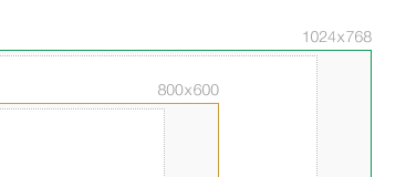
With 800x600 it’s easy: Account for browser chrome and scrollbars (usually 40-50px) and then use as much of the remaining space as possible. This usually means a layout width of 750-760px.
If we use the same logic for 1024, browser chrome is still the same, so that leaves us with 974-984px as the “ideal” width. However, many users (including myself) don’t browse full screen, especially as display resolution in increased. Almost as if there’s an inverse relationship between browser width and display resolution — as the display gets wider, the browser width gets smaller (proportionately).
Additionally, in a time we all are, or should be, considering grid usage in layouts, is a random number like 974 an optimal number for dividing a layout into its necessary elements — sidebar(s), main content area, and so on? Fluid/liquid layouts are another issue, but even those have to be optimized for a minimum width.
I’ve been using 960 for some time now, as it’s slightly smaller than full width, and it’s divisible by 3, 4, 5, 6, 8, 10, 12, 15, and 16 (imagine the grid possibilities). I’d love to hear what all of you are wrestling with.
Update: Jon (first comment) brings up an interesting point: If your layout includes ads, 960 seems to facilitate IAB widths fairly well.
Update II: Jeremy (comment #22) makes a good case for fluid instead of fixed-width. My thinking here was aimed at optimizing for 1024 resolution and not necessarily 1024 fixed-width sites, per se (there’s a difference). Hence, I’ve changed the title of this article as it appears to have been misleading.
Shameless Workshop Promotion
This is one of the many topics we’ll cover in-depth in my all-day workshop, “Designing Elegant User Interfaces”. Only 4 weeks left before showtime — register now if you haven’t done so already!70 Comments
 Veer: Visual Elements for Creatives.
Stock photography, type, and killer tees. Genuinely recommended by Authentic Boredom.
Good point, Jon…
Most Windows users I know browse fullscreen, even if they have gargantuan displays (1400+ pixels wide)… I just don’t get it. Maybe they love whitespace?
We have been designing at 950 width for about a year now whenever developing a site intended to a mature, online-conscious audience.
Yeah, I’ve found 960 to be a great number for the same reasons you have, but I’m trying more and more these days to design elastic layouts that will degrade to 800 and skinnier (which is, of course, easier said than done when there are concrete image sizes to work with). I think Jakob Nielsen’s latest Screen Resolution and Page Layout guidelines really hit the nail on the head.
960 does seem to be a great “optimal” width thanks to the divisibility and the fact that it comes close to hitting several IAB sizes.
FWIW, I’ve found that 996 seems to be the absolute biggest you can get away with w/o causing scroll bars in any of the major desktop browsers.
I’m a latecomer to the web design party, currently redesigning my personal site to 1000px max width, with fixed width navigation, sidebar and liquid content area. It gives the user choice in browser width but also lets my design be viewed as intended. And 1000px is a nice round number, even though it was designed with no grid. (As a Tschichold/Muller-Brockmann disciple, it pains me to say that.)
Good to know, Jeff (996). Hadn’t pushed the limit that extensively yet, as I did back in the day for 800x600 (I think 768 was as wide as I could get, if I recall).
For three column layouts at 1024, I try to make the second column end at or very near 760px and put “secondary” information in the third column. That way, if the user is on an 800px monitor the site still feels like it naturally fits their browser, in a sense.
I’ve used either 980 or 970 before, but using 960 makes perfect sense for its divisability (that’s probably not a word).
Of course, I misspelled divisibility. And dang it, it is a word! Now I just sound stupid. And I’m rambling now. Someone stop me.
I’ve always kept it simple.
770
880
990
It’s cool seeing websites optimized for bigger resolutions. I just redesigned my site and made the jump as well, trying out a 900px width on a 3 column.
I always browsed full screen when I was on a pc, but now I don’t, and I’m on a mac. Don’t know why that changed……maybe screen resolution?
It would be interesting if you could track in a web analytics package the pixel widths of users’ browsers.
Although it should probably track a 5 - 10 pixel range because people who don’t browse full screen set the width themselves and it would be some arbitrary number rather than standard resolutions that are easier to track.
Reason I say this is I think the majority of people keep their browser at full screen, and this is because the majority of people use Windows.
When I was a windows user, I kept mine maximized all the time, simply because that’s what the Window’s interface encourages. Once you maximize you lose the ability to adjust and change the browser window.
On a Mac however, you can hit the green plus buttom “maximize” and it doesn’t necessarily display the browser at full-screen (at least that’s what it does on my mac). Even if one does maximize the browser one still has the ability to adjust it on a mac. I also noticed that I don’t keep my browser full screen anymore like I did when I was a windows user.
Saying many users do this is probably true, but not the majority. Not many people have large high resolution displays either. Although, a 960px width for a website wouldn’t cause any harm to people with the minimum 1024x768 resolution and a maximized window.
Hi,
Yep, I go for about 950 - 960 pixels preferably.
It does appear to be true that Windows users tend to go fullscreen as it’s just so easy to do so. On Mac it’s not so easy as click the + has mixed results, for instance I tried it just now and all that happened was my browser window just fit the full height of my screen but left the width untouched.
Another interesting statistic to know is what is the maximum safe *height* vertically on a 1024 x 768 screen? I’m not in the habit of making sites that try to fit everything within the visible height completely but it’s interesting to know what content will be visible immediately without scrolling.
J Phill:
I always browsed full screen when I was on a pc, but now I don’t, and I’m on a mac. Don’t know why that changed… maybe screen resolution?
As Chris says, hitting the green pill on a Mac isn’t the same as hitting the maximize button on Windows. That’s part of it.
However, I for one never browsed full-screen on Windows machine either during my corporate years…
I’ve switched to designing liquid layouts almost exclusively, so this is something of a non-issue for me. I continue to mock up my comps at about a 760-740 width, since I want to make sure that everything will still fit at that size. I may start mocking up with a 960 width, though — but still going to stick with liquid that goes down to at least 740 pixels. I gotta say that I agree with Nielsen’s recent writeup as well.
I have recently made the jump to 1024 as well. After wrestling with a few widths, I too have settled on 960px for the same reasons you have stated.
I’ve recently tried 890 pixels. This provides a grid of 18 columns (40 pixels each) and 17 gutters (10 pixels each), which you can use in a variety of ways from 2 or 3 equal sized columns or a wide selection of mixed width columns. Mark Boulton has presented some useful posts on grid layouts as has Khoi Vinh. But, the best resource for theory and practice of grid layouts that I’ve read is a book named “Making and Breaking the Grid” by Timothy Samara.
980px is about right for me. When I have to convince clients that this is not too large, I point them to nytimes.com, businessweek.com and others that use 980px. forbes.com uses 1010px!
I believe we should approach screen resolution much like we do JavaScript. Best-practice tells us to “degrade, degrade, degrade!!” We should be degrading our layouts for screen resolution just as we do for the technology running our sites. Build them for an optimal width of 1024 but let the layout accommodate a screen resolution width of 800 without a scroll.
I proposed this question a few weeks ago:
800x600, should I really care?
I recently designed a flexible-width site that scales from a minimum of 760px to a maximum of 960px, then remains centered for larger browser widths. It looks great on displays large and small, IMO.
Aw, fer feck’s sake! Always with the numbers. In another few years, there’ll be some new width that’s the “right” one.
How about designing sites that are flexible, that fit all manner of widths? You can still *optimise* for whatever width you want, but with a little bit of forethought and work, you can make sure that there are no horizontal scrollbars in a range of sizes.
I’m not suggesting that a site should look perfect at ridiculously minuscule or ludicrously wide sizes, but it’s certainly possible to pick a range (say, 800 pixels to 1200 pixels) and ensure that the design works within those parameters.
I’ve heard all the arguments against liquid layouts and the most plausible are:
1. They’re harder than fixed width layouts (no argument there, but I personally like that challenge) and
2. Optimal line lengths for reading.
Width the introduction of min-width and max-width in IE7, that argument is also blown out of the water.
Talking about numbers, comparing 800 to 1024 or whatever, is like comparing Pepsi and Coke. They both suck.
Phew! Quite a rant. Please excuse the outburst, Cameron.
No worries — rant away, Jeremy! It’s certainly a good point. And as one who made a good case for fluid layouts in CSS Mastery (with min/max in the 800/1200 range you suggest, no less), I can vouch for the benefits of fluid layouts.
That said, I don’t think we’ll escape the need — frequent or infrequent — for fixed-width layouts. I say that having seen both sides of the coin. I’d love to go fluid with everyone one of my projects, but I don’t think it’s always practical.
We went with 990 on the Notre Dame Forum website which might be a bit too big. You’re correct though, 1024 is right around the corner.
I was reading the article from The Man in Blue on Resolution dependent layouts just 2 seconds before hitting this article (Reading Authentic Boredom is great for taking breaks while designing - so touché Cameron).
I think as the change is inevitable in 2007, this option gives a great way to have the design degrade to smaller resolutions. I first found out about this on Hicks Design. I prefer this method to fluid layouts as you can still design by pixel.
960 feels right, I start out with 940 as I always end up using shading and accents to the edges and end up making my 940 a 960 design.
Chris, the maximize button should not take up the full screen on a Mac. In theory, it should enlarge the window to a size that does not require scroll bars.
I’m glad you acknowledged the fact that not all users browse the web with maximized browsers. I too, prefer my browser non-full screen at high resolutions.
Yes, I know that there are a lot of people who do continue to browse full screen at higher resolutions, but I believe that is simply a habit picked up from smaller resolutions. As higher resolutions become more and more prevalent, users will start to catch on that they don’t need to browse full screen.
In short, increasing screen resolutions won’t continue to bring a directly proportional increase in browser size. Personally, I think that we’ll settle on an optimal size of somewhere between 800 and 1024px wide no matter what the screen resolution is.
So I echo the previous sentiments that it’s important to design for a range of resolutions, no matter what the resolution is currently the most popular.
@ Jerry
That does make sense, I did not know that. OS X pretty much broke me of my maximize habit when I first started using it almost 2 years ago.
My point was though, OS X’s interface encourages you to adjust the window to your liking versus Windows.
I think that the divisibility of 960 is great. I’ve also found that I like to have a bit of room to breath between the content of the page and the border of the browser.
Depending on the grid that you are trying to get at, you can use 960 as your maximum width, then allow 30px or more margin for your content (at this point, you can set your margins to whatever you need to in order to get the grid size that you need). You’ll end up fitting the content into a smaller area (900px or so), but you do create more space which seems to be more comfortable for viewing - away from the edge of the page.
Great post Cameron. I’m now designing for 1024, but had one of those “smack my head” moments when I read the IAB/grid stuff…
Chris G - actually, Shaun Inman’s Mint has a “Window Width” pepper (plug-in) that measures a users browser width:
The Window Width Pepper picks up where User Agent 007 leaves off by tracking the width of the browser window on each page load allowing you to make more informed design decisions regarding page width than you could with screen dimensions alone.
Check it out. I’ve been using it for a while now - it works really well!
I don’t think 800x600 is going away completely for a very long time; it’s life is not built around hardware support as many of us designers would like to believe… plenty of users choose it for other reasons.
Let me elaborate with an example: while I was webmaster at Northland College the director of communications had horrible eyesight and ran 800x600 to increase readability on her 17 inch monitor (it was a lot easier than changing font size preferences in firefox and IE, which is an unreliable method altogether). Once I noticed this, I saw users all over the place in a similar situation, and suddenly the webtrends reports that say I should ignore 800x600 because of our user base seemed to hold much less weight.
I think we need some more time (and an OS/Browser combo with easy to use, greater accessibility tools) before we forget about 800x600 completely.
@ Rich
Sweet! I use Mint already so this would be perfect. Thanks!
@Dan
I think you right dan, that’s why I prefer the method I mentioned earlier that uses stylesheets depended on screen resolution. It is some extra work, but not to hard if you don’t want to be constricted by 800 wide.
800x600 is down to 17% according to the w3c, but should offcourse not be disregarded.
So I think we shouldn’t choose just one resolution, but try to more progressive in that matter and serve alternates when possible.
Years and years ago when Webmonkey.com was the only web developer/designer resource there was a great article written called Sizing up The Browsers. In that article they had a link to a PSD that contains browser windows as a layer so you can design your site accordingly. Just have a look as the file to see what I’m mumbling about…
According to xScope, you can use up to 986px if you only care about IE5-6 WIN, Safari, Firefox MAC + WIN, and NS6 MAC. If you drop NS6 off the list you can go up to 999px.
I recently made a site that used the golden ratio for the relationship between column widths. I ended up with a 926px wide site that was broken up into 10 sub-columns with 14px padding between. The layout can be broken up into columns that are 2, 3, or 5 sub-columns wide. Its slightly more complicated than that. I would upload an image to explain but I am too lazy.
Wow, I’d never even realized this. My thing has always been 1.) New Photoshop document; 2.) Width: 1024px, height 1000px; 3.) Setup guides for 32px margin.
This gives a 960px content area. And I just did 32px the first time I designed for 1024 because it’s the square root of 1024…
I’m wondering why people still do fixed width webpages in the first place. Isn’t it patronising to dictate the width of a users browser window?
Designing for fixed width is MUCH easier, granted, but I especially expect professional (business) sites to take the time to create fluid width webpages.
Look at amazon.com — it’s a nice example that it actually CAN be done professionally.
Any site at which I’ve marvelled at the prettiness has been fixed-width. Call me superficial, but I would visit Amazon more often if its width was fixed and its layout clearly under control, rather than looking like the default template of a shopping cart package.
Lately I’ve always been using 975 as a width. When developing flash sites that have a fixed canvas I use 975x560 which seems to fit quite good in every browser on a 1024x768 screen resolution.
Haha, it CAN be done professionally, but I wouldn’t say amazon.com is a great example, not even a good example.
And I don’t think most of us are talking about fixed width, we’re talking about 1024-based width. “Optimal width for 1024 resolution,” not, “Optimal fixed width for every website, ever.”
There’s no definitive answer for going with fixed, fluid, or elastic in any case.
“Most Windows users I know browse fullscreen, even if they have gargantuan displays (1400+ pixels wide)- I just don’t get it.”
Windows makes it easy - 1 click full screen, one click minimised, 1 click in the taskbar to switch programs. (maximised windows are full attention windows)
I still haven’t found out how to have a full screen browser window on my Mac Mini
So I guess with windows users, sizing a window is less important.
managing white space therefore becomes an issue for designers.
We got similar results from our long-term web-usage study: Never expect to have the full screen resolution, as many users don’t have the whole desktop available or they don’t like to maximize their browser.
See:
http://www2006.org/programme/item.php?id=18
It’s good to see this topic being discussed so much at present and in so many places.
I’m currently designing fluid layouts that stretch from 765px to 1000px.
Neither of these values divides up as well as 960px, however I’ve opted for percentage widths for nearly every layout element for which it makes sense so as to keep the main content a sufficiently decent width with respect to line length.
I chose 1000px as the maximum width due to line length issues at greater widths. Or more accurately, I wanted a width up to which line lengths were still suitable and 1000 was a more-or-less arbitrary choice.
My 2 pennies…
I agree with one poster that said the sites he preferred were fixed. I look at the designs I like, and typically this is the case. Digg.com for example. There are exceptions, slashdot.org , newsvine.com , in which the site is fluid and retains it’s “sex”. These sites (fluid) tend to have smaller left or right aligned header logos.
I can’t really see us pushing much more past the 1024 resolution. I mean, I personally hate browsing in a browser window bigger than 1024. But perhaps this is because I always want to experience what my users my experience.
There is a threshhold however. People simply won’t want to read something that forces their head to go from shoulder to shoulder to read something. There is a limit in what is comfortable. I think 1024 (950 + chrome) is the Optimal zone we won’t push much (if any) past.
Fluid vs. Fixed is like Emacs vs. Vim heh [Vim rocks btw. :)]
Great work Cameron! Now I am very interested in how to properly use “the grid” for layout. Could you possibly expound on that a little more? As a novice designer, without a graphic design background I would love to understand how to properly use the grid to complete a design comp set for 960px or whatever the size. Unfortunately, I can’t make it to your workshop, but believe me if I had the income I would already be waiting on you. :o) Take care and thanks.
Nobody has mentioned pixel density. It has been rumored that the next Mac OS version (Leopard) may introduce resolution independent display technology.
Even though it may not be “comfortable” to read wide columns in large displays, the near future should allow for designs that can scale proportionately so that row character count remains constant as the screen scales.
In other words, we’ll be able to have layouts with the same physical dimensions but with higher pixel counts.
We’re taking the plunge at my day job. Next version of the coporate site will be 960. That size works for our audience and we need the room for content. I think we had hung on to 800 X 600 for no logical reason though. We could have done this a year ago.
The new size divided up beautifully, lots of room for content and our old friend whitespace. Delicious!
According to my analysis, practically none browse maximized at 1024x768 (you need to go above 1400×1050 before you see a change in browsing behavior).
And, in order to support about, say, 95% of the people you need to design at a maximum width of 792px. At 90% it is 840px and you only support about 80% at 960px (all based on 1024x768 resolution).
Yep, we’re doing most sites at 960 now too - much nicer to work with than 780, far more flexibility.
We did pretty much the same analysis as Thomas Baekdal in our german weblog. The results confirm his findings.
Viewport width summary chart
That is, to support 95% you need take a viewport width of 780 pixels into account.
Viewport width at 1024 pixel chart
These figures show the viewport width of users with a screen resolution width of 1024 pixels. If you “optimize” for a width of 960 pixels, you only reach 80% of those users. Therefore it’s not wise to “optimize” based on the screen width.
The report in german:
Optimierung f�r Bildschirmaufl�sungen
By the time 800x600 is completely gone, it will be back on handhelds…
Just to reiterate what your clarifications, Cameron, even when you’re designing a liquid layout you have to pick a width to design to in Photoshop et al. As you say, choosing 960 is a handy number as it can be divided wholly by so many numbers.
Another point worth noting is that whole numbers are particularly important to Safari when creating a grid, as for some unfathomable reason, it cannot deal with decimalised percentages such as 33.33% (to create a third). Safari would round this down to 33% which is utterly irritating sometimes.
I think Barry Haanstra makes a really good point here! (Why didn’t I think of it myself?! :-)
I expect that more and more people are going to surf the web with devices other than PC’s in the upcoming years. Almost every new device out there is being equipped with WiFi already. Not only PDA’s, but also handheld game consoles, mp3 players (MS has announced WiFi in it’s new mp3 player called Zune, which will probably force Apple in doing the same with the Ipod) and cell phones. Right now, almost all of these screens have a max. resolution of 320x200, which doesn’t make them very fit for browsing. But already the trend with PDA’s is to supply them with VGA (640x480) screens and this trend will extend to other devices as well. Combine this with the increasing availability of (free) wireless access points and we will have to ask ourselves whether we shouldn’t be designing with a smaller resolution in mind?
Come to think of it, my reply above is a little off topic, but I’d still wonder how you guys stand on this.
The reason why I don’t want XGA resolutions and I prefer SVGA for my sites is because mobile browsers can easier reformat an SVGA site rather than an XGA one. No matter what CSS you use, the point remains: if a mobile user hits your site, his browser would be praying in its knees that you don’t use huge resolutions.
Has anyone else noticed that both 750px @ 800px and 960px @ 1024px are 93.75% of the maximum screen width?
I prefer liquid/elastic layouts so a width of 94% might be worth trying.
We use a combination of fixed and fluid sites for our clients, but i can concur that recently(last 3 months) for the fixed width layouts we have been used 964px, 984px, 985px and 986px. I hadn’t noticed the variation before your post mentioning the optimal width, which is strange as on the 800 layouts that we have done over the last few years we have used 760px as the basis for probably all fixed width layouts.
Thanks for kicking my brain into gear, i’ll probably set a regular fixed with for designs now.
You just HAD to bring up 1024?! haha… and I just finished getting sign off from my office on a corporate redesign. All the comps are 750px wide. lol
Anyway great topic. I’ve been debating the transition for a while. With all the great feedback above I think i’ll have to give the 960px a try.
You do have a good point here, actually. I made my site a long while back 1024x768, but did it at 1000 pixels wide as I looked at other sites at the time that made their websites for that resolution. I can’t really hop into it and make my site 960 pixels wide anymore, but I’ll keep that in mind when I make my next one or if I feel insane and decide to reduce the website’s width by 40.
Most websites simply do not deserve to be more that 600px wide. :)
Regarding Windows users’ tendency to browse fullscreen - Tony Crockford (comment 41) touched on something important:
…(maximised windows are full attention windows)
Some people find it distracting to have content from other applications visible around the edges of their browser window. Too much clutter. So they maximise their window to drive away distraction - and do so regardless of the application or the screen resolution.
Windows has a larger percentage of users who might think this way, than Max OS X or GNU/Linux. For example: the elderly; people who use computers for recreation rather than work; less tech-savvy people.
The “fullscreen” behaviour is also driven by habit. Windows dedicates a lot of screen space to chrome, but this waste reduces when the window is maximised. Users learned a long time ago that the quickest way to eliminate unnecessary scrollbars was to maximise their window.
We launched a complete redesign of three online properties last February after nearly a year’s preparation. We settled on a 902px width (yes, 902). Width-wise only, the leaderboard ad and house ad stretch the full width, with NAV and editorial content underneath as follows from left:
Tool Rail - 120px (starting 4px in)
gutter - 10px
Editorial Content (chewy centre) - 428px
gutter - 10px
Utility Rail - 160px
gutter - 10px
Premium Content - 160px
The chewy centre content is elastic and collapses from the right to accomodate those few remaining 600x800 screens (studies showed them to be 20 percent or less of our readership). Article pages are also elastic.
When re-designing such large environments, its always a tug-of-war between hugely disparate parties like advertising, editorial, design, development. In the end its almost less of a re-design than a difficult course in UN mediation. But our odd choice of size has left us with a rigid grid that is flexible all over the place for ad and editorial content. We’re very happy.
Do any of you designers use Flash for your websites? I’m wondering how this would carry over with that segment of web development; 100% width/height scripts? Or pop-out windows?
See what I mean:
http://www.stephrose.com/studio/
The problem with fixed layouts is that we set a width for everybody.
The problem with fluid layouts is that people may have looong unreadable lines. You know people won’t resize their browser window to match your site.
I guess we could use fixed-fluid layouts : Setting widths with ems, at least for the content column, so that the number of characters per line would be the same even if we change the font size. Sounds good.
But another problem would appear : wich width should we use? If at standard font size the site is 960px large, it would then be wider if you increased the font size, and a horizontal scroll bar would appear.
So which one is the lesser evil? Big text in a narrow column or horizontal scrolling?
a minor point regarding Full Screen — the Alt+Tab functionality has been inconsistently supported by Mac, if my memory serves (for a while it was a feature that was installed if you installed MS Office, but wasn’t native to the OS, right?). Alt+Tab has been an essential navigation command for a decade in Windows.
Add to that the issues of inadequate video cards (if any) in enterprise environments, regardless of multitasking support, and I suspect many users were trained over time to work full screen and Alt+Tab because it seemed more efficient (slow screen redraws on a Windows machine are legion).
That I still don’t think there has been an effective UI for docking windows that made them easily navigable. I’m sure there are some jockeys out there that can move quickly, but it sure seems that Alt+Tab is about the fastest way to move around.
Regarding Windows vs. Mac window maximization, I can see it from both angles. My main machine is a Mac, and I usually have my browser window opened to full screen width (1900 right now) in order to keep the content from other windows (or even the desktop) from distracting me. At the same time, I totally see the wisdom in Apple’s decision to not have the green “maximize” button elicit Windows-like behaviour. Most people aren’t going to necessarily want to browse at full screen width even if they are given the choice. One reason is that text columns inflate to the extent that text becomes difficult to read. The minority of those who *do* have a lot of screen real estate AND still choose to use a fully maximized window can still do so, but they’re a minority, and so it’s like the 80/20 rule. Thus, I think Apple made the right decision. Windows’ behaviour is akin to bad advice that falls into general acceptance due to ubiquity.
As for the poster who mentioned Alt + Tab: I don’t think I could live without it. I prefer to keep my hands on the keyboard; moving my hand away to use the mouse is something like a last resort in my mind.
We have also been tracking browser width settings. Our results indicate that among the visitors with a screen res of 1024 or greater only 25% have a browser width greater than or equal to 1000 pixels.
So for us, if we were to go with a fixed width setting it would be between 750 and 960.
When I put myself through our browser test, I learned that I prefer to keep my browser width around 940, regardless of the platform I am on.
FWIW … As a user of sites, I prefer fixed width. I don’t like the arrangement of content changing on me as I change the browser width. I really don’t like it when I am looking to purchase online and come to a site designed for 1024, forcing me to scroll horiz to view products, info, etc. Those sites don’t get my business.
Good discussion.
As always: it depends.
I would like to second Barry Haanstra’s comment that sooner or later 800x600 will be back in full effect on handheld devices. Months ago I heard about Nokia developing a new handheld device equipped with a 800x600 display, so there definitely a case for fluid layouts.
On the other hand, there’s also aesthetics. Clients still want pretty looking webpages with visuals that span the entire width of the page. We all know that’s impossible with fluid designs. Not to forget about Nielsen’s recommended maximum line width of approx. 400 pixels (that’s about 10-12 words).
It’s better for us to adjust to our visitors’ browsing habits, than to require them to resize their browser windows in order to make a webpage look pretty and read well, no?
I have a rather uninformed question… what is it you’re doing with all that space? There are dozens of websites (https://www.google.com/search?client=safari&rls=en&q=words+per+line+web+ideal&ie=UTF-8&oe=UTF-8) and books that state the ideal words per line to be in the 10-15 range and yet somehow designs keep requiring more width… what am I missing? Using width for width’s sake seems like a poor decision. Am I in the minority?
The actual text field could of course be more narrow than 960px, even though you are designing towards that width :-)
Authentic Boredom is the platitudinous web home of Cameron Moll, freelance new media designer, author, and speaker. More…

Full-time and freelance job opportunities. Post a job...
A selection of fine reading, available for a limited time only:
- Jobs home page reorg
- Coming soon: Mobile Web Design, the book
- Dyson ad: Text as more than just words
- Setting sail for Europe
- Review: Sumo Omni bean bag chair
- Dashboard widget for Authentic Jobs
- Limited-time offer: $99 listings
- Nine skills that separate good and great designers
- Fire sale
- Introducing AuthenticJobs.com
 CSS Mastery: Advanced Web Standard Solutions A solid round-up of indispensable CSS design techniques by Andy Budd, Simon Collison, and Cameron Moll.
 Mobile Web Design A guide to publishing web content beyond the desktop. Tips, methodology, and resources. Now available.
 Letterpress Posters The unassuming beauty of a freshly letterpressed print.
 That Wicked Worn Look. Techniques for that worn, aged, distressed look.
 Mister Retro Machine Wash Filters Turn the dial to “Instaworn” with these filters.
 Blinksale Dive in and enjoy shamelessly easy invoicing from Firewheel Design.
 Basecamp My preferred web app for internal and client project collaboration.
 HOW Conference Austin, June 24–27. Pentagram, Adobe, P&G, et al.
 Web Design World Seattle, July 20–22. Practical sessions on web design.
 Stimulate Salt Lake City, September 2009. Entrepreneurship and design conference.
Linkage:
Follow me: 
1 Jon ~ 14 September 2006 at 09:43 AM
Just being pedantic…
960 is divisible by 1, 2, 3, 4, 5, 6, 8, 10, 12, 15, 16, 20, 24, 30, 32, 40, 48, 60, 64, 80, 96, 120, 160, 192, 240, 320, 480, and 960.
Lots of IAB widths near those numbers, too.
Thanks for the tip.