 I went postal and got paid for it
~ 16 August 2004 ~
Let’s cut to the chase: Designing for direct mail is often as respectable as telemarketing. You get paid to do it, but you don’t exactly boast about the privilege.
That aside, earlier I promised a write-up detailing a recent 6”×11” postcard project. Time to make good on the promise.
This article contains a few general tips for designing direct mail, coupled with a few morsels of design advice applicable to other mediums.
Surprisingly, there was a bit of “usability” involved — in an offline print piece, no less — that prompted a drastic redesign only days before printing.
Usability in print pieces? Yes, that’s what I said the first time.
Usability in Print
Two days before printing I received a colorful postcard of the same size as the one I was designing. After analyzing, I realized I was reading the back first. I hardly even read the supposed ‘front’ of the card. Further analysis led me to conclude that most of the mail I receive is address-side up, which is usually the back of a postcard. (Take note when you check mail today.)
So why not make the ‘back’ the front, if the back is generally the first thing ‘users’ (recipients) will see? After internal discussion, we decided to do just that. We completely revamped the layout and reversed selected elements from the front to the back.
Putting Your Money Where Your Mouse Is
Of the mediums I’ve worked with, direct mail seems to take the cake when it comes to judging a design solely by how well it performs in terms of lead conversion. Hence, you’ll often see superfluous usage of “Call today!” and “Hurry, this offer expires soon!” and the like.
This piece was no different. And it turned out to be a lot busier than I hoped it would be. I generally prefer a clean front with minimal copy, such as this one. However, this postcard was replacing a tri-fold mailer that included a business reply card (BRC) and couldn’t rely solely on brand recognition to encourage a reply. Meaning, we had to say a lot with little space, to an audience that knew relatively nothing about the brand.
Tips & Tricks
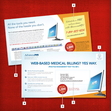
Enough preface. Let’s talk tips and tricks. Each of the points below refers to the diagram above.
 1. The Indicia. When mailing more than a few hundred pieces, you’ll qualify for bulk rate
postage. The visual at right is what is known as an indicia and is required for any bulk rate mailings. Guidelines for indicia
can be found here: USPS
| Canada Post
1. The Indicia. When mailing more than a few hundred pieces, you’ll qualify for bulk rate
postage. The visual at right is what is known as an indicia and is required for any bulk rate mailings. Guidelines for indicia
can be found here: USPS
| Canada Post
2. Postal Address. As mentioned earlier, we made the address side the front on this particular piece. That meant we had to work in space for the postal address. As a general guideline if working with a mailing or fulfillment house, you’ll need to reserve a space approximately 4.5”×1.5” in size.
 3. Special Offer. Direct mail isn’t direct mail without a call to action. While working on this piece,
close friend Jesse Bennett-Chamberlain was working on a DVD jacket.
We were sharing designs for critique, and each design had a special offer that needed emphasis. Jesse beat me out on completing his
design first, and his special offer “seal” was too good to pass up. So I blatantly stole the style and modified it for my
purposes. (With his permission, of course.) With that in mind, don’t kill yourself when designing seals of these sorts. Make it
original, but don’t let it eat up time. Find an existing style, copy and modify it, and move on.
3. Special Offer. Direct mail isn’t direct mail without a call to action. While working on this piece,
close friend Jesse Bennett-Chamberlain was working on a DVD jacket.
We were sharing designs for critique, and each design had a special offer that needed emphasis. Jesse beat me out on completing his
design first, and his special offer “seal” was too good to pass up. So I blatantly stole the style and modified it for my
purposes. (With his permission, of course.) With that in mind, don’t kill yourself when designing seals of these sorts. Make it
original, but don’t let it eat up time. Find an existing style, copy and modify it, and move on.
4. Background Image. I’ll let you in on a secret: The inner glow (or inner shadow) is a technique I’ve used in much of my work, both offline and online. For example, it’s used to create the soft edges of this site. It does wonders for adding flavor with minimal work. On this piece, however, I wanted a rounded inner glow, something that can’t be accomplished using Illustrator or Photoshop defaults. So I resorted to using an oval marquee with feathered edge of 250px. After inversing the selection, I filled the area with a soft hue of blue. Shown below is the completed background image.

5. Vectorized Screenshot. Some time ago I wrote about screenshots in print, in which I praised an article by Kevin Potts, titled Capturing and Optimizing Screenshots for Print. I used his vector technique for this toolbar screenshot, but in the end reverted to a raster screenshot just before printing due to muted colors I couldn’t correct otherwise. But expect to see the vector technique surface again in the future.
6. The Virtual Sticky. In doing research for this piece, I happened on 3M’s Post-it® Notes for Direct Mail. Although not an entirely new idea, I was drawn to the added pull they would provide. Yet, after lengthy consideration, I couldn’t justify the added printing and application costs, nor could I ensure they’d even still be on the postcard by the time they arrived. So I cheated. I made my own note, and replicated an actual sticky note as closely as I could. Again, the concept of a fake sticky note is nothing new. But the idea was to create a note that looked real enough to make recipients think twice about its authenticity. In the end, it took an envelope warp, a couple of gaussian blurs, and six separate elements to produce the effect. Sample detail shown below.
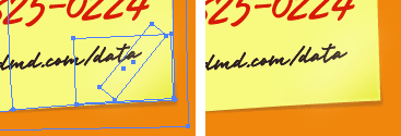
Veer’s Brisa typeface rounded out the effect.
Hurry!
Interested in a printed copy of the postcard? I’ll email a personal copy to the first 20 people to request one by emailing me their mailing
address (U.S. residents only). But hurry, this offer expires soon.
![]()
UPDATE
All 20 copies have been requested.24 Comments
Stock photography, type, and killer tees. Genuinely recommended by Authentic Boredom.
I’m usually not a fan of anything direct mail-related, but I think I might even take a gander at this if it came to me. I’m a huge fan of the inner glow, too.
What handwriting font did you use on the stickys?
Gabriel - Ugh, thanks for pointing out the broken link. I originally linked the pic to the full article, not to an enlarged picture. Speaking of which, the content on this postcard is somewhat new thinking compared to what’s being done currently by competitors. Therefore, I don’t feel comfortable yet releasing the full graphic for competitive purposes.
Jeff - Font is Brisa by Veer.
I can’t believe you stole my seal you punk! ;)
I like how you duplicated the call-to-action on both the front and the back of the piece and the ‘usability’ aspect of the back being the most prominently read area.
How was the address customization handled? Generally I’ve noticed that a direct mail piece that’s been addressed directly to the recipient is noticed more than a generalized “Current Resident” you see on many pieces. Perhaps that’s why the back is read more than the front? Because the recipient is checking whether it was truly made out to them or not?
Cameron, you are an inspiration as always.
This is probably the first direct mail piece I have seen in a while that got my attention, the other was the fuzzy postcard from some random company. :)
How did the printing proofing and printing process go any snags?
Cameron, Excellent job!
The background image that you used, was that done in illustrator? If you can possibly make a high res version of it, say 1680x1050 I would LOVE to use it as a desktop picture. You’ve got my email ;)
Seriously though, wonderful work, it looks great.
Interesting how you term user experience/interface design as “usability in print.” Despite the fact that web and print are different mediums, a lot of the techniques used in one can be used for the other.
The trick is figuring out which of those techniques are most appropriate for the medium. :-)
Anyway, the direct mail looks fantabulous. Did you use any special printing techniques, like varnishes over the seal? Is it going to be printed on cover or text type of paper?
Cameron, I’m the Manager of Internet Strategy for the Adventist Health System Midwest Region and while I would love to see what this mailer looks like in person, I would also like to take a look at it becuase the product seems useful as well.
Always a fan of your work, but I think this is something that needs to be pointed out. It seems to me that the most brilliant ideas stem from something so simple as opening one’s mail. Funny enough while crafting some Thank You postcards recently I noticed the same and went with the ‘front’ on the ‘back’
I also enjoy the fact that your ‘call to action’ is the first thing that catches my eye (in screenshot) regardless of the side. Comes to show that you’ve really made this piece sell while producing a superb design at the same time.
Two thumbs up from this crowd - just hoping I got in soon enough to get a piece of this in the mail. Is it sick that I look forward to the mail because of the advertisements and junk mail?
Thanks for walking us through your discoveries, Cameron. I’m pretty new to your site, but it keeps getting recommended to me, so I keep dropping by. :)
I just wish you’d written this 2 weeks ago, BEFORE I’d designed two 6x9 direct mail cards for our church! I’m especially looking forward to trying the “inner glow/shadow” the next time I get a chance…
Thanks again for sharing the gooey goodness!
Lots of qood questions to address. Allow me to take some time later today to post a few specs about the piece.
Great Timing! I just went to a workshop last week that the USPS put on about direct mail marketing. It was insightful, but offered nothing in the way of design tips (other than, “Make sure people can read your fonts”). This is a huge help as I begin to work on my first direct mailer (It’s taking some time to get up the gumption to admit that I’m basically sending junk mail too…).
Thanks a lot!
I like it. So… how much control over the project as a whole did you have? What kind of ‘red tape’ or ‘politics’ did you run into during the process?
Again, nice work.
Great article and design. How do you go about choosing your colors?
Wow. For once I actually want to get junk mail… ;)
In your previous post you mentioned that 60K of these were mailed. This must have been nerve-wracking; my largest mailing was 2.1 million pieces for a pantyhose manufacturer, and man was I nervous sending those files to the printer. I think I checked the mechanicals ten times.
I think the most important point you made was #3. The “Call to Action” is so critically important in direct mail, that I have seen the exact same piece get different response rates just by changing a few words in the offer — sometimes just by changing the position. The company I used to work used to have literally twelve different working versions of a piece that would test and test until they got it down to the highest response.
People who do this stuff full-time (which I am glad I no longer do) have it down to a science.
A science it truly is, Kevin. Thanks for sharing.
I especially like how you used key graphics on both sides of the card, and the way you limited the use of white. Overall the design is really brilliant, and the points you mentioned very informative. Nice work.
It’s very nice. Elegant. And I wouldn’t mind getting it through my door, either…
I’d be very interested to know what the response rate is - not only incoming calls, but also actual sales conversions. Will you have access to that info, Cameron?
Yes indeed I will.
Nice work. I’ve done a direct mail piece myself. It was actually extremely effective. It increased business in the specifica area by 75%. We where trying to promote birthday pacakges for a Water Park and sent the piece to a database of customers each month when a child had a birthday in the upcoming month. You can see the card at http://www.pushstop.com/FolioImages/SplashPartyCard.jpg
although there was not direct call to action it ended up being quite effective.
Who did you use to print the postcards? I have a small number (5000, small compared to you) for a client. I have used a few in the past, but nothing too great. Just curious.
Thanks,
Matt
Authentic Boredom is the platitudinous web home of Cameron Moll, freelance new media designer, author, and speaker. More…

Full-time and freelance job opportunities. Post a job...
A selection of fine reading, available for a limited time only:
- Jobs home page reorg
- Coming soon: Mobile Web Design, the book
- Dyson ad: Text as more than just words
- Setting sail for Europe
- Review: Sumo Omni bean bag chair
- Dashboard widget for Authentic Jobs
- Limited-time offer: $99 listings
- Nine skills that separate good and great designers
- Fire sale
- Introducing AuthenticJobs.com
 CSS Mastery: Advanced Web Standard Solutions A solid round-up of indispensable CSS design techniques by Andy Budd, Simon Collison, and Cameron Moll.
 Mobile Web Design A guide to publishing web content beyond the desktop. Tips, methodology, and resources. Now available.
![]() Letterpress Posters The unassuming beauty of a freshly letterpressed print.
Letterpress Posters The unassuming beauty of a freshly letterpressed print.
![]() That Wicked Worn Look. Techniques for that worn, aged, distressed look.
That Wicked Worn Look. Techniques for that worn, aged, distressed look.
![]() Mister Retro Machine Wash Filters Turn the dial to “Instaworn” with these filters.
Mister Retro Machine Wash Filters Turn the dial to “Instaworn” with these filters.
![]() Blinksale Dive in and enjoy shamelessly easy invoicing from Firewheel Design.
Blinksale Dive in and enjoy shamelessly easy invoicing from Firewheel Design.
![]() Basecamp My preferred web app for internal and client project collaboration.
Basecamp My preferred web app for internal and client project collaboration.
![]() HOW Conference Austin, June 24–27. Pentagram, Adobe, P&G, et al.
HOW Conference Austin, June 24–27. Pentagram, Adobe, P&G, et al.
![]() Web Design World Seattle, July 20–22. Practical sessions on web design.
Web Design World Seattle, July 20–22. Practical sessions on web design.
![]() Stimulate Salt Lake City, September 2009. Entrepreneurship and design conference.
Stimulate Salt Lake City, September 2009. Entrepreneurship and design conference.
Linkage:
Follow me: ![]()
1 Gabriel Mihalache ~ 16 August 2004 at 08:37 AM
The link on the image is broken:
http://www.cameronmoll.com/archives/
Can we get a larger image, so we can admire your work with the detail it deserves? I can’t make out much of what you did on that tiny image.