 Wornamental, Thornamental
~ 26 October 2006 ~
It’s been well over two years since a few select designers and I authored “That Wicked Worn Look”, a four-part series of techniques and resources for creating that worn, aged, distressed, grunge look.
Back then I was certain the look would have worn out (sorry, couldn’t resist) its welcome by now. Perhaps it has. Yet it seems wornness is still hot as ever.
Add to that a new flavor of grungeness that has since entered our collective vernacular: “thornament”, as coined by Jessica Helfand in her article, “The Propensity for Density”:
Today’s decorative leanings, however, appear to lean less to the geometrical than the overtly botanical. I’ve participated in judging several juried exhibitions this year in which I’ve seen a preponderance of twisted and winding viney things, which I’ve taken to referring to as ‘thornament’.
Whether it’s the thornamental or wornamental look you’re after — or both, as they tend to blend well — the two aesthetics are still showing plenty of leg. Here’s just a handful of sites spotted around the web recently:

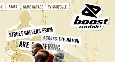

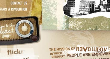
A few bookmarks for going all-out worn and thorn:
- Jason Gaylor’s Photoshop brushes: Worn I, Worn II, Worn III, Fresh Foliage I, Fresh Foliage II, Grafitti I, Tasty Tattoo
- Misprinted Type: Photoshop brushes
- Veerle: Create your own grunge brushes
- Veer: Worn typefaces
- MyFonts: Distressed typefaces
- Type Embellishments One
- How-to: Worn + “bulletproof” liquid layout
- How-to: Worn type using CSS
- How-to: Worn/weathered/stamped look
- iStockphoto: “grunge” vector and raster artwork
Wear yourself out, kiddo.
![]()
11 Comments
Stock photography, type, and killer tees. Genuinely recommended by Authentic Boredom.
I’m a big fan of the worn, torn, thorny look. Thornamental is a new term. Done well I think it has a lot of visual aesthetics.
I’ve always been a fan of the worn look, but I enjoy creating my own brushes. There’s a lot of fun in rummaging through old flooring, papers, and whatnot to find items to throw in the scanner. Or, making ink splats. But that is time consuming.
Don’t forget Misprinted Type. There are plenty of good fonts and brushes there as well.
The ‘worn look’, by default, will never go away. What’s more amazing is how long it took to become so popular.
The look obviously originated from the fact that man-made things will all fall apart at some point in the future. Therefore, since there is an never-ending cylce of creating, there is also a never-ending cycle of wearing. People will tend to think that the worn look is authentic and genuine forever because of this. No matter how old or young a person is, we can all identify with it, because from the second something is made, it begins to wear away.
Cleanliness, however, is not something all of us can identify with :-).
Another grungy font is K.O. Dirty from 2Rebels. It’s a pretty messed up font that could also be used for background texture, etc.
Once again - very inspiring!
I can tell you for a fact that many of the young designers LOVE this style. I love Jason Gaylor’s brushes but boy am I starting to see a lot of our students using them now that they know about them. So I agree that the worn style probably won’t go away - I’d rather say it’ll likely evolve as we see more and more creativity. So I’d like seeing more uniqueness such as in the examples provided - they are a great example of why worn won’t totally go away because those who are that creative to design these layouts will continue to be a step up on those that are using some of the repetitive worn techniques.
I’ve seen a lot of the common default flourishes lately too.
Some awesome links there. I’ve stumbled upon a few of them before, and even used some of those photoshop brushes for my weblog design. They can be used in such a variety of ways to achieve such different effects.
The worn type using css is a great tutorial.
Kay, this is the second post of yours in a row with perfect timing in my world.
Thanks alot (!).
Do I spy Worn Ajax in the works?
Don’t you think it’d be nice compared to some of its current uses?
Thornamental + Wornamental + Latency Reduction + Data Brushing + Magnetism + Responsive Disclosure
…
This will be the best thing since the introduction of Clockwerk Goblins.
Here is one which I find stunning, more like thornamental on steroids: Shinybinary
Authentic Boredom is the platitudinous web home of Cameron Moll, freelance new media designer, author, and speaker. More…

Full-time and freelance job opportunities. Post a job...
A selection of fine reading, available for a limited time only:
- Outage
- Wornamental, Thornamental
- AJAX design terminology
- UI design sessions (and help decide where)
- The witty works of Hanoch Piven
- Jobs home page reorg
- Coming soon: Mobile Web Design, the book
- Dyson ad: Text as more than just words
- Setting sail for Europe
- Review: Sumo Omni bean bag chair
 CSS Mastery: Advanced Web Standard Solutions A solid round-up of indispensable CSS design techniques by Andy Budd, Simon Collison, and Cameron Moll.
 Mobile Web Design A guide to publishing web content beyond the desktop. Tips, methodology, and resources. Now available.
![]() Letterpress Posters The unassuming beauty of a freshly letterpressed print.
Letterpress Posters The unassuming beauty of a freshly letterpressed print.
![]() That Wicked Worn Look. Techniques for that worn, aged, distressed look.
That Wicked Worn Look. Techniques for that worn, aged, distressed look.
![]() Mister Retro Machine Wash Filters Turn the dial to “Instaworn” with these filters.
Mister Retro Machine Wash Filters Turn the dial to “Instaworn” with these filters.
![]() Blinksale Dive in and enjoy shamelessly easy invoicing from Firewheel Design.
Blinksale Dive in and enjoy shamelessly easy invoicing from Firewheel Design.
![]() Basecamp My preferred web app for internal and client project collaboration.
Basecamp My preferred web app for internal and client project collaboration.
![]() HOW Conference Austin, June 24–27. Pentagram, Adobe, P&G, et al.
HOW Conference Austin, June 24–27. Pentagram, Adobe, P&G, et al.
![]() Web Design World Seattle, July 20–22. Practical sessions on web design.
Web Design World Seattle, July 20–22. Practical sessions on web design.
![]() Stimulate Salt Lake City, September 2009. Entrepreneurship and design conference.
Stimulate Salt Lake City, September 2009. Entrepreneurship and design conference.
Linkage:
Follow me: ![]()
1 Aaron ~ 26 October 2006 at 11:04 AM
That Gaylor fella is somethin’ else, what with all those fancy brushes and such.